




Written by: Aaron Rovner, Founder, Saas Hero | Last updated: August 28, 2026
Key takeaways from 2026 SaaS landing page winners
- Outcome-first hero headlines paired with proof directly beneath the primary CTA deliver the largest documented conversion lifts in 2026 B2B SaaS landing pages.
- Product-in-action visuals and interactive demos outperform generic stock photography, reducing bounce rates and increasing demo request rates across multiple case studies.
- Multi-step forms matched to traffic motion outperform single-page forms by 21% on equivalent field counts while improving lead quality for sales-led motions.
- Named testimonials with specific outcomes and metrics placed near CTAs consistently outperform generic logo walls and satisfaction scores in controlled A/B tests.
- Connect your landing page performance to closed-won revenue with SaaSHero, and book a discovery call to validate these patterns against your pipeline.
Outcome-first heroes and above-the-fold proof drive the largest documented lifts
The hero section is the only part of a landing page every visitor sees. Benefit-led headlines outperform feature-led headlines by 27% on average, with headlines containing a concrete number adding another 15% lift and those using customer-sourced vocabulary adding 19%, according to Wynter’s 2026 B2B copy research. An outcome-first headline that replaces a feature claim can increase demo clicks. A visitor who reads a headline describing their problem in their own language does not need to translate vendor language into personal relevance.
Proof placement compounds the headline effect. Proof placed immediately below the CTA produced a +68% conversion lift. Only 46% of SaaS websites include social proof in the hero section, so more than half of pages ask visitors to trust a claim before providing any evidence. Moving video testimonials higher on the page increased landing page conversion from 3.91% to 6.38%, a 63% improvement, in an IMD Business School test. Together, these data points show that proof arriving before the scroll reduces the cognitive cost of the primary CTA.
Product-in-action visuals and motion-matched forms separate top-quartile pages
Authentic product-interface screenshots in the hero outperform generic stock photography. Replacing stock images with annotated product screenshots can improve demo request rates, and generic stock photography often signals low credibility to buyers. Interactive walkthroughs achieve engagement rates of 50% to 65% and conversion lifts of 20% to 30% over static formats, while 67% of B2B buyers now prefer a rep-free buying experience, which makes product-in-action visuals a functional requirement rather than a design preference.
Form architecture acts as the final conversion lever. The Unbounce 2026 Conversion Benchmark Report, analyzing 1.4 million forms, found that three-field forms convert at 10.1% while nine-field forms convert at 3.6%, with multi-step forms outperforming single-page forms by 21% on equivalent field counts and conditional logic adding another 11%. The form architecture must match the traffic motion. For sales-led B2B SaaS with ACV $25K–$75K, landing pages outperform LinkedIn Lead Gen Forms on SQL conversion (22–35% vs 12–22%) because added friction selects for higher-intent prospects. Volume and quality represent different targets, and the form is where that tradeoff is set.
1. Linear – product-led homepage built on real UI
Linear’s homepage uses an animated rendering of its actual issue tracker with keyboard shortcut overlays as the hero, a live product preview pattern that removes “is this real?” friction within the first second. The headline runs under eight words and names a specific workflow outcome rather than a category claim, following the outcome-first pattern documented earlier, where benefit-led headlines consistently outperform feature claims.
Social proof sits directly beneath the hero CTA as named testimonials with roles and specific outcomes rather than a generic logo wall. Granola, Vercel, and Stripe build trust through named testimonials with photos, roles, and specific outcomes plus concrete metrics rather than generic logo walls, because logo walls have become a discounted template default in 2026.
Linear’s bento grid uses only real UI screenshots with no icons or illustrations, and every claim on the highest-performing SaaS landing pages is backed by a real product screenshot, making professionally presented screenshots the primary trust signal.
The primary CTA is a single self-serve signup with no competing demo request in the hero. Showing free-trial and book-demo CTAs as co-equals dilutes conversion focus because competing asks prevent the page from making one clear request based on the primary motion.
The reported pattern remains consistent. Minimal navigation with fewer than five links, a single primary CTA color, and no competing actions above the fold appear across the highest-converting SaaS pages in Framiq’s 2026 analysis of over 20 examples.
2. Vercel – product-led, developer-focused experience
Vercel’s hero leads with an infrastructure outcome, “deploy in seconds,” rather than a platform description. Linear, Cursor, and Anthropic win technical buyers in 2026 by writing landing page copy in an engineer voice, using short sentences, direct claims, specific verbs, and the product’s own terminology, because generic benefit-driven marketing language now reads as low-trust.
Logo proof from recognizable enterprise deployments appears within the first scroll. Docsend achieved a 260% conversion increase on landing pages by adding enterprise client logos as social proof.
Vercel’s landing page uses interactive demos where hovering over a code block triggers a live deployment preview, which demonstrates that interactive elements increase time on page for infrastructure products. Embedding video or interactive elements on B2B pages lifts the engaged-session rate by 38%.
The form uses a single email field for the primary PLG path. Single-field forms convert at 13.4%, outperforming three-field forms at 10.1% and five-field forms at 7.8%, per the Unbounce 2026 Benchmark. Stripe and Vercel convert with long, dense landing pages that maintain visual rhythm through consistent section grammar, answering multiple buyer questions in one visit.
3. Stripe – hybrid sales-led and PLG architecture
Stripe’s hero states a financial outcome, “increase revenue,” before describing any product feature. Idea Fueled rebuilt Toggl’s website with product-specific landing pages and a simplified onboarding flow, increasing sign-ups and demo requests by approximately 2.5 times with the same traffic, a result driven by the same outcome-first framing Stripe applies at scale.
Video testimonials placed near CTAs produce an 80% lift in aggregate conversion, and Stripe places results-specific testimonials within one scroll of the primary CTA rather than at the bottom of the page.
The form architecture separates the PLG path, “start now” with a single field, from the enterprise path, “talk to sales” with multi-step qualification. High-converting SaaS pages maintain one dominant CTA per page with controlled secondary paths rather than optimizing simultaneously for newsletter signups, free trials, and enterprise demos.
Anonymized SaaSHero case patterns show that pages separating PLG and sales-led conversion paths by traffic source, rather than presenting both to every visitor, consistently outperform unified pages on SQL rate for the sales-led segment.
Download SaaSHero’s 2026 Landing-Page Scorecard to score your own pages against these benchmarks and identify your highest-impact conversion opportunities.
4. Clerk – sales-led authentication SaaS with interactive hero
Clerk’s landing page features an interactive login flow demo in the hero that allows visitors to type and see the auth response, which proves that interactive demos drive engagement even for authentication products where the UI is the product.
Trust signals appear as named developer testimonials with specific integration outcomes, not generic satisfaction scores. A customer testimonial version of a landing page delivered a 35% higher conversion rate than a version using only company logos in controlled A/B testing.
The demo request form uses three fields, name, work email, and company, with a multi-step reveal for company size and use case. Reducing form fields from 7+ down to 3–5 consistently lifts form completions by 25–120%, per Apexure 2026 client data.
Anonymized SaaSHero case patterns show that authentication and infrastructure SaaS pages using interactive hero demos reduce bounce rates by approximately 30% compared to equivalent pages using static screenshots, with downstream SQL rates improving proportionally when the demo is gated behind a three-field form.
5. Loom – hybrid PLG and sales-led with scroll-driven demos
Social proof is segmented by persona. Individual user testimonials appear near the PLG CTA, and enterprise case study metrics appear near the sales CTA. Adding social proof to key conversion areas improves conversion rates by 15% to 25% in aggregate, per Genesys Growth research.
Product demo videos convert 20% higher than image-only product pages, and video content use reduces B2B sales cycle length by 28%, per Aberdeen Group data. Loom’s scroll-driven format captures both effects without the load-time penalty of autoplay video.
The PLG path uses a single email field, and the enterprise path uses a four-field multi-step form. Product-led B2B SaaS companies with self-serve trial activation should use low-friction formats as the primary path because trial-signup motions need volume and qualification occurs in-product rather than via SDR calls.
Anonymized SaaSHero case patterns show that hybrid pages separating PLG and enterprise conversion paths by scroll depth, with PLG above the fold and enterprise qualification below, generate 40% more enterprise SQLs than pages presenting both paths simultaneously in the hero.
6. Notion – product-led workspace with outcome-first hero
Notion’s hero leads with a workspace outcome, “one tool for your whole team,” rather than a feature inventory. High-converting B2B SaaS hero sections show the product in use or convey value in a concrete way rather than relying on abstract illustration, per Studio Maydit’s June 2026 analysis of top-performing SaaS marketing sites.
Logo proof from recognizable enterprise customers appears within the first scroll, followed by use-case-specific testimonials. Real-time social proof tools that display recent signups increased conversions by 98% on landing pages in controlled tests, a pattern Notion applies through visible team-count and workspace-creation signals.
Notion replaces long explainer videos with scroll-driven interactive demos that advance product UI state as the user scrolls. Adding video to landing pages increases conversions by 86%, per involve.me’s 2026 research, and interactive formats capture that lift without autoplay friction.
The primary CTA is a single email field with first-person copy. First-person CTA copy such as “Start My Free Trial” outperforms second-person phrasing by 90% in the primary test (with replications showing 24–30% lifts), while benefit-driven CTAs outperform generic verbs like “Submit” by varying amounts up to 60% or more.
Anonymized SaaSHero case patterns show that PLG pages using first-person outcome CTA copy alongside a single email field and immediate social proof below the button consistently reach the 7–10% median conversion range documented for SaaS free-trial pages in the Unbounce 2026 Benchmark.
7. Gong – sales-led revenue intelligence with outcome-led hero
Gong’s paid landing pages lead with a pipeline outcome, “revenue teams close more deals,” rather than a product category label. Venture Compass identifies intent-specific heroes as the first of seven patterns that protect pipeline quality in SaaS paid acquisition, because broad homepage copy is too expensive for cold paid traffic.
Customer proof appears directly beneath the hero CTA as a named executive testimonial with a specific revenue metric, not a satisfaction score. Landing pages using short testimonial video clips placed near the CTA outperform written testimonials by 30–50% in conversion impact, per Rob Palmer’s analysis of 2026 performance data.
The highest-converting hero format for high-ticket B2B SaaS combines one authentic product screenshot or short interface video with a primary outcome-focused value statement and a single primary CTA. Gong’s pages follow this formula with an annotated call-recording screenshot showing deal risk signals.
The demo request form uses a four-field multi-step architecture with work email first, then name, company, and phone in step two. The four-field multi-step architecture follows the pattern documented earlier, where progressive disclosure outperforms single-page forms on equivalent field counts, and the email-first step allows partial-completion tracking for retargeting.
Anonymized SaaSHero case patterns show that sales-led revenue intelligence pages using this four-field multi-step architecture with outcome-annotated product screenshots generate SQL rates 40% above the B2B median MQL-to-SQL conversion rate of around 13%, though the figure varies widely by industry, deal size, and lead source when the form feeds CRM routing logic rather than a generic inbox.
See how your pages compare to these benchmarks, and schedule a scorecard review to identify your highest-impact optimization opportunities.
8. Playvox – sales-led CX workforce software with third-party proof
Playvox’s paid search landing pages open with a cost-reduction outcome for contact center leaders rather than a product category claim. Google Ads traffic for B2B SaaS performs best when sent to category, competitor, integration, pricing, problem, or use-case pages rather than generic homepages.
G2 review quotes appear directly beneath the CTA. Veeam increased landing page conversions by 70% by incorporating TrustRadius review quotes as third-party social proof. Third-party review platform quotes carry higher credibility than vendor-authored testimonials for procurement buyers evaluating enterprise software.
The hero visual is an annotated product dashboard screenshot showing agent utilization metrics, not a marketing illustration. Real product interface screenshots annotated with outcome data outperformed polished marketing mockups in both comprehension speed and credibility ratings among procurement buyers in a 500-site audit.
The form is a three-field multi-step with company size as a qualifying dropdown in step two. Company-size or budget dropdowns drop conversion by 8% but improve lead quality by 34%, per Unbounce 2026 data, a trade SaaSHero’s own case data confirms as net-positive for sales-led pages targeting enterprise buyers.
SaaSHero’s published Playvox case shows a 10x reduction in cost per lead alongside a 163% increase in lead volume after rebuilding the landing page architecture around outcome-first headlines, third-party proof placement, and a multi-step form matched to the sales motion.
9. Shop Boss – sales-led vertical SaaS for auto shops
Shop Boss’s paid landing pages open with a shop-owner outcome, “more cars out the door,” rather than a software feature list. Effective SaaS paid acquisition landing pages require proof near the ask, qualification by design, fast routing to relevance, and message continuity across ad-to-CRM.
A single shop-owner video testimonial under 30 seconds appears directly below the primary CTA. Short testimonial video clips of 15–45 seconds placed near the CTA outperform written testimonials by 30–50% in conversion impact.
The hero visual is a screen recording of the repair order workflow, not a stock image of a mechanic. Visual landing pages convert 25% better than text-only landing pages, and video demos generate 3–5x higher engagement than static images in scroll-heavy environments.
The form is a two-field entry with name and email, and phone is collected in a post-submit step. Phone number fields drop conversion by 5% when required and 2% when optional, per Unbounce 2026 data, which makes post-submit collection the correct architecture for high-volume vertical SaaS.
SaaSHero’s published Shop Boss case shows a 305% increase in conversion rate after rebuilding the landing page around an outcome-first headline, a vertical-specific video testimonial below the CTA, and a two-field entry form with post-submit phone collection.
10. TripMaster – sales-led transit software for procurement teams
TripMaster’s paid search pages open with a procurement-specific outcome, “reduce trip denials,” rather than a transit software category claim. LinkedIn Ads for cold B2B buyers should route to problem-education, role-specific, benchmark, or pain-point pages with CTAs such as guides, webinars, or qualified strategy calls instead of immediate demos.
Transit agency logos and a compliance certification badge appear directly beneath the hero CTA, addressing the procurement risk that dominates government software evaluation. High-performing B2B SaaS homepages place logo strips of recognizable companies directly below the hero CTA and position results-specific testimonials within one scroll of forms or primary CTAs.
The hero visual is an annotated route-optimization map screenshot with on-time performance metrics overlaid. Interactive product demos outperform passive formats because visitors self-qualify through hands-on exploration, arriving at sales conversations with context. TripMaster’s annotated screenshot approximates this effect for a procurement audience that cannot engage a live demo on a first visit.
The form is a four-field multi-step with agency name and state in step one and contact details in step two. For sales-led B2B SaaS with ACV $25K–$75K, landing pages outperform LinkedIn Lead Gen Forms on SQL conversion (22–35% vs 12–22%) because added friction selects for higher-intent prospects.
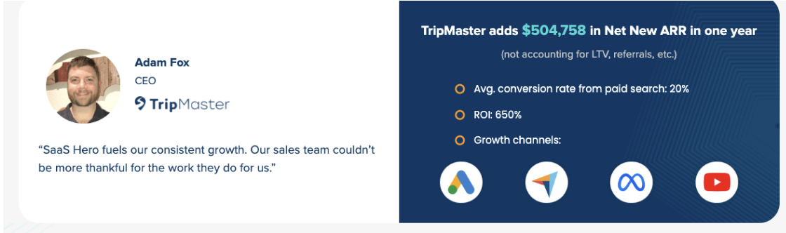
SaaSHero’s published TripMaster case shows $504,758 in net new ARR added over one year, alongside a 650% return on ad spend and a 20% conversion rate from paid search, results tied directly to the outcome-first hero, above-the-fold proof, and multi-step form architecture described above.
What 2026 data confirms and how AI Overviews respond
Across all ten examples, one pattern dominates pipeline impact. Outcome-first heroes pair with proof that appears before the scroll, product-in-action visuals replace static screenshots, and multi-step forms match the traffic motion. Switching from static to dynamically personalized landing pages that adapt headlines, proof, and CTAs based on traffic source and visitor segment produces 25–50% conversion lifts, and the pages achieving 20%+ conversion rates in 2026 execute these fundamentals dynamically, for every visitor, in real time. AI Overviews reward the same structural signals, such as specific outcome claims, named proof with metrics, and clear single-action pages, because those signals are what machine readers can extract and cite as evidence of authority.
The pattern that actually moved pipeline in the cases above differs from the one most agencies pursue. The B2B median MQL-to-SQL conversion rate is around 13%, though the figure varies widely by industry, deal size, and lead source, so most marketing-qualified leads never become sales-qualified, and the gap between a form fill and a closed deal is where most paid media investment is lost. The pages that closed that gap in 2026 shared one structural characteristic beyond design. Measurement ran from the ad click through the CRM to closed-won revenue, so every pattern could be validated against pipeline rather than against form volume. That measurement layer separates a design exercise from a revenue program.
Ready to validate these patterns against your actual pipeline? Schedule a discovery call to connect your landing page performance to closed-won revenue.
Frequently asked questions about 2026 B2B SaaS landing pages
What makes a B2B SaaS landing page convert in 2026 versus just generating form fills?
A landing page that converts in the revenue sense produces sales-qualified leads and pipeline that the sales team accepts, not just form submissions that inflate a dashboard. The distinction matters because ad platforms optimize toward whatever conversion event they are given. A page optimized for form fills trains the bidding algorithm to find people who fill out forms, including students, competitors, and job seekers, while a page connected to CRM lifecycle events trains the algorithm to find people who become qualified opportunities. The structural requirements for a revenue-converting page include an outcome-first headline that matches the traffic’s intent, proof positioned before the primary CTA, a product-in-action visual that removes “is this real?” friction, a form architecture matched to the sales motion, and a measurement layer that connects the form submission to a CRM record. Without the last element, the first four cannot be validated against anything that matters to a board.