




Written by: Aaron Rovner, Founder, Saas Hero | Last updated: July 19, 2026
Key Takeaways for SaaS Ad Pricing Visuals
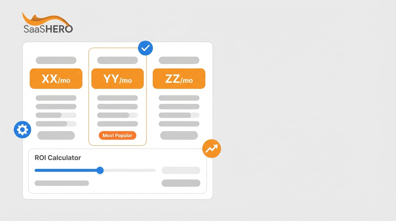
- Transparent pricing visuals place price anchors, tier comparisons, and trust signals inside ad creatives so B2B buyers can judge value in three seconds.
- Sort keywords and audiences into Pricing, Problem, or Review intent buckets, then match them with visuals like three-tier cards, usage calculators, or competitor matrices.
- Follow platform rules: design LinkedIn creatives at 1200×1200 px with critical elements in the center 70%, and place pricing data in Google RDA headlines and descriptions instead of image overlays.
- Layer trust signals in sequence, with a price anchor first, a savings badge second, a review badge third, and a no-hidden-fees statement fourth, so objections are resolved before the click.
- Book a discovery call with SaaSHero to roll out these transparent pricing techniques and connect ad performance to closed-won ARR.
Technique Comparison: 10 Transparent Pricing Visualization Methods
| Technique | Best For | Ad Format | Platform Specs | CTR / Conversion Lift Example |
|---|---|---|---|---|
| Three-tier pricing card | Seat-based SaaS with clear plan differentiation | LinkedIn Single Image | 1200×1200 px, PNG, 5 MB max | Improved conversion rates compared to layouts with more tiers |
| ROI slider / usage calculator | Usage-based or API-volume pricing | LinkedIn Single Image, Google RDA | RDA: 1200×628 px, headline ≤30 chars | Improved conversion rates for usage-based or variable pricing |
| Competitor conquest matrix | High-intent “vs” and “alternative” queries | Google RDA, LinkedIn Single Image | RDA: up to 5 headlines, 80-char descriptions | Improved closing rates for price-qualified leads |
| Annual savings badge | Driving annual plan uptake over monthly | LinkedIn Single Image, Google RDA | Place badge in center 70% of frame, PNG preferred for text legibility | Increased annual plan uptake when the default is annual |
| No-hidden-fees badge | Enterprise buyers with procurement risk aversion | LinkedIn Single Image | Limit to one short claim in image, headline truncates at 70 chars on mobile | Price transparency is important to many B2B decision-makers |
| Per-seat + scenario total callout | Seat-based SaaS targeting team leads | Google RDA headline + description | RDA description ≤80 chars, for example “$15/seat — 10 seats = $150/mo” | Reduces buyer mental math friction, improves qualified click rate |
| Outcome-framed plan label | Mid-market SaaS with multiple buyer personas | LinkedIn Carousel (1080×1080 px) | 1080×1080 px, JPG/PNG, 10 MB per card | Outcome framing outperforms feature-list framing for plan differentiation |
| G2 / Capterra trust badge overlay | Review-intent and validation-stage buyers | LinkedIn Single Image | PNG lossless, place in center 70% to survive 1.91:1 crop | Can improve SQL/MQL rates for companies using transparent pricing |
| TCO / value-gap comparison | Pricing-intent buyers evaluating a higher-priced competitor | Google RDA + dedicated landing page | RDA prohibits overlaid logos, embed TCO data in headline/description copy | Can reduce price negotiations and support higher average prices |
| Overage / usage-limit disclosure | Usage-based SaaS with variable billing | Google RDA description | RDA, ad content must be accurately reflected on landing page | Disclosing overage charges in ads reduces post-signup cancellations |
Step 1: Map Buyer Intent into Three Clear Buckets
Start by segmenting your target keywords and audience signals into three intent buckets: Pricing, Problem, and Review. Each bucket reflects a specific mindset and needs a tailored creative approach.
Pricing-intent buyers search terms like “[Competitor] pricing” or “how much does [tool] cost.” They feel price pressure and often face a renewal decision or an opaque enterprise quote. Problem-intent buyers search “[Competitor] alternatives” or “cancel [tool]” and feel frustrated, so they respond to a clear switch message. Review-intent buyers search “[Competitor] vs [Your Product]” and want social proof that reduces risk.
The input for this step is your keyword list and LinkedIn audience segments. The output is a three-column intent map that assigns each keyword or audience to a bucket, a visualization technique, and a destination URL. Many teams send all three intent types to the same homepage, which breaks message match and inflates bounce rate.
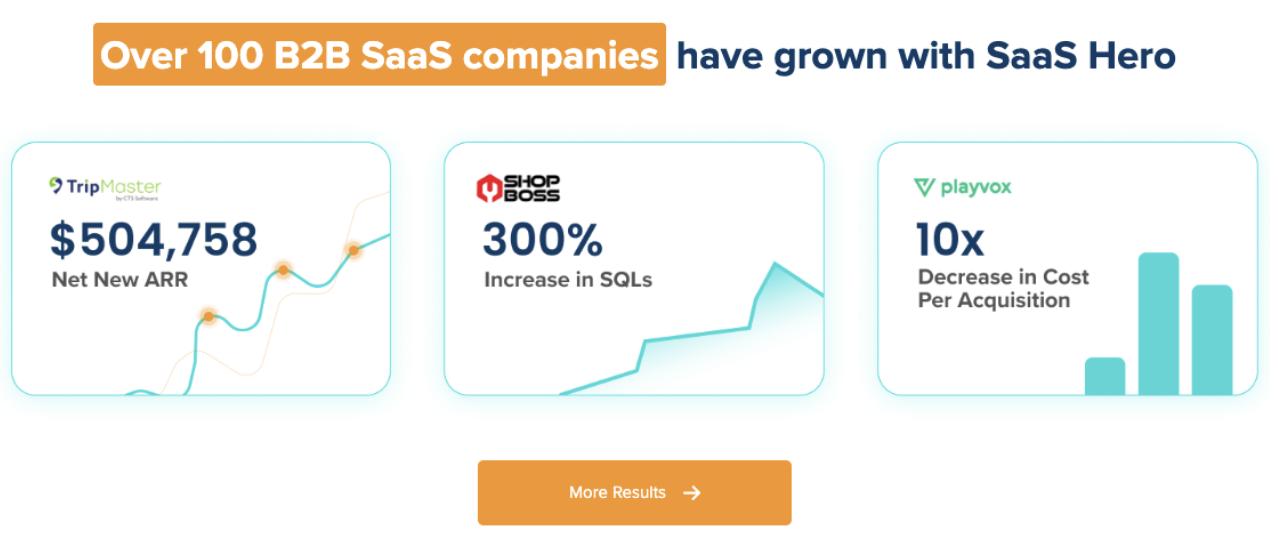
Segmenting campaigns by buyer intent can reduce CPL by consolidating ad groups into intent-bucketed campaigns with dedicated creatives and landing pages. SaaSHero’s Playvox case study documents a 10x CPL reduction using this same intent-segmentation approach.
Step 2: Match Visualization Types to Each Intent Bucket
Each intent bucket maps to a primary visualization technique supported by 2025–2026 performance data.
For Pricing intent, use a three-tier pricing card or a per-seat scenario callout. Showing both the per-seat rate and a common-scenario total, for example “$15/seat — a 10-person team pays $150/month,” removes mental math and speeds up qualified clicks. For usage-based products, use a usage calculator visual with a slider illustration, because column comparison creates confusion for variable pricing structures.
Once Pricing-intent buyers see clear costs, shift attention to Problem intent prospects. For this group, use a competitor conquest matrix or a TCO comparison. Companies with transparent pricing can achieve lower customer acquisition costs by filtering out unqualified buyers before the click.
For Review intent, combine a G2 or Capterra trust badge with an annual savings callout. Annual savings badges reading “Save 20%” or “Save 2 months” outperform precise percentages like “Save 16.7%” because round numbers are processed faster in a three-second glance. Many B2B decision-makers rate price transparency as very important for supplier selection.
Step 3: Apply Platform Rules for Dimensions and Visual Hierarchy
Platform constraints decide which visualization elements survive rendering, so design with those limits in mind.
LinkedIn Single Image Ad, 1200×627 px (Landscape), Pricing-Intent Creative: Design in a 1200×1200 px square first, and place all critical elements, such as pricing tier labels, savings badge, and CTA, in the center 70% of the frame so cropping to 1.91:1 preserves them. Use PNG for lossless text rendering. Follow this visual hierarchy from top to bottom: bold plan name and price anchor at 48px minimum, three-bullet feature differentiators at 18px, a “Save 20% annually” badge in a contrasting color block, and the brand logo in the bottom-left corner. Headlines truncate at 70 characters on mobile, so the price point must appear inside the image graphic, not only in the headline field. Limit image text to one short claim or data point, because dense text overlays correlate with lower engagement rates and suppressed ad quality scores.
Google Responsive Display Ad, 1200×628 px (Horizontal), Competitor Conquest Creative: Google RDA prohibits overlaid logos, text, or buttons on images, so pricing elements and trust badges must live in the original image design or in headlines and descriptions. Use the five headline slots for “$49/mo — No Hidden Fees,” “[Competitor] Alternative,” “G2 Leader — Spring 2025,” “Cancel Anytime,” and “Free Migration Included.” RDA descriptions are capped at 80 characters, so write descriptions like “All features included. No per-seat surprises. Start in 24 hours.” Upload the same creative at 1200×1200 and 900×1600 to cover all placement sizes. Google recommends uploading 5–10 images per aspect ratio and creating 3–4 ads per ad group with varied images and messaging to improve performance testing.
Step 4: Sequence Trust Signals and Savings Badges
Trust signals act as conversion infrastructure, not decoration. The order in which they appear in the creative shapes whether a buyer resolves skepticism before or after the click.
Place trust elements in a specific sequence so each one addresses a clear objection. First, use a numeric price anchor such as “From $49/mo” to remove fear of an enterprise quote call, which is often the biggest barrier to engagement. After price anxiety drops, add a savings badge like “Save 20% annually” to create urgency without fake scarcity and to give interested buyers a reason to act quickly. With cost and timing covered, add a review platform badge such as G2 High Performer or Capterra Top 20 to provide third-party validation and reduce perceived risk. Finish with a no-hidden-fees statement that confirms the transparent price shown is the real price, which removes the final objection. Avoiding surprise fees through transparent design is a critical principle for high-conversion pricing communications because transparency builds trust.
This pre-qualification effect, introduced earlier in the context of CAC reduction, also speeds up the sales cycle. Buyers who click transparent pricing ads arrive with accurate expectations, so sales teams spend less time on budget discovery and more time on fit and value.
SaaSHero’s senior-led team rolls out this trust-layering system across LinkedIn and Google in the first 30 days of an engagement, with no long-term contract. Book a discovery call to see how SaaSHero applies these techniques to your ad account.
Step 5: Build Creatives and A/B Test in Figma or Canva
A tight production workflow lets insights compound quickly. In Figma, create a master component for each visualization type, such as a three-tier card, savings badge, or trust badge row, and use variants to swap pricing figures, badge colors, and CTA copy without rebuilding layouts. Export as PNG at 2x resolution, then downsample to the platform’s required file size. In Canva, use the Resize function to generate the 1200×1200 and 1200×628 versions from a single master, and confirm the center-70% rule before export.
Structure A/B tests around one variable per flight. Test price anchor placement, image versus headline copy, in week one. Test savings badge wording, such as “Save 20%” versus “2 Months Free,” in week two. Test trust badge type, such as G2 versus Capterra versus a customer logo strip, in week three. Run each test for at least 200 clicks or two weeks before declaring a winner. Plan cards should be limited to 4–6 headline differentiators, and the same limit applies to ad creatives to avoid cognitive overload.
Companies that use price transparency with this level of discipline often see higher conversion rates. Systematic A/B testing is the engine that moves a team from average performance to those stronger results.
Step 6: Connect Ad Clicks to CRM and Net New ARR
CTR and CPL act as leading indicators, while Net New ARR is the metric that secures budget from a CFO. Connecting ad-click data to CRM revenue records requires three components: GCLID or LinkedIn Insight Tag pass-through to the CRM, a hidden form field that captures the UTM source and campaign name on every lead submission, and a CRM pipeline report that segments closed-won revenue by ad campaign.
In HubSpot, create a custom contact property for “Ad Campaign” that the UTM parameter populates. Build a deals report filtered by that property to reveal which pricing visualization technique generates the most closed revenue, not just the most clicks. In Salesforce, use campaign influence reporting with a first-touch or linear attribution model to credit the ad creative that started the buying journey.
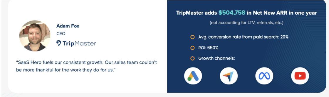
This tracking architecture separates a performance marketing team from a traffic team. SaaSHero’s TripMaster engagement produced $504,758 in Net New ARR in one year by optimizing campaigns against closed revenue, not form fills. Book a discovery call to learn how SaaSHero sets up this tracking infrastructure in the first two weeks of an engagement.
6-Step Checklist Recap
- Map all keywords and LinkedIn audiences to Pricing, Problem, or Review intent buckets before touching any creative file.
- Assign the correct visualization type to each bucket: three-tier card or usage calculator for Pricing, conquest matrix for Problem, trust badge plus savings callout for Review.
- Apply platform dimension rules: design LinkedIn creatives at 1200×1200 with critical elements in the center 70%, and place pricing in RDA headlines and descriptions, not as overlaid image text.
- Layer trust signals in sequence: price anchor first, savings badge second, review platform badge third, and no-hidden-fees statement fourth.
- Build master components in Figma or Canva and A/B test one variable per two-week flight across at least 200 clicks.
- Pass GCLID and UTM data into the CRM and report on closed-won ARR by ad campaign, not just CPL.
Next Steps by Team Maturity Level
Teams at different stages of marketing maturity need different starting points within this playbook.
Founder-led or early-stage teams (sub-$1M ARR, $10k/month ad spend or less): Start with Step 1 and Step 4 only. Map intent buckets manually in a spreadsheet and add a single no-hidden-fees badge and price anchor to your existing creative. Delay investment in a full Figma component library until you confirm that transparent pricing improves CTR in your market. SaaSHero’s Dedicated Campaign Manager tier at $1,250/month fits this stage with a flat fee, month-to-month terms, and no percentage-of-spend markup.
Growth-stage teams (Series A–B, $10k–$50k/month ad spend): Execute all six steps in sequence over 90 days. Prioritize Step 6 first if CRM tracking is missing, because without revenue attribution, optimization decisions rely on incomplete data. SaaSHero’s Full Marketing Team tier supplies the senior strategist, designer, and tracking setup needed to compress this 90-day roadmap into 30 days.
Scale-up teams (Series C+, $50k+/month ad spend): Use this playbook as a quarterly audit framework. Run a full intent-bucket review each quarter as competitive positioning shifts. Invest in dynamic creative optimization tools that automate A/B testing across pricing visualization variants at scale. Book a discovery call to discuss how SaaSHero manages multi-channel transparent pricing campaigns at this spend level.
Frequently Asked Questions
How long does it take to implement transparent pricing visualization techniques across LinkedIn and Google ad campaigns?
A focused team can complete Steps 1 through 4, which cover intent mapping, visualization selection, platform-spec creative production, and trust-signal layering, within five to seven business days if design assets and pricing data are ready. Step 5, which covers A/B testing, needs at least two weeks per variable to generate statistically meaningful data. Step 6, which covers CRM tracking setup, typically takes three to five business days for a HubSpot or Salesforce integration when a developer or marketing ops resource is available. The full six-step playbook can be live within 30 days for a team with dedicated resources. SaaSHero shortens this timeline by providing senior strategists, designers, and tracking specialists under a single flat-fee retainer, which removes the coordination overhead of managing multiple vendors.
Which visualization technique delivers the fastest CTR improvement for a B2B SaaS company new to transparent pricing in ads?
The annual savings badge combined with a numeric price anchor usually produces the fastest measurable CTR improvement, because it only requires a creative update to an existing ad and no new landing page or tracking setup. Adding “From $49/mo — Save 20% Annually” to a LinkedIn image creative that previously showed no pricing can be tested within a single week. The three-tier pricing card and usage calculator visuals often deliver stronger downstream conversion improvements, but they need more production time and a matched landing page to reach full impact. For teams with limited bandwidth, the savings badge is the highest-leverage starting point.
How should a B2B SaaS company adapt these techniques if it uses usage-based pricing rather than flat-tier pricing?
Usage-based pricing needs a different visualization strategy than seat-based or flat-tier models, because a static price card creates confusion when actual cost depends on consumption. The most effective approach for usage-based products is a calculator visual that shows a slider illustration with two or three example outputs, such as “1,000 API calls = $12/mo” and “10,000 API calls = $95/mo.” This format explains the pricing model’s logic without forcing the buyer to visit a pricing page to estimate cost. In Google RDA, use the description field to state a common-scenario total, such as “Most teams pay $80–$150/mo.” Pair this with a no-hidden-fees badge to address the overage anxiety that usage-based pricing often triggers. The landing page must mirror the calculator logic shown in the ad to maintain message match and comply with Google’s requirement that ad content be accurately reflected on the destination page.
What roles are needed internally to execute this playbook without an agency?
Executing all six steps in-house requires four distinct skill sets. You need a paid media strategist to own intent mapping, campaign structure, and A/B test design. You need a graphic designer who works in Figma or Canva and understands LinkedIn and Google RDA dimension rules. You need a marketing operations or analytics resource to configure GCLID pass-through, UTM tracking, and CRM pipeline reporting. You also need a copywriter to produce platform-compliant headline and description copy within character limits. At Series A–B companies, these roles rarely all sit on a single team. The most common gap is the overlap between paid media strategy and CRM revenue attribution, which is the capability SaaSHero provides under its Full Marketing Team retainer without a long-term contract.
How does transparent pricing visualization affect lead quality, not just click volume?
As discussed in Step 4, transparent pricing functions as a pre-qualification filter. The specific mechanism is simple: displaying “From $499/mo” in the ad creative causes budget-misaligned prospects to self-select out before the click. This shift means your sales team’s discovery calls focus on prospects who already confirmed they can afford the product, which replaces a qualification step that usually happens 20–30 minutes into the first sales conversation. This effect explains why transparent pricing correlates with higher SQL-to-MQL ratios and shorter sales cycles rather than just higher click volumes. The qualification impact grows when pricing appears with a no-hidden-fees badge and a specific plan label, because buyers arrive at the landing page with accurate expectations and face less friction between form submission and sales conversation. Teams that track only CTR will undervalue this technique, while teams that track pipeline-to-closed-won conversion rates will see its full impact within one or two sales cycles.