




Written by: Aaron Rovner, Founder, Saas Hero | Last updated: July 26, 2026
Key Takeaways for 2026 B2B SaaS Ad Creative
- Enterprise B2B SaaS buyers in 2026 evaluate ads independently across buying committees, so they expect proof elements and precise visuals that reduce perceived risk at the impression stage.
- The eight visual elements (UI mockup hero, ROI visualization, trust badges, high-contrast CTAs, modular grids, dark-mode variants, purposeful motion, and negative-space typography) create a repeatable recipe for pipeline-generating creative.
- Exact pixel dimensions and platform specs for LinkedIn and Google Display keep creative assets legible and compliant across placements and funnel stages.
- SaaSHero’s heuristic CRO audits and flat-fee model deliver measurable outcomes such as 20% conversion rates and 650% ROI by aligning creative execution with enterprise buyer psychology.
- Ready to transform your B2B SaaS ad creative? Schedule your heuristic audit with SaaSHero to identify conversion killers before you scale spend and start generating Net New ARR.
The 8 Visual Elements Driving B2B SaaS Ad Performance in 2026
- UI Mockup Hero. Place a cropped, in-context interface screenshot as the dominant visual, not an abstract illustration. DataCamp uses simple UI-first designs on Meta, and Stripe pairs “Start accepting payments in minutes, not days” with an actual payment link UI screenshot so the visual acts as evidence rather than decoration. For LinkedIn single-image, export at 1200×1200 px (1:1, max 5 MB). For Google 300×250 static, export at 600×500 px at 2× resolution, max 150 KB. Enterprise buyers want to see the interface before they book a demo.
- ROI Visualization. Anchor the creative on one specific, verifiable metric from a named customer outcome. Lovable’s “$50M ARR in 6 months” and Clay’s “80–90% match rate for contact-based audiences” outperform vague percentage claims because buyers can verify or challenge them. Use LinkedIn 1200×627 px landscape (1.91:1). For Google 300×250, export at 600×500 px at 2×. A single hard number from a named account removes the “too good to be true” objection before it forms.
- Trust-Badge Hierarchy. Place G2 ratings, recognizable customer logos, and certification marks inside the ad creative itself, not only on the landing page. Coursera ads featuring 4.9-star ratings and DeepLearning.AI co-branding show that proof elements inside the creative reduce friction at the impression stage. For LinkedIn, use 1200×1200 px. For Google 300×250, keep badge assets above the horizontal midpoint of the 600×500 canvas. Enterprise evaluators use social proof to de-risk vendor selection before they engage sales.
- High-Contrast CTA. Use a single, context-specific CTA button such as “Request a Demo” or “Download Comparison Guide” in a color that reaches at least a 4.5:1 WCAG AA contrast ratio against the background. Context-specific phrasing such as “Request a Demo” outperforms generic “Learn More” in B2B CTAs. On LinkedIn, reserve the bottom 15% of a 1200×1200 canvas for the CTA zone. On Google 300×250, set CTA button height to at least 40 px on the 600×500 canvas. One clear action path prevents decision fatigue for high-intent visitors.
- Modular Grid. Structure the ad canvas with a bento-style grid that separates the UI mockup, metric, and CTA into distinct visual zones. Bento grid layouts, popularized by Apple and Linear, present multiple features cleanly without overwhelming enterprise viewers. On LinkedIn, divide the 1200×1200 canvas into a 2×2 or 3×1 grid. On Google 300×250, use a stacked single-column layout at 600×500. Modular zones help each stakeholder in a buying committee find the proof element that matters to their role.
- Dark-Mode Variant. Produce a dark-mode version of every static and animated creative using near-black surfaces and desaturated accents. By 2026, dark mode has matured into a standard design approach across enterprise software, and over 80% of smartphone users enable dark mode. Maintain identical pixel dimensions to the light variant and verify 4.5:1 contrast independently in dark mode. A polished dark theme signals technical sophistication and product quality within the first 50 milliseconds.
- Motion Cue. Add one purposeful animation such as a UI state transition, a kinetic headline, or a data-row toggle instead of decorative motion. Animated ads often outperform static ads on engagement, and kinetic typography now acts as a primary storytelling tool for sound-off viewing environments common to social advertising. For LinkedIn, use MP4, 1080×1080 px, 15–30 seconds for direct response. For Google Display, use animated GIF or HTML5, max 30-second loop, 150 KB. Focused motion explains complex SaaS value propositions in seconds for time-pressed enterprise buyers.
- Negative-Space Typography. Use tight, high-contrast headline type against generous negative space instead of filling the canvas with copy. ClickUp’s “One app to replace them all” headline paired with minimal UI panels ran for 802 days on Meta. LinkedIn enforces a 20% text-overlay rule and rejects ads where text covers more than 20% of the image area. Keep text under 20% of the canvas on both platforms. Negative space pulls the enterprise buyer’s eye to the single most important claim without cognitive overload.
These eight elements define what effective B2B SaaS ad creative looks like in 2026. The next step is fitting them into real-world formats without losing clarity.
Designing Legible B2B SaaS Ads at 300×250
The 300×250 medium rectangle is the highest-performing Google Display size by CTR across industries because it offers the highest inventory volume, works on both mobile and desktop, and supports hero image plus headline plus CTA layouts effectively. At that canvas size, every pixel carries weight. Use a simple rule: one UI element, one metric, one CTA. Export at 600×500 px (2× resolution) to avoid quality penalties, keep file size under 150 KB for static assets, and place all critical content inside the center 80% of the frame so it survives aggressive cropping.
LinkedIn’s format landscape calls for a format mix by funnel stage. While the 300×250 display format forces visual compression, LinkedIn offers formats that bypass this constraint. LinkedIn Document Ads support PDF, DOCX, or PPTX files up to 100 MB and 300 pages, so marketers can preview eBooks, guides, or whitepapers directly in the feed without a landing page. This format suits evaluation-stage enterprise buyers who need depth that would never fit inside a 300×250 canvas. When content quality matches the headline, Document Ads deliver strong form completion rates and often act as the strongest mid-funnel format when sequenced after a video warm-up campaign.
LinkedIn Conversation Ads support up to 5 CTAs and optional 300×250 px banners on desktop with message text up to 8,000 characters. This structure enables interactive qualification paths that suit enterprise accounts with multi-stakeholder buying committees. Instead of fighting 300×250 legibility limits, Conversation Ads move the detailed narrative into the message body while the optional banner reinforces brand and offer.
On Google, Responsive Display Ads support up to 15 images per aspect ratio and auto-assemble thousands of size and layout combinations, which maximizes inventory coverage. SaaSHero’s competitor-conquesting landing-page architecture pairs these responsive assets with dedicated comparison pages that match the psychological intent of the searcher, such as pricing, problem, or validation, so message match holds from impression through conversion.
See SaaSHero’s platform-specific creative process in action and request a portfolio review to understand how these formats work together across the funnel.
Before-and-After: Turning a Low-Converting Ad into a 20% Conversion Asset
SaaSHero’s heuristic analysis methodology uses three independent evaluators who review a creative and its destination page against seven usability principles: relevance, clarity, trust, friction, visual hierarchy, message match, and CTA prominence. This review happens before any A/B test runs. The qualitative audit produces a prioritized roadmap of conversion killers without waiting for weeks of traffic data.
The before state for a typical client account features a landscape 1200×627 LinkedIn single-image ad with four feature bullets, a stock photo background, and a generic “Learn More” CTA that links to the homepage. CTR sits at the global average for LinkedIn sponsored content of 0.44%–0.65%, with single-image ads averaging 0.56% and a sub-2% landing page conversion rate.
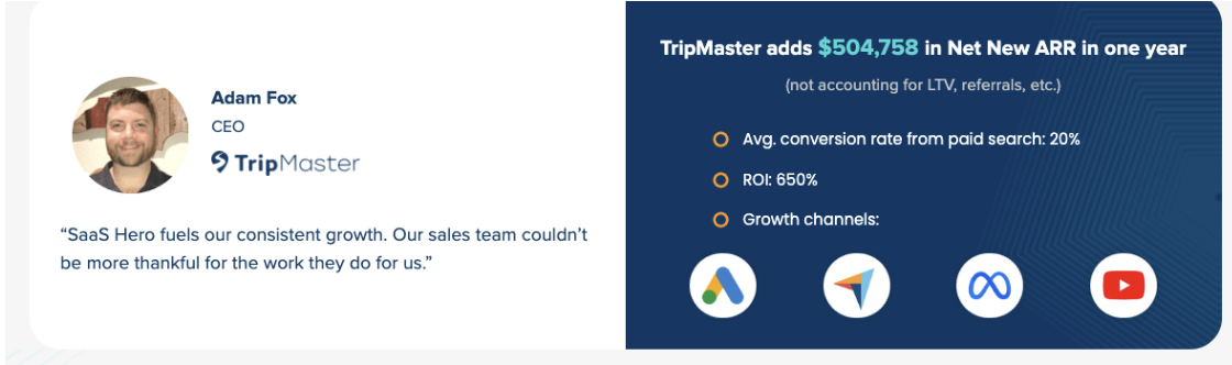
The after state following SaaSHero’s audit uses a 1200×1200 square creative (the highest-performing aspect ratio for B2B SaaS on LinkedIn) with a single ROI metric from a named customer, a cropped UI mockup in the upper two-thirds, a G2 badge at mid-canvas, and a high-contrast “Request a Demo” CTA. The destination becomes a dedicated comparison landing page with above-the-fold social proof and a single form. The result mirrors SaaSHero’s documented outcome for Shop Boss: a 305% increase in conversions without increasing cost per acquisition, and for TripMaster, a sustained 20% conversion rate from paid search.
Exact LinkedIn and Google Display Specs for 2026 Campaigns
LinkedIn single-image ads support three aspect ratios: 1.91:1 landscape, 1:1 square, and 1:1.91 vertical (mobile only), each with a 5 MB maximum in JPG, PNG, or GIF. The 1:1 square is recommended for B2B SaaS on LinkedIn because it delivers 30–60% higher CTR than 4:5 vertical due to 40–50% desktop usage, algorithm favoritism, and larger-screen viewing where vertical loses impact. LinkedIn video ads support 16:9 (1920×1080), 1:1 (1080×1080), 4:5 (1080×1350), and 9:16 (1080×1920) at a 200 MB maximum in MP4. Durations of 15–30 seconds perform best for direct response.
For Google Display, the five static sizes that cover roughly 90% of GDN inventory are 300×250, 728×90, 336×280, 300×600, and 320×50. Responsive Display Assets require landscape images at 1200×628 px (1.91:1), square images at 1200×1200 px (1:1), landscape logos at 512×128 px (4:1), and square logos at 128×128 px minimum, all capped at 5,120 KB. Short headlines are limited to 30 characters each, long headlines to 90 characters, and descriptions to 90 characters each.
How SaaSHero’s Flat-Fee Model Aligns with Net New ARR
The percentage-of-spend billing model that dominates the agency industry creates a direct conflict of interest because the agency earns more when the client spends more, regardless of efficiency. SaaSHero’s flat monthly retainer, which is tiered by spend band but fixed within each band, removes that incentive. A recommendation to increase budget from $12,000 to $15,000 per month does not change the agency fee, so clients can trust that the recommendation reflects performance data.
The month-to-month contract structure strengthens this alignment. SaaSHero re-earns the client’s business every 30 days, which creates a forcing function for sustained performance. Leasecake founder Taj Adhav describes SaaSHero as “part of our team,” which validates the embedded growth team model that supported a $3M VC round and record growth. TestGorilla’s 80-day payback period and $70M Series A show that the model scales to investor-grade outcomes. Playvox’s 10× decrease in cost per lead alongside a 163% volume increase illustrates what disciplined account restructuring delivers when agency incentives reward efficiency instead of spend.
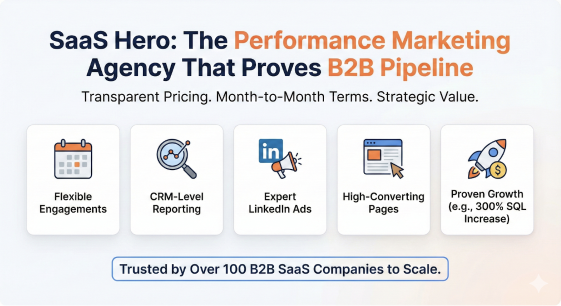
Explore SaaSHero’s flat-fee pricing model and see how month-to-month contracts align agency incentives with your ARR growth.
Designer-Ready Checklist for LinkedIn and Google Display Ads
Use this checklist to audit every LinkedIn and Google Display creative before it goes live.
- UI mockup hero exported at 1200×1200 px for LinkedIn and 600×500 px (2×) for Google 300×250, showing the interface mid-task.
- Single ROI metric from a named customer placed in the upper third of the canvas.
- G2 badge, customer logo bar, or star rating visible inside the creative, not only on the landing page.
- High-contrast CTA button with context-specific copy (“Request a Demo,” “Download Comparison Guide”) that reaches a 4.5:1 WCAG AA contrast ratio.
- Bento or modular grid separating UI, metric, and CTA into discrete visual zones.
- Dark-mode variant produced at identical dimensions with independently verified contrast ratios.
- Motion cue limited to one purposeful animation, LinkedIn video 15–30 seconds MP4, Google Display GIF or HTML5 under a 30-second loop at 150 KB.
- Text overlay under 20% of canvas area on all LinkedIn creatives.
- Dedicated comparison or competitor-conquesting landing page as the destination, not the homepage.
- Heuristic CRO audit completed before scaling spend above $10,000 per month.
Frequently Asked Questions
Most impactful SaaS-specific visual elements for enterprise LinkedIn in 2026
The highest-impact elements for enterprise LinkedIn campaigns are the UI mockup hero, a single verifiable ROI metric from a named customer, and a trust-badge hierarchy placed inside the creative. These three elements address the core enterprise buyer objection, “Does this product actually work for companies like mine?” at the impression stage before the buyer reaches the landing page. Supporting elements include a high-contrast, context-specific CTA, a modular grid layout that separates proof zones, and a dark-mode variant that signals technical sophistication. For cold audiences, a 15–30 second video with a belief-challenging hook in the first three seconds usually outperforms static creative. For warm retargeting audiences, a 1200×1200 px single-image ad with a bottom-funnel CTA such as “Request a Demo” tends to deliver the strongest conversion rate.
Correct LinkedIn single-image and Google 300×250 specs for B2B SaaS in 2026
LinkedIn single-image ads support 1200×627 px (1.91:1 landscape), 1200×1200 px (1:1 square), and 720×900 px (4:5 vertical), all at a maximum 5 MB in JPG, PNG, or GIF. The 1:1 square is the recommended default for B2B SaaS campaigns because it occupies more mobile screen space and delivers higher CTR than landscape formats. For Google Display, the 300×250 medium rectangle is the highest-inventory format. Export static assets at 600×500 px (2× resolution) to avoid quality penalties, keep file size under 150 KB, and place all critical content, including product visual, headline, and CTA, inside the center 80% of the frame. Responsive Display Assets for Google require landscape images at 1200×628 px, square images at 1200×1200 px, and logos at a minimum of 128×128 px, with all assets capped at 5,120 KB.
How a heuristic CRO audit improves B2B SaaS ad conversion rates
A heuristic CRO audit uses structured expert evaluation against usability principles such as relevance, clarity, trust, friction, visual hierarchy, message match, and CTA prominence to find conversion killers in the creative and its destination page before media spend scales. Three independent evaluators review the same assets and produce a prioritized remediation roadmap within days instead of waiting weeks for statistically significant A/B test data. The audit usually surfaces three to five high-impact fixes, such as replacing a homepage destination with a dedicated comparison page, swapping a stock photo for a UI mockup, reducing form fields, and adding above-the-fold social proof. SaaSHero integrates this audit into every new client engagement as the foundation for creative iteration, which helps clients like TripMaster reach a 20% conversion rate from paid search instead of the industry-average 2–5% seen on many B2B SaaS landing page ads.
How SaaSHero’s enterprise B2B ad design differs from a generalist agency
SaaSHero operates exclusively within B2B SaaS and technology verticals, so every creative decision reflects the dynamics of multi-stakeholder buying committees, long sales cycles, and revenue metrics such as Net New ARR, CAC, and LTV. A generalist agency often applies the same creative framework to e-commerce, local services, and SaaS, which produces ads that lack the proof density and platform-specific precision that enterprise buyers expect. SaaSHero pairs platform-specific ad specs, including exact pixel dimensions, aspect ratio recommendations, and text-overlay limits, with annotated creative examples and a heuristic CRO workflow that connects upstream ad impressions to downstream CRM revenue data. The flat-fee, month-to-month pricing model keeps every creative recommendation tied to performance outcomes rather than the agency’s incentive to increase billable spend.