




Written by: Aaron Rovner, Founder, Saas Hero | Last updated: July 23, 2026
Key Takeaways
- B2B SaaS UX success in 2026 means users complete core tasks faster, make fewer errors, and hit a real value moment within 14 days to sustain 80%+ retention at month 12.
- Every UX metric, including time-to-first-value, activation rate, and support tickets per user, directly maps to ARR growth, CAC reduction, and payback period outcomes tracked by CFOs and boards.
- Time-to-value, progressive disclosure, role-based personalization, and contextual empty states are the highest-leverage tactics for compressing activation windows and lifting trial-to-paid conversion.
- Connecting UX telemetry to closed-won ARR requires instrumented activation events, cohort analysis, and CRM attribution that passes GCLID data from first touch through product activation.
- Run a free UX-to-revenue audit with SaaSHero to map your own metrics to ARR and pinpoint where your product is leaking revenue.
Map UX Goals to ARR and CAC Outcomes
The table below connects the three UX metrics product and growth teams own to the financial outcomes their CFOs and boards track. Use this mapping to translate your own UX improvements into the language your board understands, because every reduction in TTFV, every lift in activation rate, and every decrease in support tickets per user has a direct, quantifiable impact on ARR growth and CAC efficiency. Every figure is drawn from 2026 benchmark data.
| UX Metric | 2026 Benchmark | ARR / CAC Impact | Source |
|---|---|---|---|
| Time-to-first-value (TTFV) | Industry average: 1 day, 12 hrs, 23 min | Reducing TTFV can lift ARR growth for mid-market SaaS | Koji / Digital Applied |
| Activation rate | The 2026 B2B SaaS industry median activation rate is approximately 37% | Higher activation rates correlate with lower churn | Taskray / Userpilot |
| Support tickets per user | Average cost per support ticket | 80-85% of SaaS support tickets stem from UX not technical bugs, a direct CAC inflator | Tandem / Simon McCade |
Cut Time-to-Value for Faster Retention Wins
Time-to-value is the single variable with the highest leverage on retention, expansion, and Net New ARR. Your goal is to remove every step between signup and the moment a user experiences the outcome they were sold.
Actions to take:
- Start by defining one specific first-value event per persona and instrumenting it in your product analytics platform, because this event becomes your measurement baseline.
- Next, audit your onboarding flow and remove all setup steps that are not required to reach that event, then defer those steps to a secondary session.
- To accelerate exploration, pre-populate the product with sample data so users can explore before connecting real data, a pattern Mixpanel uses to reduce TTFV for analytics users.
- Finally, set a 14-day activation target based on the retention data cited earlier, because the 9–14 day window separates 80%+ retention from the much lower retention of slower onboarders.
Common mistake: Teams often measure setup completion instead of the actual value moment. Products with a clearly defined first-value moment and a measurement framework targeting TTFV see higher trial-to-paid conversion than products that measure only setup completion.
Simplify Workflows with Progressive Disclosure
Compressing time-to-value requires more than removing setup steps. It also requires a simpler interface so users can spot the core workflow immediately. Progressive disclosure, which defers advanced or rarely used features to a secondary screen so interfaces become easier to learn and less error-prone, provides the structural fix for feature-bloated B2B SaaS interfaces.
Actions to take:
- Audit your interface for a core layer with high-frequency actions, an advanced layer with lower-frequency options shown on request, and an expert layer with role-gated operations.
- Cap first-session onboarding tours at 4–7 steps, because progressive disclosure lifts onboarding completion from 53% to 75%.
- Use behavior-triggered Layer 2 hints during the first week instead of front-loading all guidance on day one.
Common mistake: Teams often use more than two disclosure levels per interaction. Nielsen Norman Group warns that more than two disclosure levels per interaction causes navigation confusion. When implemented correctly, progressive disclosure drives 25% higher adoption, 58% productivity gains, and 10–20% retention improvement.
Design Dashboards That Drive Decisions
A dashboard that surfaces the metric proving ROI within seconds of login and links every chart to a workflow becomes a retention tool. A dashboard that requires heavy filtering and interpretation becomes a churn risk.
Actions to take:
- Limit the default view to three to five core metrics tied directly to user decisions, and apply Hick’s Law to speed decision-making.
- Implement role-based dashboard views, because a B2B SaaS operations platform redesign reduced onboarding-related support tickets by 61% in a 60-day post-launch window by aligning views to job responsibilities.
- Use skeleton screens during data fetching to maintain perceived performance and prevent disengagement.
Common mistake: Many teams treat the first dashboard view as a blank canvas. Before redesign, Prospectory showed users an empty dashboard on first login with zero guidance; after redesigning empty states as activation hooks, trial-to-paid conversion rose from 4% to 73%. Treat the first view as a guided onboarding moment to avoid this.
Reduce Repetitive Work with Smart Automation
Repetitive manual tasks inflate time-on-task, depress satisfaction scores, and generate avoidable support tickets. Automation and smart defaults provide the UX fix when applied deliberately.
Actions to take:
- Start by auditing recurring tasks by frequency, complexity, and error risk, then prioritize by ROI and effort, because this audit identifies your highest-leverage automation targets.
- For quick wins, implement smart defaults that preconfigure choices to reduce micro-decisions, and use bulk actions and shortcuts to deliver faster task completion without full automation.
- For higher-risk workflows, apply the suggest-explain-review-approve-automate control model from UX Studio Team to introduce automation gradually while preserving user trust.
Common mistake: Teams often automate before defining the expected input, output, and failure state. Wrong actions in B2B SaaS can affect revenue, operations, or internal processes, so a human-in-the-loop review step is required for high-risk workflows.
Use Role-Based Personalization Across the Journey
Role-based personalization delivers different experiences by role, so admins receive setup steps while end users receive “how to win with it” guidance. This pattern compounds value across the entire customer lifecycle.
Actions to take:
- Collect role signal with two or three questions before any product content loads, then route users to role-specific starting templates.
- Personalize value propositions by role first, then layer in industry proof points, because role patterns for CMO, RevOps, and Sales leader repeat across industries, making role-first the more scalable approach.
- Track 7-day feature activation rate per role, and compare retention for role-based personalization flows against generic flows.
Common mistake: Many teams use role name checks instead of permission-aware logic. Permission-aware steps outperform role-name checks because roles vary across tenants in multi-tenant SaaS.
Turn Empty States into Activation Moments
Empty states are the highest-leverage, lowest-cost UX surface in B2B SaaS. They are often the first thing a new user sees and a frequent trigger for abandonment.
Actions to take:
- Replace blank screens with one explicit primary CTA and one secondary demo-data link, because empty states with this structure convert users to first action more often than text-only screens.
- Use contextual onboarding triggered by behavior rather than fixed time schedules, and rely on behavioral triggers that fire in-app messages when users reach specific friction points rather than on broadcast calendar schedules.
- Target an empty-state CTA conversion rate above 25%, and treat one strong redesign as a test that can significantly lift empty-state CTA conversion.
Common mistake: Many products show a generic “Get started” prompt with no role or goal context. Good empty states boost activation by approximately 60%, moving B2B SaaS companies from a 25–30% activation rate to 40%+.
Build Jobs-to-Be-Done Navigation
Navigation organized around features confuses users, while navigation organized around jobs-to-be-done, the outcomes users are trying to achieve, compresses time-to-value and reduces “where is this?” support tickets.
Actions to take:
- Collapse feature-based top-level navigation items into task-based hubs, because one B2B SaaS redesign achieved 62% faster median task completion time on five revenue-critical workflows.
- Add a command palette for power users who prefer keyboard-driven workflows to reduce repetitive navigation.
- Use semantic search with intent recognition instead of exact keyword matching to reduce zero-result frustration.
Common mistake: Many teams organize navigation by internal product team structure rather than by user workflow. 80% of features in enterprise software go unused, primarily due to discoverability issues rather than lack of development.
Competitor-Conquesting UX Pages That Capture Intent
The tactics above focus on the post-signup experience, but UX strategy starts before a user creates an account. The pre-signup landing page becomes your first activation surface, especially for competitor-conquesting campaigns where you intercept users actively evaluating alternatives. SaaSHero’s landing-page architecture targets three psychological intent states, including pricing intent, problem or complaint intent, and review or validation intent, and each state requires a distinct page structure and message match.

Actions to take:
- Build dedicated pricing comparison pages for users searching “[Competitor] pricing” and lead with a clear total-cost-of-ownership table instead of a generic homepage.
- Deploy problem-solution pages for “[Competitor] alternatives” traffic that directly address known competitor weaknesses with case studies from customers who switched.
- Create review-focused pages that aggregate G2 badges, Capterra ratings, and side-by-side feature comparisons for validation-intent searchers.
Common mistake: Many teams send competitor-conquesting traffic to a generic homepage. Poor message match between ad copy and landing page becomes the primary conversion killer in this campaign type, and SaaSHero’s heuristic CRO audit process identifies and fixes this mismatch before media spend scales.
Feedback Loops That Prioritize UX by Revenue
Feedback loops close the gap between what product teams assume users need and what users actually do. These loops also provide the primary data source for prioritizing UX improvements by revenue impact.
Actions to take:
- Use ticket data to identify recurring UX problems, because if 200 users per month submit tickets about the same error message, that indicates a product bug to fix upstream rather than a support issue to deflect.
- Deploy in-app micro-surveys at friction points using Customer Effort Score, which is a more actionable retention predictor than satisfaction scores alone.
- Run session recordings and heatmaps to identify drop-off points in activation flows before running A/B tests.
Common mistake: Teams often report on aggregate NPS without segmenting by role, plan tier, or activation status. Aggregate metrics obscure performance variations between user groups that segmented analysis reveals, enabling 15-30% improvements in profitability.
Fix Error Messaging to Cut Support Tickets
One of the most common friction points that feedback loops surface is poor error messaging. Error messages are a direct support-ticket generator, and every vague error code represents a user who cannot self-serve and will either contact support or churn.
Actions to take:
- Replace generic error codes such as “Error 403” with plain-language explanations and a specific next step, because when users see an “Error 403” with no explanation, they contact support instead of resolving the issue themselves.
- Audit your top 10 support ticket categories and trace each back to a specific UI state or error message, then fix the root cause instead of the symptom.
- Apply clear empty states and error messages that provide next steps rather than generic codes to guide users back to productive workflows.
Common mistake: Many teams treat error messaging as an engineering concern rather than a UX and revenue concern. As noted in the metrics table earlier, the majority of support tickets stem from usability problems rather than genuine bugs, and error messaging is one of the highest-frequency culprits.
Measure UX with Product and Revenue Metrics
UX improvements without measurement remain opinions. You need a measurement framework that connects every design change to an activation event, a retention cohort, and a revenue outcome.
Actions to take:
- Establish baselines for task success rate, time-on-task, activation rate, and support ticket volume before any redesign, because without a baseline it is impossible to demonstrate impact on retention or expansion revenue.
- Group KPIs into behavioral metrics such as task completion rate above 80% and activation rate above 30%, attitudinal metrics such as System Usability Scale above 68, and business metrics such as annual retention above 90% and monthly churn below 5%, following Taqwah’s SaaS UX measurement framework.
- Translate time savings into dollar terms by multiplying hours saved per user per week by the number of users and their blended hourly cost, a method that makes UX ROI legible to CFOs.
Common mistake: Many teams optimize for activation events that do not correspond to genuine user value. Teams that focused on first-time value reporting saw improvements in self-described “successful onboarding” rates.
Connect UX Measurement to Closed-Won ARR
Connecting UX telemetry to closed-won ARR requires the same attribution infrastructure SaaSHero uses for paid media. You pass GCLID data from the first ad click through the landing page, into the product activation event, and into the CRM pipeline, which lets product and growth teams report on which onboarding flows produced the highest-value customers instead of only the most activated users.
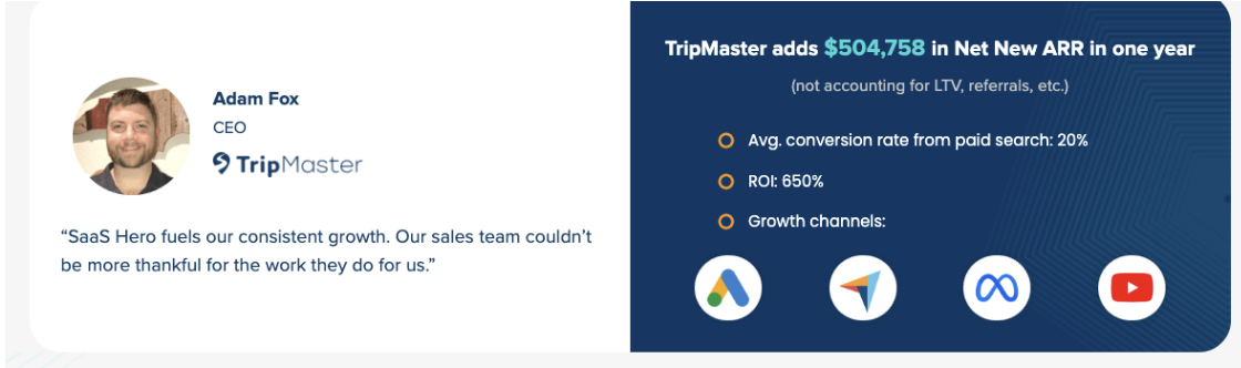
SaaSHero’s flat-fee, month-to-month model removes the incentive misalignment that inflates this process at traditional agencies. Because SaaSHero’s fee is fixed within spend bands rather than tied to a percentage of budget, every recommendation, whether to increase ad spend, rebuild an empty state, or restructure a dashboard, is driven by what the data supports, not by what grows the agency’s revenue. The result is a reporting framework anchored in Net New ARR and payback period, the metrics that matter to boards and investors, not impressions and click-through rates.
5-Bullet Checklist Recap
The five highest-impact tactics from this framework, in order of leverage on Net New ARR:
- Define one first-value event per persona and instrument it, then engineer every onboarding step to reach it inside 14 days.
- Replace generic empty states with a single primary CTA and demo-data link to convert the first session into an activation event.
- Implement role-based personalization at the routing layer, collect role signal before product content loads, and deliver tailored starting templates.
- Collapse feature-based navigation into job-based task hubs and add contextual error messages with explicit next steps to eliminate avoidable support tickets.
- Baseline task completion rate, activation rate, and support ticket volume before any redesign, then report UX outcomes in ARR and payback-period terms.
Turn UX Wins Into Net New ARR
Every tactic in this framework produces a measurable output, including faster task completion, lower error rates, higher activation, reduced churn, and lower CAC. For a mid-sized SaaS business, a retention improvement in the at-risk cohort from faster time-to-value represents significant recoverable annual revenue, and the math matches the same approach SaaSHero applies to every client engagement, from onboarding redesigns to competitor-conquesting landing pages.
SaaSHero’s flat-fee model, detailed in the measurement section above, aligns agency incentives with client revenue outcomes instead of budget inflation. The month-to-month structure fits the financial realities of $5M–$50M ARR SaaS companies that need a partner who speaks in Net New ARR, not impressions.
Frequently Asked Questions
What is the most important UX metric for B2B SaaS companies to track in 2026?
Time-to-first-value (TTFV) is the single most important UX metric for B2B SaaS teams to track because it is the leading indicator for activation rate, 90-day retention, and ultimately Net New ARR. When users reach a genuine value moment inside 14 days, 12-month retention exceeds 80%. When that window extends past 30 days, retention drops to 35–50%. Every other UX metric, including task completion rate, error rate, and support ticket volume, contributes to TTFV. Product and growth teams should instrument a specific first-value event per persona in their analytics platform, baseline the current TTFV, and treat any redesign that compresses that window as a direct revenue investment.
How does progressive disclosure reduce churn in B2B SaaS products?
Progressive disclosure reduces churn by preventing the cognitive overload that causes new users to disengage before they reach their first value moment. When a product surfaces every feature, setting, and advanced capability on day one, users cannot identify the core workflow that delivers the outcome they were sold. Progressive disclosure solves this by presenting only the highest-frequency, highest-value actions in the first session and unlocking advanced capabilities based on demonstrated behavior, such as after a user completes five projects or reaches 14 days of active use. The result is higher onboarding completion rates, faster activation, and lower early-stage churn. The pattern also reduces support ticket volume because users encounter features at the moment they are ready to use them, rather than being overwhelmed and abandoning the product or contacting support.
How do B2B SaaS teams connect UX improvements to closed-won ARR?
The most reliable method is a combination of instrumented activation events, cohort analysis, and CRM attribution. Teams first define activation events that correspond to genuine user value, not arbitrary setup checkpoints, and instrument them in a product analytics platform. They then build retention cohorts segmented by time-to-first-value window and compare downstream conversion rates, expansion revenue, and churn rates across cohorts. To connect these cohorts to closed-won ARR, teams pass a unique identifier such as a GCLID or user ID from the first marketing touchpoint through the product activation event and into the CRM, which enables revenue reporting by onboarding cohort. For teams running A/B tests on specific UX changes, a difference-in-differences or interrupted time series analysis isolates the revenue impact of the design change from other variables. SaaSHero implements this full attribution stack, from ad click to closed-won revenue, as part of its standard engagement model.
What is the ROI of fixing empty states and error messages in a B2B SaaS product?
The ROI is measurable and often immediate. Empty states and error messages are the two highest-frequency friction points in early-stage user journeys, and both generate avoidable support tickets and activation drop-off. Redesigning empty states to include a single primary CTA and a demo-data link has been shown to increase empty-state CTA conversion rates significantly. Replacing vague error codes with plain-language explanations and specific next steps directly reduces support ticket volume, and because support tickets have a significant cost to resolve, ticket reduction translates directly into lower CAC and improved payback period. For a product with 500 monthly active users generating 200 avoidable tickets per month, fixing the underlying UX issues recovers substantial support costs annually, before accounting for the retention impact of users who would have churned rather than contacted support.
Why does SaaSHero use a flat-fee model instead of a percentage-of-spend model for UX and growth engagements?
The percentage-of-spend model creates a structural conflict of interest, because the agency earns more when the client spends more, regardless of whether that spend is efficient. This structure incentivizes agencies to recommend budget increases that serve their own revenue rather than the client’s unit economics. SaaSHero’s flat-fee, month-to-month model removes this conflict entirely. Because the fee is fixed within spend bands, every recommendation, whether to increase ad spend, rebuild an onboarding flow, or restructure a dashboard, is driven by what the data supports. The month-to-month structure creates a forcing function for performance, so SaaSHero must re-earn the client’s business every 30 days, which aligns the agency’s survival with the client’s revenue outcomes. For B2B SaaS companies at $5M–$50M ARR where CAC efficiency and payback period are board-level metrics, this alignment forms the foundation of a trustworthy growth partnership.