

Written by: Aaron Rovner, Founder, Saas Hero
Key Takeaways
- Average B2B SaaS landing pages convert at 1.1%. Top performers reach 10–20% by improving relevance, clarity, trust, and friction reduction.
- Use the 10-step Figma framework, starting with a 7-heuristic audit and a hero section that passes the 5-second clarity test to align ad messaging and build trust.
- Place social proof near CTAs, highlight benefit-focused features, and use context-appropriate CTAs like “Get a Demo” for enterprise sales to increase conversions.
- Check mobile responsiveness, competitor comparisons, A/B test variants, and launch validation to protect performance across devices and support ongoing improvements.
- Ready to achieve 20%+ conversion rates? Book a discovery call with SaaSHero for their proven $750 flat-fee landing page design service.
Tools, Skills, and Time You Need Before You Start
Set up your toolkit before you start designing. You need a free Figma account, access to Google Analytics 4 or HubSpot for tracking, and a basic grasp of SaaS metrics like conversion rates, Customer Acquisition Cost (CAC), and Monthly Recurring Revenue (MRR). Block 4–6 hours to complete the full design process without rushing key decisions.
The stakes are high, because message mismatch between your ads and landing pages can destroy your Return on Ad Spend (ROAS). This tutorial applies SaaSHero’s heuristics that support the 5-second clarity test, build trust for long B2B sales cycles, and reduce friction so skeptical visitors turn into qualified leads.
High-Level Framework Overview for Your 10-Step Build
To solve these challenges systematically, our 10-step framework follows SaaSHero’s philosophy of fast clarity and trust for complex B2B purchase decisions. The methodology incorporates 7 core heuristics including relevance, clarity, trust, and friction reduction. The table below shows how each step connects to a specific objective and outcome, so you can see the full path from initial audit to launch validation.
| Step | Objective | Key Outcome |
|---|---|---|
| 1. Heuristic Audit | Score relevance, clarity, friction | Baseline assessment |
| 2. Hero Wireframe | 5-second value proposition | Clear messaging hierarchy |
| 3. Problem-Solution Copy | Agitate pain, pitch solution | Emotional connection |
| 4. Social Proof Integration | Build trust near CTAs | Risk reduction |
| 5. Feature Benefits | Benefit-focused modules | Value demonstration |
| 6. CTA Optimization | Demo vs. trial testing | Conversion maximization |
| 7. Mobile Responsiveness | Thumb-friendly design | Cross-device performance |
| 8. Competitor Conquest | Comparison tables | Competitive advantage |
| 9. A/B Test Setup | Variant preparation | Optimization readiness |
| 10. Launch Checklist | Speed and tracking validation | Performance assurance |
How to Design a High-Converting SaaS Landing Page in 10 Steps
Step 1: Run a 7-Heuristic Audit
Start with a structured evaluation of your current landing page or competitor benchmarks. Apexure’s methodology scores pages on relevance, clarity, trust, and friction using a 1–5 scale. In Figma, create a scoring template with sections for each heuristic, and document issues like unclear value propositions, missing trust signals, or forms with too many fields.
Pro Tip: Focus first on message match between your ad copy and landing page headlines. Misalignment here kills conversion rates before visitors even scroll.
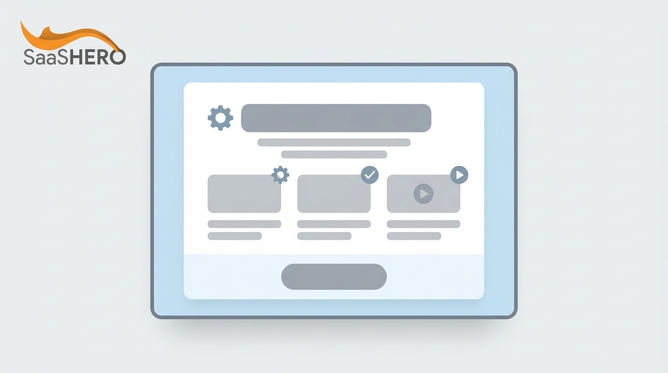
Step 2: Design the Hero Section Wireframe
Build a hero section that passes the 5-second test for clarity. Use Figma’s auto-layout feature to create a clean hierarchy with a benefit-driven headline, supporting subhead, single primary CTA, and product visual. ThunderClap’s CLEAR framework recommends limiting above-the-fold content to exactly one headline, one subhead, and one CTA.
This simplicity forces you to highlight your value proposition and make every word count. Replace generic labels like “Advanced CRM Software” with outcomes such as “Reduce Sales Cycle Time by 40%” so decision-makers see concrete business impact.
Step 3: Craft Problem-Solution Copy
Write copy that surfaces the prospect’s pain points, then clearly presents your solution. In Figma, create text components for problem statements, solution benefits, and supporting evidence. Persuasive copywriting that addresses objections can increase landing page conversions by 15–40%.
Structure your copy flow to mirror the prospect’s decision journey: Problem agitation → Solution presentation → Proof points → Call to action. This sequence validates the reader’s pain, positions your product as the logical answer, backs it with evidence, and then asks for action when trust is highest. Within each stage, use specific, quantifiable language like “Eliminate 6 hours of weekly manual reporting” instead of vague benefits.
Step 4: Integrate Strategic Social Proof
Place trust signals close to the moments where visitors decide to act. Positioning social proof near CTAs reduces last-moment hesitation more effectively than top-of-page placement. In Figma, create components for client logos, testimonials with specific metrics, and security badges.
Use testimonials that include numbers, such as “We increased lead generation by 40% in the first quarter,” instead of generic praise. Add recognizable company logos and G2 or Capterra ratings to create instant credibility.
Step 5: Design Benefit-Focused Feature Modules
Turn feature lists into benefit-focused modules using Figma’s component system. Strategic minimalism in 2026 B2B SaaS interfaces uses clear visual hierarchies to reduce cognitive load. Create modular layouts that you can rearrange and test without redesigning from scratch.
Lead with outcomes instead of capabilities. Swap “Advanced Analytics Dashboard” for “Identify Your Best Leads in Under 60 Seconds,” and pair it with visuals that show the real interface.
Step 6: Refine Call-to-Action Elements
Design and test several CTA variations in Figma. Changing CTA button text from “Start your free 30-day trial” to the first-person “Start my free 30-day trial” increased clicks by 90%. Create components for different CTA styles, colors, and copy options so you can test quickly.
Match your CTA to your sales model. Use “Get a Demo” for high-touch enterprise sales and “Start Free Trial” for product-led growth. Test urgency and risk-reduction phrases like “No credit card required” or “Setup in under 5 minutes” to lower perceived effort.
Step 7: Ensure Mobile Responsiveness
Design for mobile first using Figma’s constraints and auto-layout. Over 60% of web traffic is mobile, which demands large tappable buttons, readable typography, and logical reflows. Create responsive breakpoints for mobile, tablet, and desktop views.
Prioritize thumb-friendly navigation with CTAs placed where thumbs naturally rest. Simplify forms for mobile completion, and confirm that your core value proposition stays clear on smaller screens.
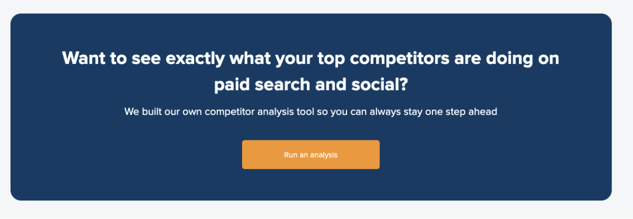
Step 8: Build Competitor Comparison Pages
Create dedicated comparison layouts for competitor conquest campaigns. Design honest feature comparison tables, pricing matrices, and switching incentives. SaaSHero’s competitor conquest strategy targets users searching for “[Competitor] pricing” or “[Competitor] alternatives” with tailored landing pages.
Include migration resources, contract buyout offers, and side-by-side feature comparisons. Use factual language and avoid competitor logos so you stay compliant while still highlighting your strengths.
Step 9: Prepare A/B Test Variations
Use Figma’s variant feature to build multiple page versions for testing. A B2B SaaS project management startup tested 12 landing page variations and achieved an 18.7% conversion rate on the winning variation, a 128% improvement from their baseline.
Create variations for headlines, CTAs, social proof placement, and form length. Write down your testing hypotheses, and give each variant a clear purpose so your results lead to specific decisions.
Step 10: Complete the Launch Checklist
Confirm technical performance before launch. Target Core Web Vitals metrics of Largest Contentful Paint under 2.5 seconds and First Input Delay under 100 ms. In Figma, prepare developer handoff documentation with clear naming conventions and export settings.
Verify that tracking pixels fire correctly, forms connect to your CRM, and mobile performance meets your standards. Test the full user journey from ad click to form submission to catch any breaks.
Ready to accelerate your results? Get expert guidance on implementing these 10 steps to see how SaaSHero’s proven methodology can deliver the conversion rates discussed earlier.
Measurement and Validation for Long-Term Performance
Set up tracking that measures real business impact, not just vanity metrics. Top-performing B2B landing pages exceed 10% conversion rates through tightly matched traffic sources and continuous testing. Focus on qualified leads, pipeline value, and closed-won revenue instead of raw form submissions.
Use tools like Google Analytics 4, HubSpot, and Hotjar to monitor user behavior, find friction points, and confirm your design choices with real data. Track time on page, scroll depth, and form abandonment so you can keep improving.
Advanced Variations and Personalization Ideas
Extend your landing page strategy with industry-specific versions, account-based marketing (ABM) personalization, and AI-assisted tools for dynamic personalization based on visitor context. Add progressive profiling for lead nurturing and multi-step forms for complex B2B purchases.
Test 2026 trends like immersive product previews, micro-animations, and voice UI integration to stand out and increase engagement.
Scale your success with SaaSHero’s comprehensive CRO and copywriting services. Explore retainer options for ongoing optimization and continuous testing.
Summary and Next Steps for Your Team
You now have a complete framework for designing high-converting B2B SaaS landing pages in Figma. Start with the heuristic audit, aim for 5-second clarity, and keep testing your assumptions with real user data. Remember that companies like AvidXchange reduced cost-per-lead by 79% through strategic landing page redesigns.
Ready to apply these strategies with expert support? Connect with SaaSHero’s team to explore their $750 flat-fee landing page design service and proven methodology.
Frequently Asked Questions
Should I use Figma or Canva for B2B SaaS landing page design?
Figma works better than Canva for B2B SaaS landing pages because it offers precision, collaboration, and a strong plugin ecosystem. Unlike Canva, Figma supports advanced prototyping, component systems for consistent design, and smooth developer handoff. Figma’s auto-layout and constraints enable real responsive design, and its real-time collaboration helps marketing and design teams iterate quickly. Canva lacks the technical depth needed for conversion-focused B2B landing pages and does not support complex interactions for realistic prototypes.
How long does it take to reach strong conversion rates on B2B SaaS landing pages?
Reaching high conversion rates like the 18.7% example mentioned in Step 9 usually takes 1–2 weeks of focused optimization using proven heuristics and continuous testing. The exact timeline depends on your traffic volume, current baseline, and how well you apply best practices such as message matching, trust signal placement, and friction reduction. Higher-traffic sites can test faster, while lower-traffic sites should lean more on qualitative research and heuristic improvements at first. Sustainable success comes from combining strategic design with ongoing optimization, not from a single launch.
What does SaaSHero’s $750 landing page design service include?
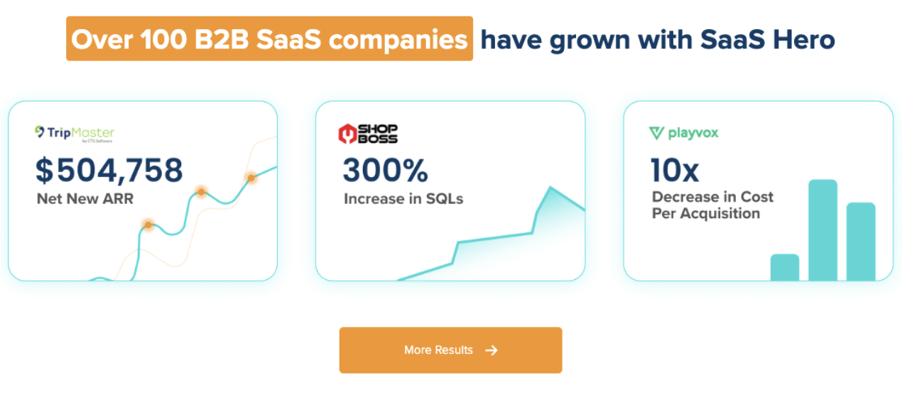
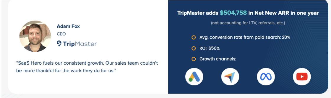
SaaSHero’s $750 flat-fee service covers a complete landing page design tailored for B2B SaaS conversions, using heuristics from their documented CRO audit framework. The service includes heuristic analysis, mobile-responsive design, conversion-focused copywriting, strategic social proof placement, and CTA refinement. Unlike traditional agencies with percentage-based fees and long contracts, SaaSHero works month-to-month with transparent pricing. This investment supports stronger conversion rates in campaigns managed by SaaSHero, with clients like TripMaster seeing 650% ROI and 20% conversion rates from paid search.
How do I improve landing page forms for B2B SaaS demo requests?
Improve B2B demo request forms by limiting fields to essentials such as name, email, and company. Use progressive profiling to collect more details after the first interaction instead of overwhelming prospects. For complex B2B purchases, use multi-step forms that start with simple questions to apply the foot-in-the-door principle. Add trust signals like security badges and privacy statements near the form, and write benefit-driven copy that highlights value instead of only asking for data. Test form length, field labels, and CTA text to balance lead quality and conversion rate.
What are the most important mobile optimization considerations for B2B SaaS landing pages?
Mobile optimization for B2B SaaS landing pages starts with thumb-friendly layouts and large, easily tappable CTAs placed where fingers naturally rest. Keep loading times under 2.5 seconds, because mobile visitors abandon slow pages quickly. Simplify forms for mobile, use clear visual hierarchy with readable typography, and protect the clarity of your value proposition on smaller screens. Since over 60% of B2B research now happens on mobile devices, your landing page must convert effectively on every device. Test on real phones and tablets, not only desktop simulations, to confirm the experience.