

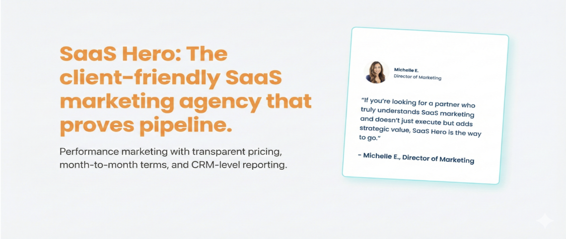
Key Takeaways
-
Top B2B SaaS ads in 2026 rely on minimalist layouts, bold typography, and whitespace to reduce cognitive load and improve ROAS.
-
Competitor conquest ads that address pricing and alternatives with clear comparisons outperform generic messaging by matching specific search intent.
-
Social proof with quantified metrics and customer testimonials builds trust and speeds up conversions for risk-averse buyers.
-
Short-form video demos and before/after visuals highlight tangible outcomes that resonate with data-driven marketing leaders who expect fast ROI.
-
SaaSHero’s flat-fee model has produced outcomes like an 80-day payback period; see how these designs could perform with your current ad spend.
Executive Summary: How High-Performing B2B Ads Work Together
High-converting B2B SaaS ads share five design principles that consistently drive stronger performance. Clean layouts with bold typography and generous whitespace reduce cognitive load, which matters most for complex security and analytics products. Data-driven social proof elements like “180K+ customers” (monday.com) and “50,000+ teams” (Synthesia) appear in nearly every top-performing Meta SaaS ad because they signal market validation.
Personalized CTAs convert 202% better than generic defaults according to HubSpot’s study of 330,000+ calls-to-action, which shows how contextual relevance drives action. This same principle of matching message to intent also powers competitor conquest strategies that target high-intent search modifiers rather than brand names alone. The relevance principle extends to device context as well, so mobile-first design supports the reality that a large share of SaaS traffic comes from phones and tablets, which makes sub-2-second load times and strong Core Web Vitals non-negotiable.
These 12 ad designs align with different stages of the buyer journey, from early awareness to late-stage comparison. The early concepts focus on attention and clarity, while later formats support evaluation, risk reduction, and final selection.
1. Minimalist Pricing Conquest Ad for Cost-Focused Searchers
This design targets users searching “[Competitor] pricing” with a clean comparison table that highlights total cost of ownership. The layout centers on a hero pricing matrix with clear value differences and avoids cluttered feature lists in favor of outcome-focused messaging. HiBob’s Google ad uses the provocative headline “HiBob Is So Much Better” to differentiate via confidence, which shows how direct comparison messaging beats vague positioning.
This approach taps into price-sensitive users who often include current customers facing renewal increases or prospects frustrated by opaque pricing. Copy leans on “Switch & Save” language with specific percentage savings called out in large type. This design resonates strongly with the Overwhelmed Founder persona who wants immediate savings and clear numbers instead of complex feature breakdowns.
2. Problem/Complaint Switch Ad for Frustrated Users
Conveyor’s LinkedIn ad honestly reviews limitations of DIY custom GPTs for security questionnaires to position itself as the upgrade, which illustrates how addressing competitor weaknesses directly can build trust. This design targets “[Competitor] alternatives” and “cancel [Competitor]” searches with empathetic copy that acknowledges frustration and then presents a clear path forward.
Visuals show before/after scenarios that contrast current pain with the smoother experience of switching. Case studies from customers who migrated from named competitors add social validation to the decision. The CTA focuses on risk reduction with offers like “Free Migration” or “30-Day Trial” that lower the perceived cost of change.
3. Review Validation Ad for Risk-Averse Evaluators
Foleon’s LinkedIn ad uses insights about mobile audience behavior to create urgency and offers a PDF conversion demo, which shows how data-backed insights can create momentum. This design aggregates G2 badges, Capterra ratings, and testimonials in a tight layout that speaks directly to buyers who rely on third-party validation.
The layout places trust signals above the fold and pairs them with quantified outcomes such as “Reduced onboarding time by 50%” tied to named customers with role and company. A simple side-by-side feature comparison then highlights unique selling points while whitespace and clear headings keep the page easy to scan.
4. Before/After Data Ad for Performance-Driven Leaders
Madgicx’s Meta ad uses before/after visuals contrasting chaos with AI control to attract expert audiences who understand these metrics. This design uses transformation storytelling with hard numbers that appeal to data-driven decision makers.
Visual contrast uses red or negative indicators for the “before” state and green or positive indicators for the “after” results. Metrics such as ROAS lifts and cost reductions provide specific proof of value. This format speaks directly to the Frustrated VP of Marketing who needs performance evidence that stands up in board meetings.
5. Social Proof Hero Ad for Fast Trust Building
monday.com’s Meta ad leads with customer count social proof and abstract workflow visuals to attract a broad audience before product details appear. This design puts quantified credibility indicators in the hero section so visitors see proof of adoption before they see features.
The visual hierarchy moves attention from the large customer count to simple product demonstrations that avoid technical overload. Recognizable customer logos add another layer of credibility, while the CTA focuses on low-friction next steps such as trials or demos instead of immediate purchase.
6. Short-Form Video Demo Ad for Mobile Attention
Motion’s Meta ad frames value as a step-by-step routine that delivers productivity gains and strong time returns, which shows how specific outcome promises increase engagement. This format fits mobile-first environments where short-form video dominates.
The video follows a problem, agitation, and solution flow within 30 to 60 seconds and uses real product interfaces instead of abstract animation. On-screen captions support sound-off viewing, and the final frame carries a clear, outcome-focused CTA such as “Get More Done” instead of a generic “Learn More.”
7. Conquest Table Ad for Side-by-Side Evaluation
ClickUp’s Google ad mirrors search intent with “Stop Switching Between Multiple Tools. Manage Everything In One Platform”, which shows how direct responses to pain points improve relevance. This design uses a structured feature table that supports fast decisions for prospects already comparing options.
The matrix highlights unique capabilities and also notes areas where competitors hold advantages, which builds trust through honesty. Pricing appears prominently for cost-focused queries, while deeper feature detail moves to the foreground for searches that signal functionality research.
8. Testimonial ROI Ad for Financial Proof
Mailchimp’s Meta ad features a real customer testimonial claiming “30x revenue ROI through our email marketing efforts using Mailchimp”, which shows how specific financial outcomes create powerful social proof. This design centers the customer’s voice as the main value argument.
Customer photos and logos support credibility, while quoted ROI metrics give concrete evidence of impact. This testimonial format works well in complex B2B cycles where buyers rely heavily on peer experiences before committing.
9. 3D Visual Bold Ad for Memorable Brand Impressions
Boomi’s B2B marketing campaign used bold 3D-style visuals and AI-assisted asset generation, outperforming typical B2B LinkedIn benchmarks through its distinctive visual approach. This design uses dimensional visuals to create brand moments that stand out in busy feeds.
The 3D elements help explain complex integration flows or data movement that flat graphics struggle to convey. High-contrast color choices protect readability on mobile while still feeling polished enough for enterprise buyers.
10. Navy/Orange Trust Ad for Instant Credibility
Navy plus orange is the highest-converting B2B color combination, perceived as 34% more trustworthy than other color pairings, and thoughtful color choices with whitespace can lift form completion rates. This design uses color psychology to create immediate confidence.
Navy blue signals stability and expertise, while orange accents draw the eye to key conversion elements such as buttons and form fields. Clean typography and generous line spacing keep the experience easy to read on any device. Security badges and customer logos reinforce the trustworthy visual language.
11. Mobile-First Scrolly Ad for On-the-Go Buyers
Pinterest’s “P is for Performance” B2B campaign focused on optimizing for mobile consumption patterns. This design uses progressive disclosure so users uncover information as they scroll, which keeps attention through interactive storytelling.
Visuals adapt to different screen sizes, and touch-friendly CTAs reduce friction on phones and tablets. The content hierarchy places the strongest value propositions early in the scroll to respect shorter attention spans in mobile contexts.
12. AI-Personalized Review Intent Ad for Late-Stage Buyers
Campaigns using dynamic creative optimization deliver a 32% higher click-through rate, which highlights the impact of AI-driven personalization in B2B advertising. This design adjusts messaging, visuals, and offers based on behavior patterns and firmographic data to keep each experience relevant.
The AI system reads search intent, company size, and industry to tailor review snippets and comparison points for each visitor. Dynamic blocks can show personalized pricing tiers, industry-specific use cases, and competitor comparisons that match the user’s likely evaluation set.
Implementing These Designs: Execution Challenges and Solutions
Traditional agencies that charge a percentage of ad spend often face conflicts of interest because higher budgets increase their fees even when performance stalls. SaaSHero’s tiered flat-fee structure ($1,250-$3,250 monthly retainers) removes that tension and gives SaaS teams predictable costs that grow with the business instead of with media spend swings.
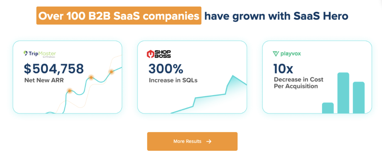
A senior-led execution model keeps experienced strategists involved in daily work so complex B2B SaaS accounts do not get handed off to junior coordinators. Case studies show the impact of this approach, as Playvox cut cost per lead by 10x and TestGorilla reached an 80-day payback period that supported their Series A raise.
Month-to-month agreements add a performance safeguard because the team must re-earn the relationship every 30 days. This structure maintains urgency around results and keeps attention on revenue impact. Explore how this pricing and execution model fits your current growth stage and budget in a focused 30-minute strategy session.
Avoiding Common Implementation Mistakes
Execution missteps can undermine even the strongest ad concepts. Generic layouts that ignore search intent remain the most common failure in B2B advertising. Users who search for pricing need a different landing experience than users who want feature comparisons or competitor alternatives, so campaigns must match message depth to intent detail instead of forcing a single template on every click.
The Overwhelmed Founder scenario benefits from quick wins that show value fast without heavy onboarding. In contrast, the Frustrated VP scenario operates at a different level and needs advanced attribution that connects ad spend to pipeline value for board-ready reporting. Matching ad design to these distinct personas prevents one-size-fits-all campaigns that fail both groups.
FAQ
What makes B2B SaaS ads convert better than generic business advertising?
B2B SaaS ads convert better when they address the specific pain points and buying processes of software customers. Effective SaaS ads focus on outcomes such as reduced onboarding time, higher team productivity, or lower operating costs instead of broad business claims. They use industry language that shows domain expertise, include data-backed social proof from recognizable brands, and offer clear trials or demos that reduce risk. Strong campaigns also speak to both end users and budget owners because B2B software decisions involve multiple stakeholders.
How can B2B companies avoid legal issues when running competitor conquest campaigns?
Legal compliance in competitor campaigns depends on accurate comparisons and respect for trademarks. Use competitor names only in truthful comparative statements and avoid placing them in headlines or display URLs that might imply endorsement. Do not use competitor logos or branded visuals that could trigger copyright issues. Back every comparison with verifiable data, and identify your company clearly as the advertiser to avoid confusion. Adding a short disclaimer that clarifies the competitive context and avoiding unprovable superiority claims further reduces risk.
Which advertising platforms deliver the best results for B2B ad designs?
LinkedIn often delivers the strongest B2B results because of its professional targeting and business mindset. The platform allows precise filters by job title, company size, industry, and seniority, which helps reach decision makers. Google Ads excels at capturing high-intent searches, especially competitor and solution-specific queries. Meta platforms support broader awareness and retargeting, particularly when short video explains complex products. The most effective strategy aligns each platform with a clear objective instead of splitting budget evenly across every channel.
What design trends are shaping B2B advertising in 2026?
AI-powered personalization shapes most leading B2B campaigns in 2026 by enabling dynamic creative that adapts to behavior and firmographic data. Minimalist layouts with generous whitespace, bold typography, and clear visual hierarchy reduce cognitive strain for busy buyers. Short-form video has become essential for mobile audiences, with 30 to 60 second demos outperforming longer formats. Interactive patterns such as scrollytelling and progressive disclosure keep users engaged while respecting shorter attention spans. Color psychology also plays a larger role, with navy and orange combinations proving especially effective for building trust and driving form fills.
How do successful B2B ads incorporate social proof effectively?
Successful B2B ads use social proof that feels specific and verifiable. The strongest examples include quantified outcomes tied to named customers with their roles and companies, such as “reduced onboarding time by 50%” or “achieved 3.3 ROAS improvement.” Recognizable customer logos add credibility, while usage statistics like “180K+ customers” or “50,000+ teams” show market traction. Industry certifications, security badges, and third-party ratings from platforms like G2 or Capterra provide extra reassurance. Placing these proof points close to forms and CTAs helps calm last-minute purchase anxiety.
Conclusion: Turn Proven B2B Ad Designs into Revenue
The 12 ad designs in this guide provide tested frameworks for driving Net New ARR instead of vanity metrics. Effective use of these formats depends on understanding the psychological triggers behind each one, from price-sensitive conquest campaigns to trust-heavy social proof layouts. Consistent success comes from aligning each design with search intent and buyer stage while maintaining a credible brand presence across every touchpoint.
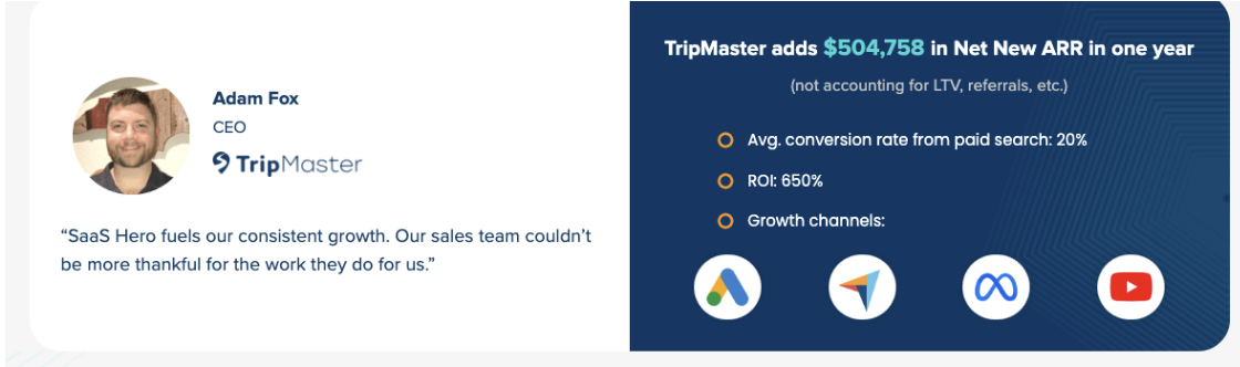
SaaSHero’s flat-fee structure and senior-led execution remove the misaligned incentives that often weaken traditional agency work. A focus on revenue-first metrics ensures every campaign dollar supports measurable growth instead of inflated impression counts. Start implementing these high-converting ad designs with a personalized campaign roadmap and join companies like TripMaster and TestGorilla in achieving strong ROAS through focused B2B advertising.