

Written by: Aaron Rovner, Founder, Saas Hero
Key Takeaways from This Competitor Conversion Playbook
- Competitor review mining reveals verbatim pain points that you can turn into high-converting headlines and messaging for comparison and problem-solution landing pages.
- Auditing competitor pricing transparency exposes gaps that dedicated pages with clear tables and TCO calculators can use to reduce buyer decision paralysis.
- Onboarding flow analysis uncovers friction points like lengthy calls or slow time-to-value, so your pages can promise faster implementation and capture frustrated searchers.
- Building intent-specific landing pages for pricing, alternatives, and reviews, combined with negative keyword filtering, drives higher conversion rates than generic site pages by matching buyer psychology.
- Partner with SaaSHero to implement this five-step competitor conquesting framework and turn high-intent competitor traffic into measurable demo requests and pipeline growth by booking a discovery call today.
Step 1: Mine Competitor Reviews for Verbatim Pain Points
Start by pulling the top three competitors’ G2 and Capterra profiles and isolating every “What do you dislike?” comment. Export these comments into a spreadsheet and tag each complaint into four buckets: pricing opacity, onboarding friction, reporting gaps, and support failures. These categories map directly to the reasons buyers search for alternatives.
Make verbatim language extraction the goal. When 40 reviewers write “I can never figure out what I will actually pay at renewal,” that exact phrase becomes a headline on your comparison page, not a paraphrase. A CRM company that analyzed 500 customer reviews via perceptual mapping discovered buyers perceived the brand as complex and expensive rather than powerful and affordable, and messaging changes driven by that insight shifted perception within six months. The same principle applies to your competitors’ review corpus, because the data tells you exactly what promise to make.
A complete competitor analysis should incorporate sentiment analysis across reviews and social mentions to map audience engagement, not just feature comparisons. Complaints about slow support response times, confusing dashboards, or hidden fees become friction points your landing page can address directly with a counter-promise and proof.
Step 2: Audit Competitor Pricing Pages for Transparency Gaps
Document whether each competitor hides pricing behind a “Contact Sales” wall, uses vague tier names without feature breakdowns, or lacks a total cost of ownership (TCO) calculator. Competitor-based pricing remains a common SaaS pricing strategy, yet many pricing pages still obscure the numbers buyers need to make a decision.
Pricing opacity hurts buyer confidence and creates an opportunity for your brand. When competitors hide their pricing, they force buyers into lengthy sales conversations before understanding costs, which pushes searchers toward alternatives. Publishing transparent, tiered pricing removes that friction and captures frustrated buyers who want clarity. A 1% improvement in price, assuming no loss of volume, increases operating profit by 11.1%, so the decision to publish transparent pricing is not just a UX choice, it is a revenue lever.
Every cell in a competitive framework should contain a number, percentage, or verifiable fact rather than adjectives. List exact pricing ($299/mo vs. $890/mo) and implementation timelines (2 to 3 weeks vs. 6 to 8 weeks) so the comparison feels immediately actionable for the buyer and credible to a skeptical reader.
Step 3: Map Competitor Onboarding Flows to Find Friction
Sign up for each competitor’s free trial using a unique email address and record the experience. Track form field count, time-to-first-value, and the content and cadence of onboarding email sequences. Note every step where a new user must contact support, watch a mandatory tutorial, or wait for manual provisioning. These friction points often drive competitor churn, and your problem-solution page can promise a faster “aha” moment in response.
Mapping customer journeys, including touchpoints, friction points, CTAs, and post-purchase experiences, provides insights directly applicable to crafting messaging and conversion paths for comparison and problem-solution landing pages. If a competitor requires a 45-minute onboarding call before a user can access core features, a page headline that states “Live in 10 minutes, no onboarding call required” speaks directly to the frustration that review mining already confirmed.
Step 4: Build Intent-Specific Comparison and Problem-Solution Pages
Route competitor-branded searches such as [Competitor] pricing, [Competitor] alternatives, and [Competitor] vs [Your Brand] to purpose-built pages, not your homepage. Each page type should match a distinct psychological intent.
Pricing-intent pages lead with a transparent side-by-side feature and cost table. Problem-intent pages open with the specific complaint language extracted in Step 1 and then present the counter-promise immediately. Review-intent pages aggregate G2 badges, star ratings, and customer quotes from buyers who switched from that specific competitor.

A project management tool that identified an empty quadrant for small teams seeking simple tools through strategic group analysis repositioned accordingly and achieved a 34% conversion rate increase in three months. The same whitespace logic applies to landing page architecture, because a transparent switching guide with a free migration offer can own the intent if no competitor offers it.
Apply negative keywords to filter navigational traffic, since users searching only the competitor’s brand name usually want the login page, not an alternative. Targeting only modifier terms such as pricing, alternatives, reviews, and cancel concentrates spend on evaluative and purchase-stage buyers. Personalized CTAs convert 202% better than generic versions, so each page’s primary CTA should reflect the specific intent that brought the visitor there.
Step 5: Measure, Test, and Scale Using Revenue Metrics
Track demo requests, SQL rate, pipeline velocity, and closed-won revenue broken down by landing page and traffic source, not just clicks and impressions. Downstream validation metrics include SQL-to-MQL ratio, sales acceptance rate, account penetration, pipeline velocity, deal size, and close rates broken down by lead source.
Run A/B tests on headlines and CTAs that come directly from the complaint language identified in Step 1. Companies that regularly conduct A/B or multivariate testing often see higher conversion rates than those that do not test. Initial data such as click-through rates, demo request volume, and cost per lead usually appears within the first 30 to 60 days, while downstream metrics like SQL rate, pipeline velocity, and closed-won revenue often require 90 to 180 days to validate with statistical confidence because B2B SaaS sales cycles involve multiple decision-makers and non-linear journeys.
Lift analysis that compares exposed and control groups using historical data can determine whether engagement with specific pages increases conversion rates without requiring complex experimental setups. For technical validation, sites that meet Core Web Vitals thresholds often achieve higher conversion rates than slower competitors, so treat page speed as a non-negotiable diagnostic alongside messaging tests.
The measurement baseline to beat matters. Ruler Analytics data from August 2025 reports a median B2B website conversion rate of 2.9%. A well-executed competitor conquesting page targeting high-intent modifier keywords should materially exceed that figure.
Frequently Asked Questions
How much can competitor-informed landing pages improve SaaS conversion rates?
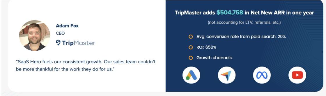
Results vary by competitive intensity, traffic volume, and execution quality, but the directional evidence remains consistent. The median B2B SaaS landing page converts at well under 4%, and purpose-built comparison pages targeting high-intent modifier keywords such as “[Competitor] pricing” or “[Competitor] alternatives” typically outperform generic pages because message match is tighter and visitor intent is more qualified. Companies that layer systematic A/B testing on headlines and CTAs derived from real review language see compounding gains over time. SaaSHero’s client TripMaster achieved a 20% conversion rate from paid search after implementing structured competitor conquesting and CRO, which is exceptionally high for B2B SaaS and shows what becomes possible when review mining, page architecture, and measurement work together.
What review categories most often convert into winning comparison page messaging?
Pricing opacity and onboarding friction are the two categories that most reliably translate into high-converting page copy, because they represent active pain that buyers already want to escape. When a buyer searches “[Competitor] alternatives,” they have usually experienced the problem and want relief, not theory. Review complaints about hidden fees, slow time-to-value, poor support responsiveness, and inflexible contracts map directly to the counter-promises that drive demo requests, such as transparent pricing tables, “live in X minutes” onboarding claims, SLA-backed support commitments, and month-to-month contract offers. The closer the page headline mirrors the exact language from the “What do you dislike?” field, the stronger the resonance with the visitor who wrote or agreed with that review.
Should I show pricing when competitors keep theirs opaque?
Transparent pricing becomes a conversion advantage when competitors hide theirs, provided your pricing is competitive or your value gap is clearly explained. Buyers searching “[Competitor] pricing” do so because the competitor did not answer the question. A page that answers it immediately with a clear tier table, a TCO calculator, and an explanation of what is included at each level captures that intent and reduces the decision paralysis that kills conversions. If your product is priced at a premium, the page should lead with the value gap, showing what the buyer gets for the additional cost, supported by customer proof. Hiding pricing to avoid sticker shock usually increases bounce rates among the high-intent buyers most likely to convert.
How long does it take to see measurable lifts from conquesting campaigns?
Initial data such as click-through rates, demo request volume, and cost per lead is typically visible within the first 30 to 60 days of a well-structured campaign. Because B2B SaaS sales cycles involve multiple decision-makers and non-linear journeys that can span months, downstream metrics like SQL rate, pipeline velocity, and closed-won revenue often require a 90 to 180 day window to validate with statistical confidence. The fastest lifts usually come from campaigns targeting competitors with known, documented weaknesses in high-volume review categories, because the page-to-intent match is immediate. SaaSHero structures its conquesting engagements to report on leading indicators such as demo requests and CPL in the first 30 days while building toward revenue-level validation over the following quarter.
Turn Competitor Insights into Revenue with SaaSHero
The five steps above form a repeatable system. Mine reviews for exact complaint language, audit pricing pages for transparency gaps, map onboarding flows for friction, build dedicated comparison and problem-solution pages that address each intent type, and measure performance against revenue metrics rather than vanity indicators. Each step produces a specific, actionable output, not a general observation.
Executing this system at scale requires ongoing review monitoring, continuous negative keyword hygiene, iterative A/B testing, and CRM-connected attribution that ties ad clicks to closed-won revenue. That is the operational work SaaSHero performs for B2B SaaS companies at Series A through C. The agency manages competitor conquesting campaigns end-to-end, from review analysis and page architecture through paid search execution and CRO, and reports on Net New ARR and pipeline velocity rather than impressions and CTR.