

Written by: Aaron Rovner, Founder, Saas Hero
Key Takeaways
- Problem-solution visuals like before-after splits and animated workflows lift B2B SaaS ad CTR by 20% to 3x by agitating pains and showing clear relief.
- Eight proven visual types, including screenshot overlays, metrics icons, and carousel sequences, drive higher engagement across Meta, LinkedIn, and Google campaigns.
- Real examples from cybersecurity, HR tech, and procurement show 650% ROI and $504k Net New ARR through authentic product demos instead of stock imagery.
- Winning plays include A/B testing emotional framing, using client-specific metrics, and designing for mobile with clear CTAs on final panels.
- Ready to roll these visuals into your campaigns for scalable growth? Book a discovery call with SaaSHero for expert B2B SaaS ad performance improvements.
1. Before-After Split Visuals That Shorten B2B Decisions
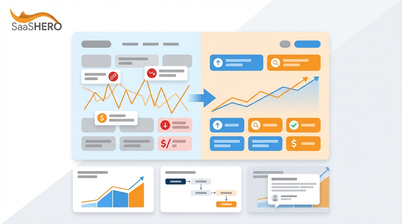
Before-after split visuals cut decision time by contrasting current pain with future relief in a single frame. These visuals address pain points like long sales cycles by showing immediate transformation potential and often reach 3x higher CTR than feature-focused ads.
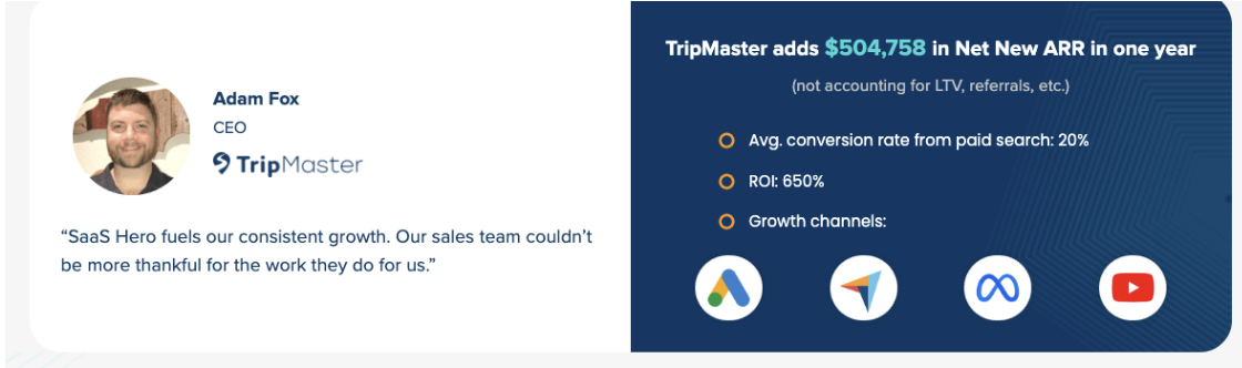
Example 1: TripMaster Transit Software Campaign – Split-screen showing chaotic spreadsheet processes versus a streamlined dashboard interface. The left side displays overwhelmed users juggling multiple tabs, while the right side shows organized workflows with automation. SaaSHero generated $504k Net New ARR for TripMaster through paid search and CRO targeting high-intent keywords like “hiring software alternatives.”
Example 2: Cybersecurity Platform – The before panel shows red security alerts flooding a SOC analyst’s screen. The after panel displays a clean green dashboard with automated threat resolution. The contrast highlights peace of mind instead of technical features.
Example 3: Procurement SaaS – Messy email chains and manual approvals shift into automated approval workflows with real-time spend visibility. The visual targets CFOs frustrated with expense management chaos.
SaaSHero uses before-after splits in competitor conquesting campaigns and reaches strong conversion rates by targeting complaint-intent keywords like “[competitor] alternatives” and “cancel [competitor].”
- Agitate specific operational pain points with realistic “before” scenarios.
- Show an aspirational “after” state with clean, organized interfaces.
- A/B test emotional and logical framing in headlines.
- Use authentic screenshots instead of stock imagery.
- Track SQL generation, not only click-through rates.
2. Animated Workflows and GIFs That Clarify Complex SaaS
Short animations show product functionality in action and clarify complex B2B processes that static images cannot explain. 73% of consumers prefer short-form videos for product discovery, so micro-animations work well for Facebook and LinkedIn campaigns.
Example 1: Document Management Platform – A 15-second GIF shows document upload, automatic categorization, and team collaboration in a smooth sequence. The animation removes confusion about multi-step processes while holding attention.
Example 2: CRM Integration Tool – An animated workflow displays data flowing between Salesforce, HubSpot, and custom databases with visual connectors and real-time sync indicators. The visual targets operations managers dealing with data silos.
Agencies like SaaSHero build modular animation assets that run across Meta, LinkedIn, and retargeting campaigns. These animations increase engagement by demonstrating product capabilities instead of describing them.
- Keep animations under 15 seconds for strong platform performance.
- Loop seamlessly to maintain continuous engagement.
- Highlight a maximum of 3 to 5 key workflow steps.
- Add subtle UI elements that signal professional software.
- Test with and without sound to fit platform behavior.
3. Screenshot Overlays With Callouts That Build Trust Fast
Real product screenshots with clear overlays provide proof while guiding attention to specific benefits. Screenshots and UI examples create visual proof that builds credibility faster than abstract graphics.
Example 1: Analytics Dashboard – A clean revenue dashboard screenshot with numbered callouts for “Real-time reporting,” “Custom KPIs,” and “Automated alerts.” Overlay arrows guide the eye to features that solve reporting chaos.
Example 2: Project Management Tool – An interface screenshot shows team collaboration features with overlay text boxes for “Instant notifications,” “Progress tracking,” and “Resource allocation.” The visual speaks to project managers struggling with coordination.
SaaSHero uses screenshot overlays in LinkedIn campaigns that target specific job titles and reaches higher relevance scores by showing real software interfaces instead of conceptual graphics.
- Use authentic product screenshots, not generic mockups.
- Limit callouts to a maximum of 3 or 4 key benefits.
- Keep text overlays readable on mobile devices.
- Match overlay styling with brand guidelines.
- A/B test callout placement and color schemes.
4. Metrics and ROI Icons That Prove SaaS Value Quickly
Quantified outcomes with visual metrics communicate value in seconds. Value-as-a-Service uses metrics visuals like “3x faster deployment” or “40% cost savings” to prove ROI and support budget decisions.
Example 1: HR Automation Platform – An icon-driven visual shows “67% faster hiring,” “89% fewer manual tasks,” and “$50k annual savings” with matching graphics. These numbers address CFO concerns about efficiency.
Example 2: Security Compliance Tool – A metrics block highlights “99.9% uptime,” “24/7 monitoring,” and “SOC 2 certified” with security badge icons. The visual targets IT directors who evaluate compliance tools.
SaaSHero pulls client-specific metrics from case studies and turns them into visuals that resonate with prospects who face similar challenges.
- Use real client metrics whenever possible for authenticity.
- Add timeframe context such as monthly or annual for clarity.
- Pair numbers with industry-relevant icons.
- Align metrics with the priorities of the target persona.
- Test percentage versus dollar amount formats.
5. Carousel Sequences That Tell Complete SaaS Stories
Multi-panel carousels tell a full story while allowing granular A/B testing of each panel. Carousel Ads on LinkedIn reach 2x CTR over single image ads, so they fit complex B2B narratives that need several touchpoints.
Example 1: Customer Success Platform – A 5-panel carousel walks through the customer journey from onboarding to renewal. Each panel speaks to a different stakeholder: implementation ease, user adoption, ROI tracking, expansion, and retention metrics.
Example 2: Financial Planning Software – A 4-panel sequence shows budget creation, scenario planning, real-time adjustments, and executive reporting. The carousel targets finance teams that need a complete planning workflow.
|
Panel Position |
Content Focus |
Target Persona |
Conversion Goal |
|
Panel 1 |
Problem Agitation |
End User |
Engagement |
|
Panel 2-3 |
Solution Demo |
Decision Maker |
Interest |
|
Panel 4-5 |
Outcomes/Proof |
Budget Holder |
Demo Request |
SaaSHero improves carousel performance by testing panel order and measuring engagement depth so each panel supports the conversion funnel.
- Lead with the strongest pain point or outcome.
- Keep visual style consistent across panels.
- Add a clear CTA on the final panel.
- Test 3-panel versus 5-panel formats.
- Track which panels drive the most engagement.
6. Short Video Demos That Stand Out in B2B Feeds
Concise product demos show functionality while holding attention in crowded social feeds. Video Ads on LinkedIn deliver 5x engagement versus static ads, so they support both brand awareness and lead generation.
Example 1: Marketing Automation Tool – A 45-second screen recording walks through campaign setup, audience segmentation, and performance tracking. The video reduces perceived complexity and shows ease of use.
Example 2: Inventory Management System – A 30-second walkthrough covers stock monitoring, automatic reordering, and supplier integration. The demo speaks directly to operations managers with supply chain issues.
SaaSHero builds video assets with modular sections so teams can customize by audience while keeping production efficient. Meta video content drives top-of-funnel awareness, while LinkedIn video brings in higher-quality leads.
- Hook viewers within the first 3 seconds with a strong statement.
- Show the real product interface instead of abstract animations.
- Add captions for sound-off viewing.
- End with a clear next step and contact path.
- Test different video lengths for each platform.
7. Infographic Layouts That Explain SaaS Problems Clearly
Structured infographics break complex information into a clear visual hierarchy. B2B SaaS marketing uses infographics at the top of the funnel for awareness and pain education through systematic layouts that build authority and trust.
Example: Compliance Management Platform – A vertical infographic shows regulatory complexity at the top, current manual processes in the middle, and an automated compliance solution at the bottom. The visual combines statistics, process flows, and outcome metrics in one cohesive design.
SaaSHero creates infographic templates that work across LinkedIn organic posts, paid campaigns, and email nurture sequences so teams reuse assets while keeping brand consistency.
- Follow a logical flow from problem to solution.
- Use consistent color coding for each concept group.
- Include credible statistics and data points.
- Check readability across sizes and devices.
- Design modular sections for quick customization.
8. Interactive Dashboard Previews That Let Prospects Explore
Dynamic dashboard previews let prospects experience product value through controlled interaction. Real customer contexts instead of abstract illustrations make SaaS benefits feel concrete by showing actual interface screenshots and workflows.
Example: Business Intelligence Platform – An interactive preview lets users filter data, change chart types, and explore different metrics. The preview demonstrates power and flexibility while keeping data secure.
SaaSHero adds interactive elements carefully and balances engagement with conversion so prospects move toward demo requests instead of endless exploration.
- Limit interaction points so users do not feel overwhelmed.
- Guide users toward key insights and outcomes.
- Include a clear path toward a full demo request.
- Maintain fast loading times on all devices.
- Track interaction patterns for future improvements.
Implementation Playbook for High-Converting Visuals
This implementation playbook covers A/B testing frameworks, CRM integration with HubSpot for lead tracking, and negative keyword strategies for intent-based targeting. SaaSHero’s method includes landing page design, conversion improvements, and customization guidelines for different verticals and buyer personas.
Teams ready to roll out these visual strategies can book a discovery call with SaaSHero for expert support.
Frequently Asked Questions
What are the top problem-solution visuals for SaaS Facebook ads in 2026?
The most effective problem-solution visuals for SaaS Facebook ads include before-after split screens, animated workflow GIFs, and carousel sequences. Before-after splits perform strongly because they create instant emotional contrast between current pain and future relief. Animated GIFs show complex processes in short 15-second loops, and carousels tell a story across several panels. These formats often reach 2 to 3x higher CTR than static feature-focused ads because they address buyer psychology instead of only listing capabilities.
How does SaaSHero measure visual ROAS and campaign performance?
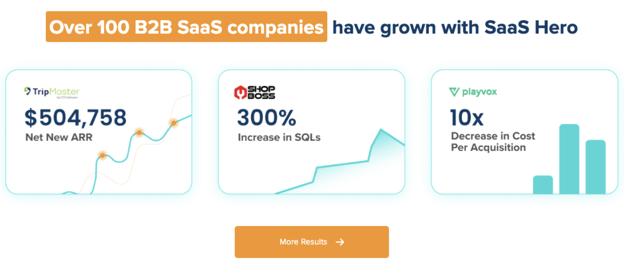
SaaSHero measures visual performance through Net New ARR attribution, SQL generation rates, and pipeline velocity instead of vanity metrics like impressions or clicks. The agency connects tracking from ad click through CRM to closed-won revenue and then improves campaigns based on real business outcomes. For example, the TripMaster campaign generated $504k in Net New ARR with 650% ROI by focusing on revenue attribution instead of top-funnel metrics. This approach needs a strong tracking setup but delivers measurable impact.
Which platforms deliver the best results for B2B SaaS problem-solution ads?
LinkedIn leads B2B SaaS lead generation with 80% of social media leads and 277% more leads than Facebook and Twitter combined. Meta (Facebook and Instagram) often delivers leads at roughly one third the cost of LinkedIn while keeping quality high for top-funnel awareness. The strongest strategy combines LinkedIn for high-intent targeting by job title and company size with Meta for broader awareness and retargeting. Cross-platform plays, such as retargeting Meta video viewers with LinkedIn case studies, increase both reach and conversion efficiency.
What are common mistakes when creating problem-solution visuals for B2B SaaS?
Common mistakes include using generic stock imagery instead of real product screenshots and overwhelming viewers with too many features in one visual. Many teams also focus on technical capabilities instead of business outcomes. Another frequent issue is poor intent alignment, such as showing generic product demos to users searching for competitor alternatives instead of comparison content. Weak mobile experiences and missing clear next steps also reduce conversion potential.
How should B2B SaaS companies adapt their visual strategy for rising CAC in 2026?
Rising customer acquisition costs require hyper-targeted visuals that focus on high-intent audiences and proven conversion elements. Companies should prioritize competitor conquesting campaigns with specific comparison visuals and use AI-driven personalization for role-based messaging. Visuals need quantified outcomes instead of long feature lists. Growing vertical SaaS specialization also calls for industry-specific visual contexts instead of generic business imagery. Teams that treat visuals as conversion assets, with every element tuned for pipeline and revenue attribution, will compete more effectively in 2026.
Conclusion: Turn B2B SaaS Visuals Into Revenue Drivers
The eight visual types and 15 examples above show proven ways to generate $500k-plus ARR impact, similar to SaaSHero client results. From before-after splits that reach 3x CTR lifts to interactive dashboards that show product value, these problem-solution visuals match buyer psychology and drive measurable outcomes.
SaaSHero delivers these visual strategies through senior-led teams at $1,250 per month flat-rate pricing with month-to-month flexibility. The team combines competitor conquesting, conversion improvements, and revenue attribution tracking for B2B SaaS. Book a discovery call for a full audit of your current visual strategy and a tailored implementation roadmap.