

Key Takeaways
-
B2B SaaS ad costs are rising to $341 CAC, so standout creative now determines who captures high-intent buyers on LinkedIn and Google.
-
Problem-Agitation-Solution splits and competitor comparison tables convert 20% higher by matching pricing and churn complaint search intent.
-
Video demos, testimonial carousels, and data-stat heroes build trust and drive 650% ROI through specific metrics and credible social proof.
-
2026 trends like AI-personalized visuals and urgency countdowns double engagement while still scaling across campaigns and segments.
-
Implement these 12 high-converting designs with SaaSHero’s expertise, and book a discovery call for templates and flat-fee management.
1. Problem-Agitation-Solution Split for Churn Reduction
Split-screen visuals that contrast chaotic “before” states with organized “after” solutions capture pricing and complaint intent searches effectively. The left side shows overwhelming dashboards, scattered data, or frustrated users, and the right side displays your clean interface and happy customers.
Key elements include bold headlines like “Churn Killing Your MRR?” paired with high-contrast visuals using blues and whites for trust. These color choices create a stark comparison that scanning users understand in seconds, while the “Start Free Trial” CTA offers a low-commitment next step. Interactive content delivers 2× the engagement and 2× the conversions compared to static formats, which supports this split-screen approach.
For competitor conquesting, adjust headlines to “Tired of [Competitor] Churn?” while keeping the same visual contrast. Use negative keywords to exclude navigational searches and keep your spend focused on evaluative intent.
2. Data-Stat Hero with ARR Proof for Pipeline Growth
Bold statistical visuals that spotlight your strongest performance metrics grab attention and reassure data-driven buyers. Center your most compelling numbers, such as revenue growth, efficiency gains, or customer acquisition improvements, with clear context and recognizable customer logos.
Design the hero area so the main metric dominates through large, contrasting typography on a clean background. Add trust signals like “G2 High Performer” badges and customer logos beneath the headline number to reinforce credibility. This layout works especially well for review intent searches where prospects want proof before they click.
Pair these visuals with landing pages that feature detailed case studies and ROI calculators. The combination of bold claims and concrete evidence reduces perceived risk for B2B buyers and supports faster pipeline movement.
3. Competitor ‘vs’ Table for Safe Conquesting
Feature comparison tables inside your ad creative to reach users searching “[Competitor] vs [Alternative]” or “[Competitor] pricing.” Select 3–4 differentiators and present them in a clean table with checkmarks that clearly highlight your advantages.
Focus on factual comparisons such as pricing transparency, contract flexibility, or specific features that buyers mention in reviews. These objective elements stay legally defensible and give prospects clear reasons to switch. Because you are making direct comparisons, avoid competitor logos to reduce trademark risk and use text-only brand names instead. This text-only approach also makes it essential that headlines clearly identify your company as the advertiser to prevent confusion and maintain compliance.
This format works best for high-intent prospects who already compare solutions. Send clicks to dedicated comparison landing pages that include detailed feature matrices, switching resources, and migration support information to lower switching friction.
4. Testimonial Carousel Snippet for Social Proof Depth
Carousel ads that feature customer testimonials with specific metrics and outcomes build trust and show real-world use cases. Each slide should highlight a different customer segment with a photo, company logo, and quantified results.
Structure testimonials around clear outcomes such as “Reduced CAC by 40%” or “Increased MRR by $200K in 6 months.” Add the customer’s title and company size so prospects can quickly see themselves in similar roles and contexts. Keep branding consistent across slides while varying customer imagery and metrics to maintain interest.
This format performs especially well on LinkedIn where professional credibility matters. The carousel layout lets you speak to multiple segments in one ad, which increases relevance across your audience.
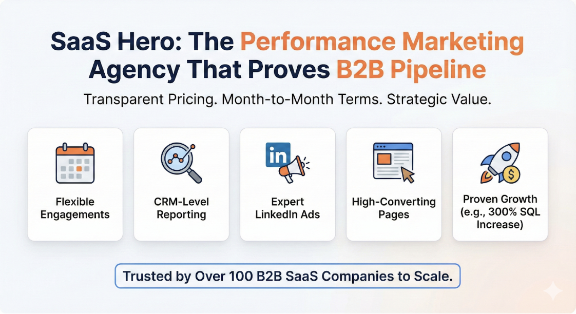
Scale these proven B2B ad design strategies with SaaSHero’s flat-fee management starting at $1,250/month. Schedule a consultation to map these designs to your specific campaigns and audience segments.
5. LinkedIn Carousel Pain-to-Demo Journey Narrative
LinkedIn carousel narratives guide prospects from problem recognition to solution demonstration and finally to a demo booking. This structure turns a single ad into a mini buyer journey that educates while it sells.
Build each slide so it advances the story. Slide 1 identifies the pain, Slide 2 deepens the consequences, Slide 3 introduces your solution, Slide 4 shows the interface, and Slide 5 drives the demo CTA. Use consistent visual styling and reveal information gradually so prospects keep swiping.
This storytelling approach fits LinkedIn’s professional environment where users expect educational content. The carousel format encourages deeper engagement and keeps the narrative clear as you move prospects toward conversion.
6. 30-Second Video Demo Hook for High Intent Buyers
Short-form video ads that show your product interface in action capture attention and drive demo requests from high-intent buyers. 87% of users make a purchase after watching product demo videos, so this format plays a central role in performance campaigns.
Structure each video with a 3-second hook that states the main benefit, followed by 20 seconds of interface walkthrough focused on key workflows. Close with a 7-second CTA that invites viewers to book a demo or start a trial. Use screen recordings with simple animated callouts that highlight specific features and outcomes.
Design for mobile viewing with large text and clear interface elements that remain legible on small screens. Include captions for sound-off viewing, which covers most social media video consumption. Test multiple hooks to find the opening line that stops the scroll fastest.
7. Pricing Ladder Transparency for Faster Trust
Clear pricing displays address cost concerns early and position your solution confidently against alternatives. Show your pricing tiers with feature breakdowns and highlight the most popular option to guide decisions.
Design pricing tables with obvious tier separation, straightforward feature comparisons, and a short value statement for each level. Add “Most Popular” badges and annual discount callouts to nudge buyers toward higher-value plans. Include testimonials or logos from customers at each tier so prospects see proof that similar companies pay those prices.
This transparent approach builds trust with cost-conscious buyers and helps qualify prospects by budget fit. Direct traffic to dedicated pricing pages that include ROI calculators and comparison tools to support final decisions.
8. Humor Meme Creative for Founder Pain Points
Relatable memes that speak to common SaaS founder frustrations create emotional connection while staying relevant to business outcomes. Use well-known meme formats adapted to B2B scenarios, such as “This is Fine” for chaotic dashboards or “Drake Pointing” for feature comparisons.
Balance humor with professionalism by centering on shared pain points like manual processes, data silos, or scaling challenges. Make sure the joke reinforces your value proposition instead of distracting from it.
This style works well for founder-focused campaigns where personality and relatability influence response. Test several meme formats and messages to see which ones resonate most with each audience segment.
Transform your B2B ad performance with SaaSHero’s specialized SaaS marketing expertise. Connect with our team to see how we have implemented these exact designs for SaaS companies in your vertical.
9. AI-Generated Personalized Visuals for 2026 Campaigns
AI tools now enable personalized ad visuals at scale for specific industries, company sizes, and use cases. AI-powered personalization drives 202% higher conversion rates compared to non-personalized experiences, which makes this tactic a strong competitive lever.
Use AI image generation to build industry-specific scenes, tailored interface mockups, or personalized data visualizations that mirror your prospect’s world. 60% of designers use AI for early concepts, blending with human creativity to produce compelling visuals quickly.
Combine AI-generated assets with human review to protect brand consistency and visual quality. Test different personalization depths, such as industry-only versus industry plus role, to find the balance between engagement lift and production scalability.
10. Lead Magnet eBook Teaser for Nurturing Sequences
Lead magnet teasers promote high-value assets like industry reports, implementation guides, or ROI calculators to capture prospects who are not ready for a demo. Feature the cover design prominently and call out one or two headline insights.
Design each teaser with a strong headline, 3–4 key takeaway bullets, and professional cover imagery that feels on-brand. Add author credentials or company expertise markers to increase perceived authority.
This approach fills the top of your funnel while delivering immediate value. Gate the content to qualify leads, then nurture them through email sequences until they reach demo readiness.
11. Feature Matrix Conquest for Clear Differentiation
Feature matrix creatives highlight your unique capabilities against competitors in a structured, scannable way. Focus on functionality gaps and advantages that your target buyers mention most often in sales conversations.
Create clean tables with clear checkmarks, X’s, and short callouts for unique features. Emphasize two or three differentiators that provide strong reasons to switch, and keep language neutral and factual to maintain credibility.
Send traffic to comprehensive comparison pages that expand on each feature, include customer testimonials, and offer switching resources. This approach fits prospects who already evaluate alternatives and need a final push.
12. Urgency Countdown for Trial and Demo Conversions
Time-sensitive offers with visual countdown elements create urgency for trial sign-ups or demo bookings. Use animated countdown timers or clearly labeled limited-time pricing to encourage faster action.
Design urgency elements that feel honest and grounded in real constraints. Focus on genuine limited-time value such as extended trials, bonus features, or implementation discounts. State expiration dates and terms clearly to protect trust.
Test different urgency styles to see what your audience prefers. Some segments respond to scarcity, such as limited spots, while others react better to deadline-driven offers.
Frequently Asked B2B Ad Design Questions
How should I A/B test these ad designs in LinkedIn and Google?
Run single-variable tests that change only one element at a time, such as headline, visual, or CTA. Keep tests live for at least 7–14 days to smooth out day-of-week swings. Use statistical significance calculators before declaring a winner. On LinkedIn, test across different audience segments in parallel. On Google, test ad variations within the same ad groups so targeting stays consistent.
Which designs work best for low vs high ACV SaaS products?
Low ACV products benefit from clear pricing, strong free trial messaging, and volume-focused social proof. High ACV solutions need deeper trust elements such as detailed case studies, executive testimonials, and security certifications. Enterprise-focused ads should emphasize ROI, compliance, and implementation support, while SMB-focused ads can highlight ease of use and fast setup.
What legal considerations apply to competitor-focused ads?
Use competitor names only in factual comparisons and avoid their logos or trademarked imagery. Clearly identify your company as the advertiser in every creative. Keep claims truthful and feature-based rather than subjective. Add disclaimers when needed and ensure landing pages provide evidence for any claims made in the ads.
What tools should I use for creating these ad mockups and templates?
Canva Pro offers strong B2B templates and brand kit features. Figma supports more advanced design systems and collaboration for custom creatives. Adobe Creative Suite remains the standard for full professional control. For AI-generated elements, consider Midjourney or DALL-E for concept creation, then refine assets in your primary design tools.
Which metrics should I track beyond click-through rates?
Track conversion rates, cost per SQL, and pipeline attribution alongside CTR. Monitor view-through conversions for brand campaigns. Watch engagement metrics such as video completion rates and carousel card interactions. Connect ad clicks to closed-won deals in your CRM so you can measure revenue attribution, not just surface metrics.
Conclusion: Turning These 12 B2B Ad Designs into Revenue
The strongest B2B SaaS ad designs combine clear psychological triggers, platform-specific execution, and sharp value propositions. Start with problem-solution splits and competitor comparisons for quick wins, then layer in video content and AI-driven personalization for deeper differentiation.
Keep message and landing page aligned, weave trust signals throughout the journey, and focus on revenue metrics instead of vanity numbers. Test in a structured way, measure carefully, and iterate based on real conversion data.
Partner with SaaSHero to implement these proven B2B ad design strategies and achieve measurable revenue growth. Our flat-fee model and month-to-month flexibility keep you efficient and agile.
Get started with a free campaign audit to identify which of these 12 designs will drive the highest ROI for your buyer journey.