

Key Takeaways
- SaaSHero’s 7 heuristic principles adapt Nielsen’s UX heuristics for B2B SaaS and focus on SQLs and ARR instead of vanity metrics.
- Core principles cover relevance, clarity, trust, and friction reduction, such as ad-to-page match, 5-second value prop, above-fold proof, and forms with 3 or fewer fields.
- The 1-hour audit process uses a small expert team, scores pages from 1-10, and prioritizes quick wins like CTA changes that lift conversions 15-40%.
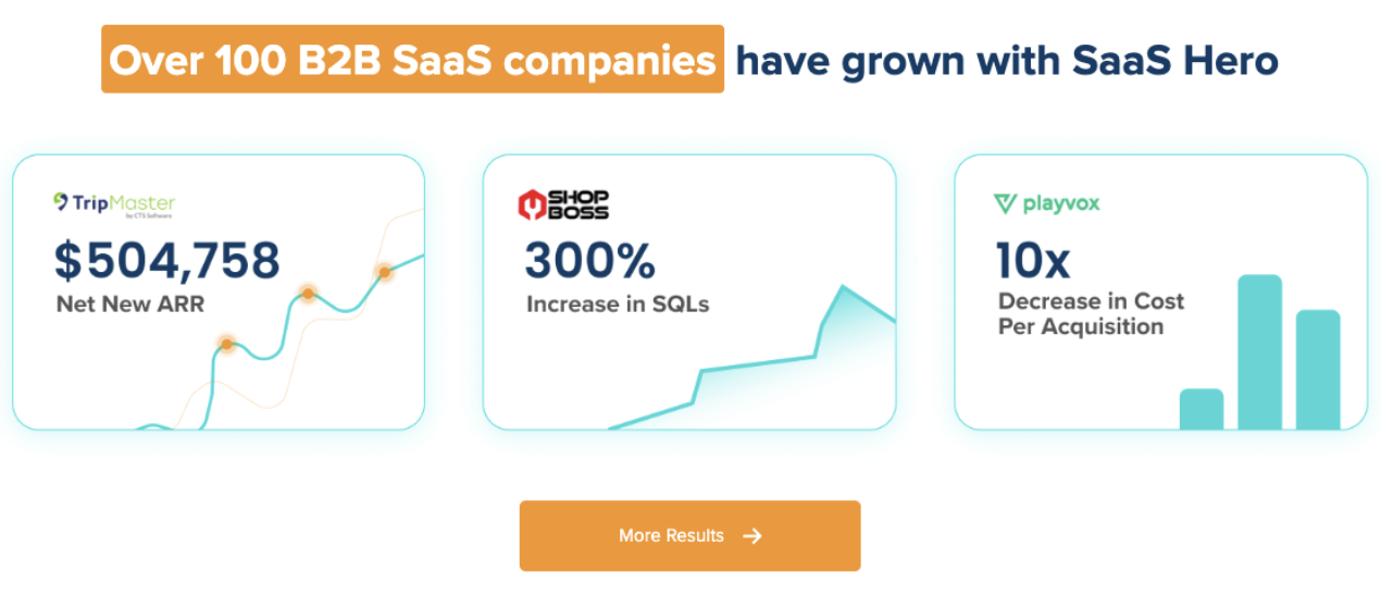
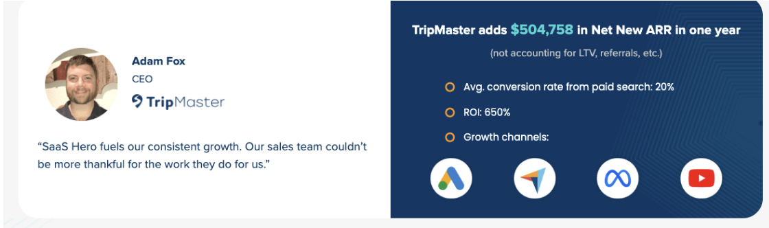
- Real audits produced $504k Net New ARR for TripMaster and lifted innQuest’s homepage conversions with targeted UX and CRO fixes.
- You can download SaaSHero’s free checklist or book a discovery call for a professional audit that often unlocks $100k+ ARR growth.
Executive Summary and Revenue Framework
Heuristic analysis uses expert UX evaluation to uncover conversion blockers without heavy A/B testing or large traffic volumes. For B2B SaaS, this approach targets SQLs, demo requests, and Net New ARR instead of impressions or clicks.
SaaSHero’s 7 principles adapt Nielsen’s heuristics for revenue-focused B2B SaaS growth:
- Relevance: Ad-to-landing page message match
- Clarity: 5-second value proposition test
- Trust: Above-fold credibility signals
- Friction: Minimal form fields and navigation distractions
- Visibility of Status: Progress indicators and feedback
- Consistency and Standards: Site-wide CTA alignment
- Funnel Alignment: Progressive disclosure that supports SQL generation
This framework grew from real CRO audits, including innQuest’s homepage work, and has been validated across mid-stage B2B SaaS startups from $1M to $10M ARR with measurable conversion lifts.
7 SaaSHero Heuristics for B2B SaaS UX
1. Relevance: Tight Message Match From Ad to Page
Relevance keeps the experience consistent from ad click to landing page. For competitor conquesting campaigns, users who search “Salesforce pricing” should land on a focused comparison page, not a generic homepage. Poor message match drives fast bounces and wastes ad spend. Quick check: The headline should match search intent within 3 seconds.
2. Clarity: Fast 5-Second Value Proposition
Clarity means users grasp your product, target audience, and main benefit within 5 seconds of page load. Pricing pages should state costs clearly instead of forcing visitors to “contact sales” for basic numbers. Revenue impact: Clear value propositions often raise homepage conversion rates by 15-20% in SaaSHero audits.
3. Trust: Above-the-Fold Proof and Signals
Trust grows when G2 badges, customer logos, and security certifications appear above the fold on pricing and demo pages. B2B buyers feel risk and want instant social proof before they commit. Implementation: Place trust signals within about 100 pixels of primary CTA buttons.

4. Friction: Simple, Low-Barrier Demo Requests
Friction drops when demo forms ask for a maximum of three required fields such as name, email, and company, with phone as optional. Each extra field can cut conversion rates by 10-15%. Demo CTAs on mobile should stay visible and easy to tap on every device size. Best practice: Use single-click demo scheduling whenever your workflow allows it.
5. Visibility of Status: Clear Progress and Feedback
Visibility of status keeps users confident during multi-step flows. Multi-step forms should display progress bars and real-time validation. Users need instant feedback on form submissions, pricing calculations, and demo confirmations. Technical requirement: Show validation messages inline near the field instead of using pop-ups.
6. Consistency and Standards: Unified CTA Language
Consistency across CTAs reduces confusion and supports intent. Primary CTAs should use the same wording, such as “Get Demo” or “Start Trial,” and keep consistent styling across the site. Mixed CTA labels dilute focus and slow decisions. Audit check: Homepage, pricing, and product pages should share the same primary action language.
7. Funnel Alignment: Content That Matches Buyer Stage
Funnel alignment guides visitors from problem awareness to solution evaluation and then to demo request. Progressive disclosure reduces cognitive load while keeping momentum toward conversion. Each page should support one main goal that fits the buyer’s current journey stage.
Step-by-Step SaaSHero Heuristic Audit
SaaSHero follows a structured process that stays fast while still detailed and actionable.
Step 1: Assemble Evaluation Team
Recruit three evaluators with B2B SaaS experience. Include one UX specialist, one marketing lead, and one sales team member to capture different views on conversion barriers.
Step 2: Define Audit Scope
Focus on high-impact pages such as the homepage, pricing page, demo request flow, and core product landing pages. Avoid spreading effort across every page and stay focused on revenue-critical touchpoints.
Step 3: Apply 7 Principles Page by Page
Ask each evaluator to score pages independently against all seven principles on a 1-10 scale, where 10 means no issues and 1 means critical problems. Capture specific friction points with screenshots and short notes.
Step 4: Prioritize by Revenue Impact
Rank issues by expected conversion impact and effort to fix. Quick wins often include CTA button changes, better trust signal placement, and fewer form fields.
| Page Type | Primary Principles | Common Friction Points | Quick Win Potential |
|---|---|---|---|
| Homepage | Clarity, Trust, Relevance | Unclear value prop, buried CTAs | High (20-30% lift) |
| Pricing | Clarity, Trust, Friction | Hidden costs, complex tiers | Medium (10-15% lift) |
| Demo Flow | Friction, Visibility, Consistency | Too many fields, poor mobile UX | High (25-40% lift) |
Free B2B SaaS Heuristic Checklist and Template
Use this quick checklist to review your B2B SaaS site and score each principle from 1-10 while you note improvements.
| Principle | Pass/Fail | Score (1-10) | B2B SaaS Specific Checks |
|---|---|---|---|
| Relevance | □ | ___ | Ad copy matches landing page headline |
| Clarity | □ | ___ | Value prop clear in 5 seconds |
| Trust | □ | ___ | G2 badges visible above fold |
| Friction | □ | ___ | Demo form ≤3 required fields |
| Visibility | □ | ___ | Form validation provides real-time feedback |
| Consistency | □ | ___ | CTA language identical across pages |
| Funnel Alignment | □ | ___ | Progressive disclosure guides to demo |
Download SaaSHero’s complete audit template for detailed scoring rubrics and B2B SaaS-specific criteria. This full checklist has been battle-tested across many CRO audits. Book a discovery call to receive SaaSHero’s full professional audit.
Real-World innQuest Audit Breakdown
A recent SaaSHero homepage audit for innQuest exposed several conversion blockers.
Issues Identified: Generic “Learn More” CTAs instead of “Get Demo,” trust signals hidden below the fold, pricing details locked behind contact forms, and a mobile demo button partly covered by navigation.
Fixes Implemented: Replaced CTAs with “Schedule Demo,” moved G2 badges above the hero section, added clear pricing tiers, and improved mobile CTA placement and size.
Projected Impact: SaaSHero projected a 15-20% conversion lift based on similar changes. Following the TripMaster case study pattern, these updates often generate $100k or more in additional ARR within six months through stronger SQL generation and lower CAC.
This structured approach follows the same methodology that supported TestGorilla’s 80-day payback period and innQuest’s documented conversion gains.
Prioritization Roadmap and Revenue Impact
Teams should convert audit findings into a clear roadmap using a simple effort and ROI framework.
| Quick Win Category | Implementation Effort | Expected ROI | Analytics Tracking |
|---|---|---|---|
| CTA Optimization | Low (1-2 days) | High (15-25% SQL lift) | HubSpot conversion tracking |
| Trust Signal Placement | Low (1 day) | Medium (8-12% lift) | Heatmap analysis |
| Form Field Reduction | Medium (3-5 days) | High (20-30% completion) | Form analytics |
| Mobile UX Fixes | Medium (1 week) | High (25% mobile conv.) | Device-specific tracking |
SaaSHero’s month-to-month retainer model supports ongoing improvements based on this roadmap. The flat-fee structure aligns incentives with client revenue instead of ad spend volume.
Common Audit Pitfalls and How to Avoid Them
Teams often repeat the same mistakes during heuristic audits, which weakens results.
Pitfall 1: Auditing too many pages at once. Focus on three or four high-impact pages per cycle.
Pitfall 2: Ignoring mobile B2B research behavior. B2B buyers increasingly research on mobile devices before they convert on desktop.
Pitfall 3: Shipping every change at the same time. Stagger updates so you can see the impact of each change and avoid overwhelming users.
Pitfall 4: Prioritizing visual polish over conversion performance. Heuristic analysis focuses on functional improvements that move revenue, not just aesthetics.
Pitfall 5: Skipping post-implementation measurement. Track conversion rates, bounce rates, and SQL volume for at least 30 days after changes.
Conclusion and SaaSHero Next Steps
SaaSHero’s 7-principle heuristic framework gives B2B SaaS teams a repeatable way to find and fix conversion barriers quickly. This approach has generated $504k in Net New ARR for TripMaster and supported TestGorilla’s $70M Series A through stronger unit economics.
The one-hour audit format delivers clear next steps without waiting for long A/B tests or large traffic samples. In a capital-constrained market, this speed and focus help teams avoid wasteful UX experiments.
SaaSHero acts as a revenue-first UX and CRO partner with deep B2B SaaS expertise, transparent flat-fee pricing, and flexible month-to-month terms. Book a discovery call today to get a comprehensive heuristic audit and uncover $100k or more in ARR growth potential.
Frequently Asked Questions
What makes B2B SaaS heuristic analysis different from general UX audits?
B2B SaaS heuristic analysis focuses on SQLs, demo requests, and Net New ARR instead of broad usability scores. The framework addresses B2B realities such as long sales cycles, multiple stakeholders, and complex pricing. SaaSHero’s seven principles extend Nielsen’s heuristics with B2B-specific checks like progressive value disclosure and trust signal placement for risk-averse enterprise buyers.
How quickly can I see results from heuristic audit recommendations?
Quick wins such as CTA changes and trust signal placement usually show impact within two to four weeks. Larger changes such as form field reduction and mobile UX fixes often need four to eight weeks to show full effect. SaaSHero’s method ranks changes by effort and expected ROI so high-impact updates go live first.
Can my team run a heuristic audit internally?
Your team can use the basic checklist internally, yet deep heuristic analysis benefits from B2B SaaS domain expertise. External experts spot subtle conversion barriers and rank fixes by revenue impact. Internal teams often lack cross-company benchmarks and may miss issues due to familiarity bias. SaaSHero’s senior-led audits apply a structured method and experience from more than 50 B2B SaaS reviews.
How do I measure the ROI of heuristic improvements?
Measure conversion rates, SQL volume, and demo requests before and after changes using tools like HubSpot, Google Analytics, and heatmaps. Capture baseline data for at least 30 days before implementation, then track results for about 60 days after changes to reach significance. SaaSHero connects with client CRM data to follow gains through to closed-won deals and Net New ARR.
What is the difference between heuristic analysis and A/B testing for B2B SaaS?
Heuristic analysis provides immediate expert insights, while A/B testing needs time and traffic to reach significance. For B2B SaaS with limited traffic or tight budgets, heuristic audits surface obvious conversion issues without heavy testing setups. The two methods work together, with heuristic findings shaping A/B test ideas and priorities for efficient experimentation.