


Written by: Aaron Rovner, Founder, Saas Hero
Key Takeaways
- Heuristic evaluation finds usability flaws on SaaS landing pages in under 30 minutes using Nielsen’s 10 principles and SaaSHero’s 7 CRO principles. Clients often see conversion lifts from 2% to 20% or higher.
- High-impact focus areas include clear CTAs above the fold, tight ad-to-page relevance, 5-second value prop clarity, visible trust signals like G2 badges, and low-friction forms.
- Follow a 5-step process for reliable results: assemble 3 evaluators, review independently, score severity, prioritize quick wins, and re-audit post-fixes for measurable improvements.
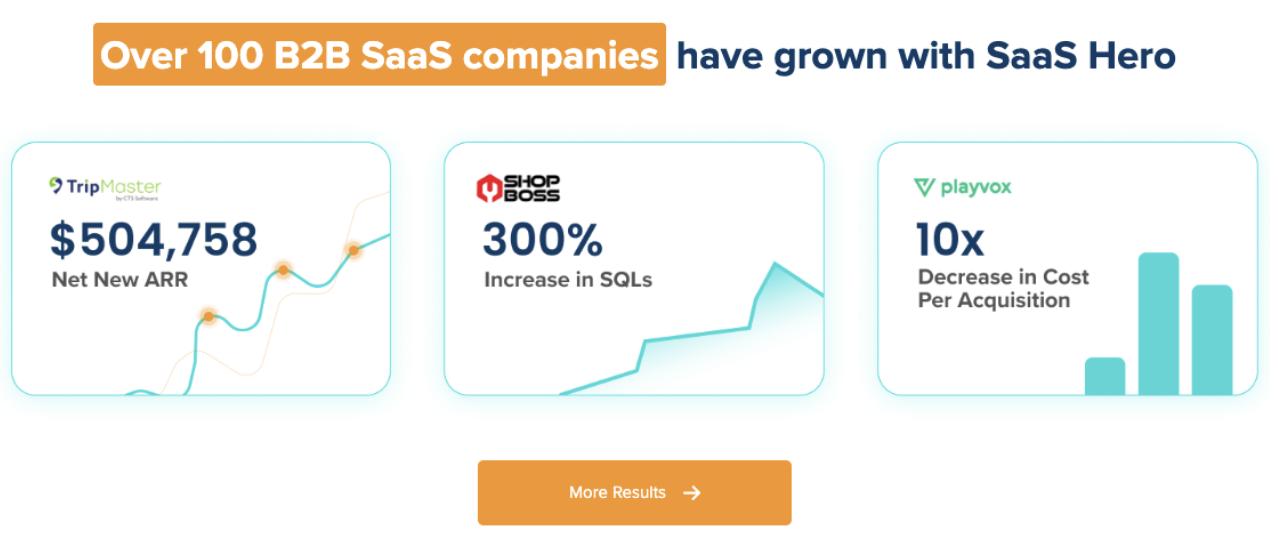
- Case studies show $504k Net New ARR gains for TripMaster from clearer value props, shorter forms, and stronger trust signals, proving direct revenue impact.
- Download free Excel/PDF templates and book a discovery call with SaaSHero to implement and scale these improvements across campaigns.
Heuristic Evaluation for B2B SaaS Landing Pages
A heuristic evaluation is an expert-led audit that finds usability flaws using proven principles without weeks of traffic data or expensive user testing. SaaS-focused heuristic evaluations target conversion killers that block demo requests and trial sign-ups instead of chasing cosmetic UX tweaks.
Evaluators review your landing page against established usability guidelines to spot friction points, trust gaps, and clarity issues. For B2B SaaS teams, the priority is elements that affect ad traffic conversion and sales pipeline creation, not general engagement metrics.
How Our Hybrid Evaluation Framework Works
Our hybrid framework combines Nielsen’s foundational 10 heuristics with SaaSHero’s 7 CRO-specific principles tailored for B2B landing pages. The table below shows how Nielsen’s general usability principles connect to conversion-focused outcomes, such as how “visibility of system status” supports relevance and clarity for paid traffic visitors.
| Nielsen’s 10 Heuristics | SaaSHero’s 7 CRO Principles |
|---|---|
| 1. Visibility of system status | 1. Relevance (ad-page match) |
| 2. Match between system and real world | 2. Clarity (5-second value prop) |
| 3. User control and freedom | 3. Trust (G2 badges above fold) |
| 4. Consistency and standards | 4. Friction (minimal forms) |
| 5. Error prevention | 5. Outcome prioritization |
| 6. Recognition rather than recall | 6. Message match |
| 7. Flexibility and efficiency of use | 7. 5-second test |
| 8. Aesthetic and minimalist design | |
| 9. Help users recognize, diagnose, and recover from errors | |
| 10. Help and documentation |
Apply this framework using the 5-step process detailed in the “What Are the Steps in Heuristic Evaluation?” section below.
Nielsen’s 10 Heuristics Checklist for SaaS
Visibility of System Status: Your demo CTA should appear clearly above the fold, and form validation should update in real time. Include loading states on demo request forms and clear progress indicators during multi-step flows.
Match Between System and Real World: Your value proposition should use industry terminology your prospects already use. Avoid internal jargon and align feature descriptions with how customers describe their problems in sales calls and reviews.
User Control and Freedom: Users should move easily back from demo forms or skip optional fields. Provide clear exit paths and avoid trapping visitors in long qualification processes that feel like a dead end.
Consistency and Standards: CTA buttons should follow a consistent style across the page, and form fields should match standard web patterns. Maintain a clear visual hierarchy so visitors instantly know where to click next.
Error Prevention: Demo forms should validate email formats before submission, and required fields should be clearly marked. Catch errors early to reduce frustration and prevent abandoned forms.
Recognition Rather Than Recall: Key benefits should remain visible without heavy scrolling. Repeat your core value proposition in multiple sections so users do not need to remember details from earlier on the page.
Flexibility and Efficiency: Power users should reach pricing or technical documentation quickly. Offer shortcuts for experienced buyers while keeping the main path simple for first-time visitors.
Aesthetic and Minimalist Design: Every element should support conversion. Remove distracting navigation, unnecessary graphics, and competing CTAs that pull attention away from your primary demo request.
Red flags include multiple competing CTAs, unclear value propositions, missing trust signals, complex forms, and poor mobile responsiveness. Many of these issues have straightforward solutions, such as simplifying headlines, adding social proof, and reducing form fields. Get expert help implementing these fixes systematically across your landing pages so improvements increase conversions without creating new friction.

While Nielsen’s heuristics provide the usability foundation, SaaSHero’s 7 CRO principles focus on conversion barriers specific to B2B SaaS landing pages.
SaaSHero’s 7 CRO Principles Checklist
Relevance (Ad-Page Match): Your landing page headline should match your ad copy closely. If users click on “Reduce Customer Churn by 40%”, that promise should appear immediately on the page or in the hero section.
Clarity (5-Second Value Prop): A first-time visitor should understand what you do and why it matters within 5 seconds. Run a quick test by showing your page to someone unfamiliar with your product and ask them to explain your value proposition in one sentence.
Trust (G2 Badges Above Fold): G2 High Performer badges, customer logos, and security certifications should appear without scrolling. B2B buyers feel risk, so they look for instant proof that others trust you.
Friction (Minimal Forms): Shorter demo request forms convert at higher rates. Start with name, email, and company, then collect deeper qualification details during the demo instead of on the form.
Outcome Prioritization: Your primary CTA should focus on the highest-value action, such as “Get a Demo” or “Start Free Trial”. Secondary actions like “Learn More” or “Download Whitepaper” should not compete visually with that main goal.
Message Match: Competitor conquest pages should explain clearly why users should switch. Generic landing pages rarely convert visitors searching for “[Competitor] alternatives”, so build dedicated pages that compare features and outcomes directly.
5-Second Test: Visitors should spot your primary CTA within 5 seconds, not just your value prop. Make the main action visually dominant and repeat it at logical points down the page.
Our innQuest CRO audit shows how applying these principles in a structured way uncovers specific conversion barriers and ranks fixes by potential impact.
What Are the Steps in Heuristic Evaluation?
Follow this 5-step process for comprehensive SaaS landing page evaluation.
1. Assemble 3 Evaluators: Include one person who knows your target audience, one with UX expertise, and one with SaaS marketing experience. This mix reduces individual bias and surfaces issues that a single reviewer might miss.
2. Review Independently: Each evaluator audits the page separately against all 17 principles, which prevents groupthink. They document specific issues with screenshots and exact page locations before any group discussion.
3. Score Severity: Rate each issue as Low (cosmetic), Medium (minor usability problem), or High (major conversion barrier). This scoring keeps the team focused on high-severity issues first, which protects limited design and development time.
4. Prioritize Quick Wins: Identify changes that you can ship quickly without engineering support. Typical quick wins include headline tweaks, CTA copy updates, and moving trust signals higher on the page.
5. Re-audit Post-Fixes: After changes go live, repeat the evaluation to confirm that fixes improved usability scores. This second pass also catches any new issues that recent edits may have introduced.
Reduce bias by keeping evaluators independent at the start and combining insights only after each person completes a full review.
Heuristic Evaluation Tools and Templates for SaaS Teams
Several free tools support heuristic evaluations. Hotjar provides heatmaps and session recordings, Microsoft Clarity highlights rage clicks, and Google Analytics reveals behavior flows.
For automated help, Baymard Institute’s UX-Ray 2.0 reaches 95% accuracy compared to human expert evaluations across 207 research-backed heuristics, although it focuses mainly on e-commerce instead of B2B SaaS.
SaaSHero offers specialized templates such as Excel scorecards with Principle, Score, Issue, and Fix columns, plus detailed PDF report formats for B2B SaaS landing pages. These templates blend Nielsen’s core principles with conversion-focused additions.
Professional evaluation usually takes 2 to 4 hours per evaluator for a thorough review. Schedule a discovery call to access expert-led audits that surface high-impact opportunities faster.
SaaS Case Studies: Heuristic Fixes Driving ARR
TripMaster: A mix of paid search, paid social, and structured CRO produced $504,758 in Net New ARR with a 650% ROI and a 20% conversion rate from paid search. Key changes included a simpler value proposition, fewer demo form fields, and stronger trust signals.

Playvox: Account restructuring with negative keywords and competitor conquesting strategies cut Cost Per Lead by 90% while increasing lead volume by 163%.

These outcomes show how systematic heuristic evaluation uncovers specific, actionable improvements that move revenue metrics such as ARR and CPL, not vanity metrics like page views or time on site. Updated March 2026 with the latest SaaSHero client results.
Common Pitfalls and Fast Fixes for SaaS Landing Pages
Major pitfalls include weak mobile responsiveness, even though more than 60% of B2B research happens on mobile. Teams also rely on AI tools with accuracy rates below 95% and chase aesthetic polish instead of conversion improvements. The table below maps common conversion killers to their warning signs and practical fixes you can apply quickly.
| Pitfall | Red Flag | Quick Fix |
|---|---|---|
| Generic messaging | Same page for all traffic sources | Create source-specific landing pages |
| Form friction | 7+ required fields | Reduce to name, email, company only |
| Missing trust signals | No social proof above fold | Add G2 badges and customer logos |
| Weak value prop | Visitors can’t explain what you do | Lead with specific outcome or benefit |
Summary and Next Steps for Your SaaS Team
This blended heuristic evaluation checklist gives B2B SaaS teams a structured way to find and fix conversion barriers on landing pages. Combining Nielsen’s proven usability principles with SaaS-specific CRO factors creates a complete audit framework you can repeat across campaigns.
Download the complete checklist and start your 30-minute audit today. For scaling these improvements across multiple campaigns and landing pages, SaaSHero’s month-to-month retainers starting at $1,250 provide ongoing optimization support. Talk to our team about the right implementation strategy for your funnel.
FAQ
What is a heuristic evaluation?
A heuristic evaluation is an expert-led usability audit that highlights conversion barriers using established principles. See the detailed explanation in the “Heuristic Evaluation for B2B SaaS Landing Pages” section above.
What are the key steps in conducting a heuristic evaluation?
The 5-step process in the “What Are the Steps in Heuristic Evaluation?” section above covers assembling evaluators, reviewing independently, scoring severity, prioritizing quick wins, and re-auditing.
Which tools are most effective for heuristic evaluations?
Free tools include Hotjar for user behavior analysis and Microsoft Clarity for friction detection. For automated support, Baymard Institute’s UX-Ray 2.0 provides 95% accuracy for e-commerce sites. SaaSHero offers specialized templates built for B2B SaaS landing page evaluation.
How should Nielsen’s heuristics be adapted for SaaS?
SaaS adaptations focus on conversion outcomes rather than broad usability. Key adjustments include tight ad-page message match, low-friction demo forms, prominent trust signals such as G2 badges, and instantly clear value propositions that reduce bounce from paid traffic.
What are the risks of conducting heuristic evaluations incorrectly?
Common risks include evaluator bias when one person works alone, cosmetic changes that do not move conversions, and use of AI tools with accuracy below 95%. Using three independent evaluators and tracking revenue-focused metrics instead of vanity metrics helps avoid these problems.