

Key Takeaways for High-Converting SaaS Landing Pages
- Minimalist designs with single CTAs and focused social proof lift conversions by 15–25% by reducing cognitive load.
- Hero sections with outcome-driven headlines and micro-animations, like Notion’s, can reach conversion lifts above 300%.
- Interactive demos and AI-personalized content deliver 20–63% higher lead rates by showing real product value.
- Video testimonials and bento grids increase engagement, with 34% conversion lifts and 47% higher dwell time.
- Ready to implement these trends? Get your custom landing page strategy from SaaSHero’s conversion experts.
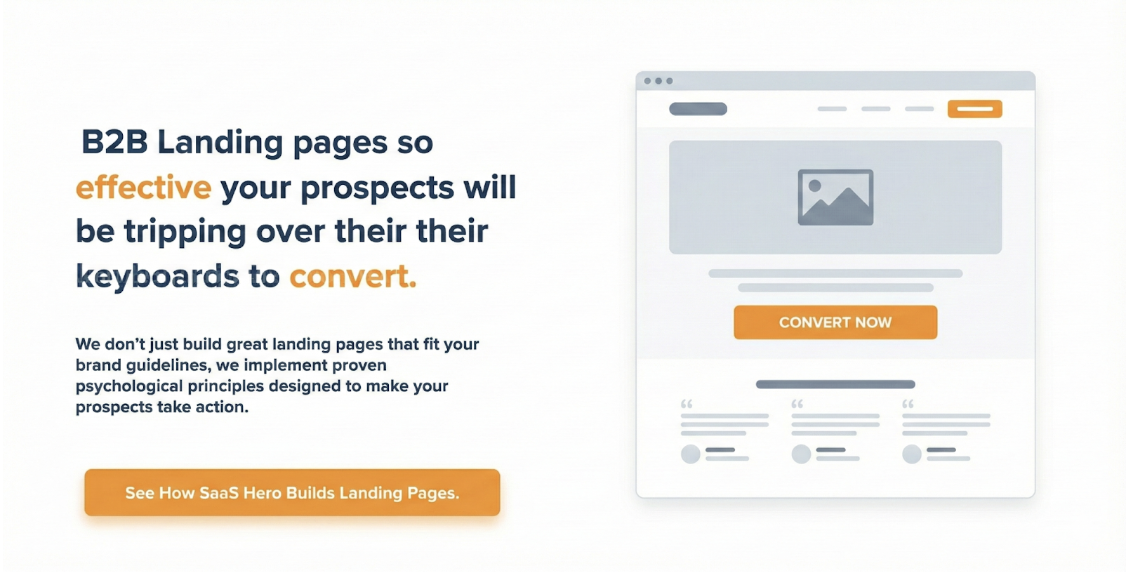
1. Minimalist Landing Page Design Ideas for SaaS
Minimalist SaaS landing pages like Grammarly and Dropbox use whitespace, a single prominent CTA, and clear value props to prevent decision paralysis. Landing pages with a single CTA convert at 13.5% compared to 10.5% for pages with five or more CTAs. Fewer choices reduce cognitive load and speed up decisions.
Grammarly’s homepage shows this clearly with a simple design, a direct product promise headline, and clear CTAs for browser install or desktop app. The page communicates value fast and avoids overwhelming visitors with long feature lists or complex navigation.
Steal This:
- Place G2 badges above the fold to create instant credibility before visitors read your value proposition.
- Use a single, benefit-focused CTA repeated 2–3 times to keep attention on one clear action.
- Keep headlines under 8 words, or about 44 characters, so mobile visitors grasp the message in one glance.
- Position customer logos near your primary CTA to reinforce trust at the decision point.
- Remove top navigation to eliminate exit paths that pull visitors away before they convert.
Minimalism still requires trust signals. SaaSHero’s minimalist redesigns lift conversions by 15–25% by placing testimonials and security badges where they support decisions without cluttering the layout.
2. Hero Sections That Drive the First Click
Minimalist structure sets the base, and the hero section decides whether visitors stay long enough to convert. Story-driven hero sections from companies like Notion and Linear use narrative headlines, micro-animations, and workflow visuals to show transformation within the first few seconds. Notion’s hero section uses the headline “one workspace. zero busywork” with a subheadline explaining team productivity gains, which communicates the core value immediately.
Linear’s website adds subtle motion and interface previews that act as lightweight product demos while keeping the page fast. These micro-interactions make the product feel responsive and reliable, which increases confidence in the software.
Steal This:
- Write benefit-driven headlines that promise a specific business outcome, not just a feature.
- Use scroll-triggered micro-animations that reveal product workflows step by step.
- Show real product UI screenshots instead of abstract illustrations to reduce doubt.
- Connect features to business outcomes with clear, emotional language.
- Test video backgrounds that show real product usage when performance budgets allow.
Feature-heavy headlines describe what the product does but not why it matters. Outcome-focused messaging highlights the transformation and drives action. SaaSHero’s hero section work for clients like Shop Boss achieved a 305% conversion increase by shifting from feature lists to transformation-focused copy and visuals.
3. Interactive Elements That Prove Value Fast
Interactive demos embedded directly in landing pages now act as self-serve sales reps. Visitors who engaged with interactive demos had a 63% higher lead generation conversion rate. Amplitude, Zendesk, and Forest Admin use tools like Guideflow to show real workflows without forcing a signup.
NitroPack replaced a static hero with an interactive URL-testing experience and increased conversions by about 23%. Prospects could experience the product’s impact on their own site instead of reading claims.
Steal This:
- Embed product tours using Navattic or similar tools so visitors can click through key flows.
- Add interactive calculators that show ROI or cost savings based on user inputs.
- Use clickable product mockups that reveal core features on tap or click.
- Reveal advanced capabilities with progressive disclosure instead of long feature lists.
- Show real-time data visualizations that demonstrate product impact on live or sample data.
Scale with SaaSHero’s proven interactive design strategies. See how we will build your interactive demo in a free strategy session.
4. AI-Personalized and Dynamic Landing Experiences
AI-powered personalization now shapes how B2B SaaS landing pages speak to each visitor. HubSpot data shows personalized CTAs perform 202% better than generic ones by aligning with visitor intent through IP data, firmographics, and behavior.
Figma’s landing page shows this clearly with dynamic value props and CTAs that adapt to context such as company size, industry, or workflow. Startup teams see different angles than enterprise buyers, which increases relevance and conversion rates.
Steal This:
- Serve dynamic headlines based on traffic source such as Google Ads or LinkedIn.
- Show industry-specific case studies that match the visitor’s vertical.
- Adjust pricing displays based on company size bands.
- Rotate social proof to feature companies similar to the visitor’s profile.
- Use behavioral triggers that adjust CTA urgency based on visit depth or return frequency.
This approach needs solid tracking and data, yet it pays off. McKinsey reports effective personalization programs deliver 5–15% revenue lifts and up to 50% CAC reductions.
5. Video-First Social Proof in the Hero
Video testimonials and product demos now sit at the center of many B2B SaaS hero sections. An analysis of 8,500 A/B tests found video testimonials deliver a 34% median conversion lift. SaaS companies also see 28% higher trial-to-subscription rates when testimonials appear near pricing.
Slack and Loom use video-first heroes that show real workflows and customer stories instead of static screenshots. Brightcove reports 88% of B2B buyers watched product videos in the past three months, so video now plays a central role in the buyer journey.
Steal This:
- Record customer testimonial videos that include specific metrics and outcomes.
- Create product demo videos under 90 seconds that walk through core workflows.
- Share founder story videos to build a personal connection and trust.
- Use screen recordings that show real product usage instead of polished mockups.
- Publish video case studies that highlight measurable business results.
Stock footage weakens trust. Authentic customer videos almost always outperform polished generic content, especially when placed near key conversion points.
6. Bento Grids and Split-Screen Layouts for Complex Products
Bento grid layouts now help B2B SaaS teams present complex products in a scannable way. The 2026 Landing UI Report states 67% of the top 100 SaaS websites on Product Hunt use bento grids, which correlates with 47% higher dwell time and 38% higher click-through rates. Linear, Notion, and Supabase use modular cards so visitors can skim and dive deeper where needed.
Decipad uses split-screen layouts that balance text and visuals for clear comparisons such as problem versus solution, user personas, or before and after states. This structure helps decision-makers understand value quickly without feeling overwhelmed.
Steal This:
- Design modular feature cards with consistent sizing, spacing, and clear headlines.
- Use split-screen layouts to show problem and solution side by side.
- Arrange testimonials in grid layouts so visitors can scan by role or industry.
- Build organized pricing comparison tables that highlight the recommended plan.
- Create feature-benefit matrices that map capabilities to outcomes in a grid.
Maintain a clear visual hierarchy inside each grid. Every module should support the primary conversion goal instead of competing with it.
7. Mobile-First Micro-Animations That Guide Attention
Most landing page visits now occur on mobile devices, so micro-animations must work well on touch screens. UserJot and Storylane use focused animations such as CTA hover states, scroll-triggered reveals, and animated icons to guide attention and show functionality.
Peec AI’s landing page uses micro-animations with clear intent. CTA buttons grow slightly on hover, scroll-based reveals keep visitors engaged, and animated icons explain product capabilities. These touches improve perceived responsiveness and satisfaction while keeping performance in check.
Steal This:
- Add touch-friendly button animations that give clear feedback on tap.
- Use scroll-triggered reveals to keep visitors moving down the page.
- Design loading animations that communicate progress instead of showing blank states.
- Introduce hover or tap states that preview extra information without clutter.
- Apply simple transition effects that guide the eye from one section to the next.
Keep animations light and purposeful. Test timing and motion on real devices so animations support the conversion goal instead of distracting from it.
8. Multi-Stakeholder Trust for B2B Buying Committees
Beyond visual polish and interactivity, B2B SaaS conversions depend on trust across a full buying committee. B2B SaaS purchases involve multiple decision-makers, so landing pages must address different stakeholder concerns. Gong and Superhuman use layered social proof such as customer logos, detailed testimonials with metrics, and industry awards to build confidence.
Superhuman’s landing page claims to “Save 4 hours per person every single week” and backs it up with “15 million hours saved.” This type of quantifiable benefit builds credibility quickly. G2 and Capterra badges increase landing page conversions by 15–22% by adding third-party validation.
Steal This:
- Group customer logos by industry or company size so visitors find relevant peers.
- Write testimonials that speak to specific roles such as IT, Finance, or end users.
- Display security certifications and compliance badges where risk-owners look first.
- Highlight case studies that show measurable business outcomes and timelines.
- Feature awards and recognition from respected industry publications.
Spread trust signals across the page instead of hiding them in one block. Each stakeholder should encounter proof that speaks directly to their risks, goals, and decision criteria. Transform your landing page performance with SaaSHero’s multi-stakeholder optimization strategies. Let’s map your stakeholder journey and identify conversion gaps.
Free Resources: Figma Templates for These Trends
Download 5 editable Figma templates based on the top-performing trends above. Each template includes conversion-focused layouts, proven copy frameworks, and mobile-responsive designs ready for your brand.
The table below summarizes the core elements and expected conversion lift for each trend so you can choose which template to launch first based on your current performance.
| Trend | Key Elements | Expected Conv Lift |
|---|---|---|
| Minimalist | Single CTA + Social Proof | 15–25% |
| Interactive | Embedded Demos + Progressive Disclosure | 20–30% |
| AI-Personalized | Dynamic CTAs + Behavioral Triggers | 25–40% |
Access these templates and get tailored guidance by requesting a free template walkthrough with our landing page optimization team.
FAQ
What makes a simple landing page design convert in B2B SaaS?
Simple landing page designs convert through clarity, not complexity. Focus on a single conversion goal with one prominent CTA and a value proposition that visitors can understand in under 5 seconds. Place social proof near conversion points and remove navigation menus or secondary links that create exits. Use whitespace to guide attention and design for mobile first, since most B2B traffic now comes from mobile devices.
How to get free landing page design templates?
SaaSHero provides 5 conversion-focused Figma templates that cover minimalist, interactive, AI-personalized, video-first, and bento grid layouts. Each template includes proven copy frameworks, mobile-responsive designs, and CRO best practices you can adapt to your product.
Best landing page UI trends for 2026?
Top 2026 B2B SaaS landing page trends include AI-powered personalization with dynamic CTAs, interactive product demos in hero sections, mobile-first micro-animations, bento grid layouts for complex products, and video-first social proof. Each trend reduces cognitive load while increasing engagement and trust through specific, relevant experiences.
Common CRO mistakes for SaaS landing pages?
Major conversion mistakes include using multiple CTAs that create decision paralysis, long forms that increase abandonment, and generic messaging that ignores specific pain points. Lack of mobile optimization also hurts performance. Pages with 5 or more CTAs convert 23% lower than single-CTA pages, and reducing form fields from 11 to 4 can increase conversions by 120%. Keep one clear conversion goal per page.
How does landing page design impact CAC and ARR?
Landing page performance directly affects customer acquisition cost and annual recurring revenue through conversion rates. A 1-point conversion lift can reduce CAC by 15–25%. High-performing B2B SaaS landing pages that reach 15–20% conversion rates, compared to the 3.8% industry median, can drive large ARR gains. Effective personalization programs also deliver 5–15% revenue lifts and up to 50% CAC reductions by improving targeting and message fit.
Conclusion: Turn These Trends into Revenue
The most impactful landing page trends for 2026 are minimalist layouts with targeted social proof, interactive product demonstrations, and AI-powered personalization. Together they often deliver 15–30% conversion lifts when paired with mobile-first design and clear value propositions.
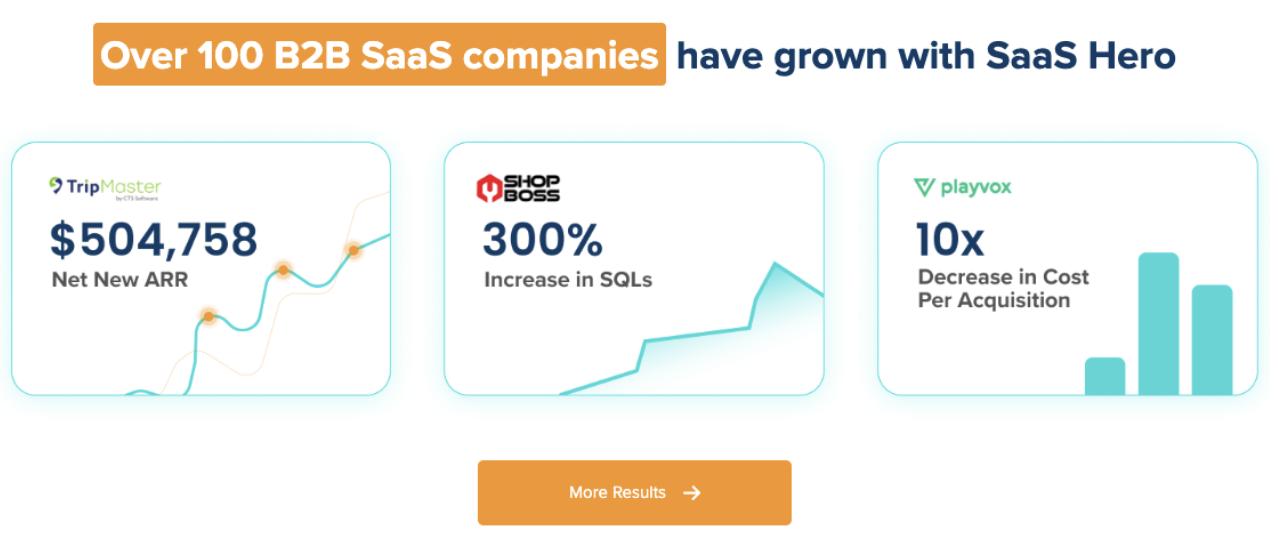
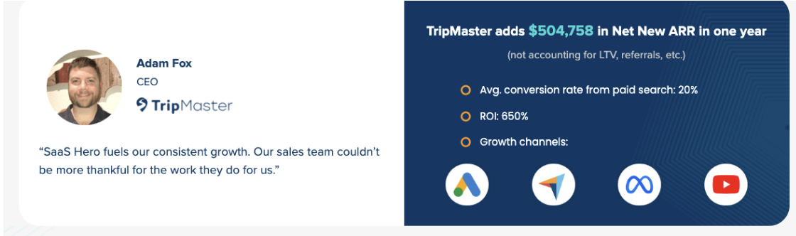
Apply these strategies using SaaSHero’s conversion optimization framework. Our systematic approach has generated $500k+ ARR increases and 650% ROI for B2B SaaS clients through data-backed landing page improvements.
SaaSHero delivers $750 custom designs, month-to-month flexibility, and a track record of $500k+ ARR gains. Start your landing page transformation today.