




Written by: Aaron Rovner, Founder, Saas Hero | Last updated: July 11, 2026
Key Takeaways for SaaS Marketers
- Rising CAC and longer sales cycles make higher-converting landing pages the fastest way to grow pipeline without more ad spend.
- Moving from a 1.5% to 3% demo request rate on paid search can match the pipeline impact of doubling monthly spend.
- The ten trends in this guide come from live platform data, A/B tests, and heuristic audits across hundreds of B2B SaaS builds.
- Each trend includes a definition, conversion mechanism, documented lift, and a practical checklist you can ship this month.
- Book a discovery call with SaaSHero to get a heuristic audit of your current landing page and start improving conversions today.
Executive Summary: Metrics and Trend Framework
Three core metrics anchor every trend in this guide.
- Demo request rate: The percentage of landing page visitors who submit a demo request form. The 2026 benchmark for B2B SaaS demo request pages sits at 1.5–4%, with top-quartile performance at 5%+.
- SQL-to-opportunity rate: The percentage of sales-qualified leads that progress to an active sales opportunity. Interactive demo engagement and personalized page variants influence this rate by improving lead quality before the first sales touch.
- Heuristic audit: A structured, expert-led review of a landing page against usability and persuasion principles, including relevance, clarity, trust, and friction. This process surfaces conversion killers without waiting weeks for traffic data. SaaSHero uses this methodology as the first step in every engagement.
The ten trends below move from hero-section architecture through proof stacking, CTA mechanics, performance, and competitor-conquesting variants. SaaSHero’s heuristic CRO framework provides the execution layer that sequences and ships these changes under a flat monthly retainer with month-to-month terms. Let’s start with the foundation of your page: the hero section.
Trend 1: Story-Driven Hero Sections
A story-driven hero replaces a static tagline with a short narrative moment. It names the target user, shows the problem-to-solution arc, and uses micro-animations or workflow illustrations to show transformation instead of listing features. All of this happens within the first viewport.
- Outcome-driven headlines score an average of 14 points higher than feature-driven headlines (58 vs. 44), and headlines using customer-sourced vocabulary can outperform marketer-written headlines.
- High-performing H1s on a B2B SaaS landing page stay concise to force clarity and remove jargon.
- Modern story-driven heroes use animation or micro-interactions to demonstrate product workflow rather than describe it, as seen in Notion, Linear, and Framer.
Documented lift: A B2B analytics scale-up increased its conversion rate after shifting to outcome-led headlines and a generative video hero.
Implementation checklist:
- Write a concise H1 using a customer-sourced outcome phrase.
- Add a subheadline that names the specific role and problem solved.
- Replace static product screenshots with a loopable micro-animation showing one core workflow.
- Place a single primary CTA in the hero with no competing links.
Trend 2: Interactive Product Demos in the Hero Area
An interactive product demo embedded in or immediately below the hero lets visitors explore the product before speaking to sales. This approach replaces a fully gated demo request form with a self-serve experience that qualifies intent in real time.
- Visitors engaging with interactive demos can achieve higher conversion rates than the dataset average.
- Awareness-stage interactive demos embedded in website product tours can lift visitor-to-meeting-booked metrics per platform benchmarks.
- Interactive demos with an optimal number of steps deliver higher completion rates based on data from large numbers of demo sessions.
Documented lift: A B2B SaaS HR technology company replaced a gated demo request form with an ungated interactive product tour on its pricing page, lifting conversion.
Implementation checklist:
- Build an interactive tour using Storylane, Walnut, or Arcade.
- Embed the tour ungated, directly in or below the hero section.
- Gate only the follow-up CTA such as “Talk to an expert about what you just saw.”
- Track demo completion as a conversion event in your CRM.
Trend 3: Stacked Social Proof Above the Fold
Stacked social proof places multiple trust signals within the first viewport. Logo bars, G2 badges, review counts, and customer quotes appear beside or just below the hero instead of in a mid-page section that many visitors never reach.
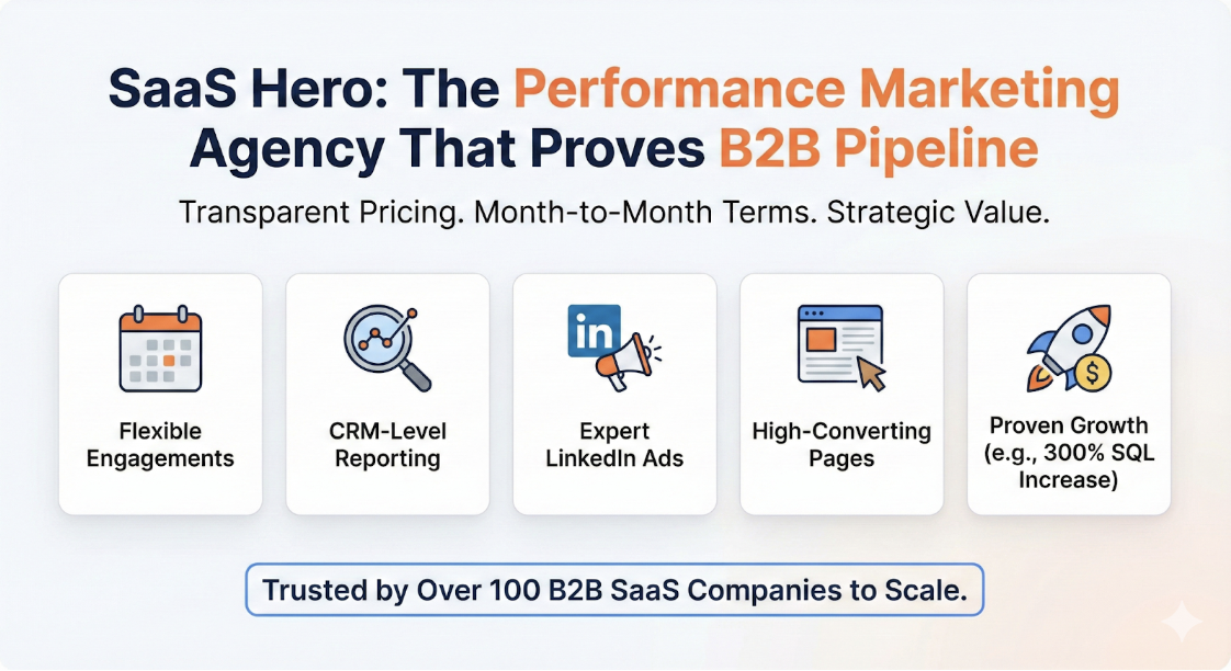
- B2B pages with credible social proof convert higher than pages without it.
- First-time visitors lose conversions if proof is not visible before scrolling; critical proof elements include company logos, review badges such as “4.8 stars from 2,000+ reviews,” and real user counts.
- High-performing 2026 SaaS landing pages consistently embed social proof directly in the hero section rather than below it.
Documented lift: Some companies have achieved lifts in qualified leads by replacing a “Request a Demo” CTA with an ungated interactive product tour combined with prominent above-the-fold proof elements.
Implementation checklist:
- Place a logo bar of 6–10 recognizable customer logos immediately below the hero CTA.
- Add a G2 or Capterra badge with star rating and review count inline with the logo bar.
- Include one short customer quote under 20 words with name, title, and company.
- Remove rotating testimonial carousels. Static grids convert better than carousels.
Trend 4: Outcome-Led, First-Person CTAs
Outcome-led CTAs replace generic verbs such as “Submit” or “Get Started” with first-person phrasing that states a specific result the visitor receives. This approach reduces the perceived cost of clicking and aligns button copy with the visitor’s internal motivation.
- First-person CTA copy such as “Start My Free Trial” outperforms second-person phrasing by 25% or up to 90%. Pages with one named CTA outscored pages with three generic CTAs by 31% according to roast.page analysis of 8,400 buttons.
- The CTA “Book a demo” can outperform “Contact sales” on many B2B pages.
- HubSpot data shows personalized CTAs perform 202% better than generic alternatives by aligning language with visitor intent signals.
Implementation checklist:
- Rewrite every CTA button in first-person, such as “Show Me My Pipeline” instead of “See Features.”
- Add a micro-copy line below the CTA button that states what happens next, such as “15-minute call, no commitment.”
- Test one outcome-specific variant per traffic segment such as paid search versus organic.
- Ensure the primary CTA is visible without scrolling on every device.
Trend 5: Mobile-First Layouts with Sub-2-Second LCP
Mobile-first adaptive design treats the mobile experience as the primary layout and then adapts upward to desktop. Sub-2-second Largest Contentful Paint (LCP) sets the performance threshold that separates converting mobile pages from bouncing ones.
- Unbounce reports 83% of landing page visits occur on mobile, yet desktop converts approximately 8% better.
- Pages that load quickly convert better than pages that load slowly.
- Autofill-enabled forms can convert better on mobile, and sticky mobile CTAs at the bottom of the viewport lift conversion by 9–14% on scrolling pages.
Implementation checklist:
- Achieve LCP of 2.5 seconds or less and target 1.5 seconds or less. Use CDN delivery, lazy loading, and compressed WebP images.
- Set all tap targets to a minimum of 44px by 44px.
- Enable autofill on all form fields.
- Add a sticky CTA bar at the bottom of the mobile viewport.
- Reduce visible form fields to three or fewer on mobile.
Trend 6: Dark-Mode Performance Optimization
Dark-mode optimization ensures landing pages render correctly and convert at parity in dark-mode environments. These environments now represent a significant share of B2B SaaS buyer sessions, especially on OLED mobile devices and in developer-adjacent verticals.
- High-performing 2026 SaaS landing pages consistently use dark mode with glassmorphism UI as a design standard, not an optional variant.
- Dark-mode pages must maintain WCAG 2.1 AA contrast ratios of 4.5:1 for body text and 3:1 for large text to avoid accessibility-driven bounce on assistive technology.
- CLS scores above 0.1 caused by theme-switching repaints degrade Core Web Vitals and Google Ads Quality Score. This degradation can raise cost-per-click by 22% versus a fast competitor.
Implementation checklist:
- Implement CSS
prefers-color-schememedia queries for automatic dark-mode detection. - Audit all CTA button colors for a 3:1 contrast ratio in dark mode.
- Test glassmorphism card elements for legibility on dark backgrounds across Chrome, Safari, and Firefox.
- Verify CLS score remains 0.1 or lower after theme-switch repaints using Lighthouse.
Trend 7: Bento-Grid Feature Modules
Bento-grid feature modules organize product capabilities into a CSS Grid of rectangular tiles with varying sizes. Spatial weight communicates priority before a visitor reads any text and replaces long vertical feature lists that require heavy scrolling.
- Sixty-seven percent of the top 100 SaaS products on ProductHunt use bento grid modular layouts in 2026.
- Modular compartmentalized layouts enable a 34% improvement in user task completion rates, per Google Material Design 3.0.
- Eye tracking studies show users fixate longer on larger bento grid items.
Implementation checklist:
- Use a 12-column CSS Grid with a 100px base unit and 16px gutters.
- Limit hero tiles that span 4–6 columns by 2 rows to a maximum of two per screen.
- Allocate 60–70% of each card’s height to a visual element and 20–30% to a 1–6 word headline.
- Set explicit minimum heights on all tiles and use skeleton loading states to keep CLS at 0.1 or lower.
- Design simultaneously for desktop with three columns, tablet with two columns, and mobile with one column.
Trend 8: Dynamic Personalization by Intent
Dynamic personalization swaps headlines, imagery, case studies, and CTA copy based on traffic source, industry, company size, or keyword intent. This approach serves a different page experience to a mid-market HR tech buyer than to an enterprise fintech evaluator without creating separate URLs for every segment.
- McKinsey studies report that effective personalization programs can deliver revenue lift.
- Dynamic personalization based on traffic source or industry can lift conversion when segments are meaningful.
- B2B teams that personalize 50% or more of their demos achieve 40% or higher conversions than teams using generic demo templates, per Walnut platform data.
Implementation checklist:
- Define three to five meaningful segments such as industry vertical, company size, or paid keyword group.
- Swap the H1, hero subheadline, and primary case study logo for each segment.
- Pass UTM parameters into your personalization layer to trigger the correct variant.
- Measure segment-level conversion rates separately in your CRM instead of relying only on aggregate page analytics.
Trend 9: Minimal Navigation with Sticky Primary CTA
Minimal navigation removes the standard site header menu from landing pages and replaces it with a sticky bar that contains only the brand logo and a single primary CTA. This structure eliminates exit paths that send high-intent paid traffic back into the general site.
- Pages with a single CTA convert at 13.5% on average, while pages with 5 or more links drop to 10.5%.
- Conversion-optimized navigation on 2026 SaaS landing pages features fewer links, smart sticky headers with persistent primary CTAs, and anchor links to reduce distraction.
- High-converting SaaS landing pages follow a fixed skeleton that includes a hero section with one CTA and no navigation, followed by social proof above the fold.
Implementation checklist:
- Remove the full site navigation from all paid traffic landing pages.
- Add a sticky header containing only the logo and one CTA button.
- Replace footer navigation links with a single repeated CTA and a privacy policy link.
- Use anchor links within the page for section navigation rather than external links.
Trend 10: Competitor-Conquesting Landing Page Variants
Competitor-conquesting variants are dedicated landing pages built for three distinct intent buckets: pricing intent, problem or complaint intent, and review or validation intent. Each variant matches the specific psychological state of a buyer who actively evaluates or feels frustrated with a named competitor. These pages run on negative-keyword-filtered campaigns that exclude navigational searches and target only evaluative modifiers.
- Pricing-intent pages target searches such as “[Competitor] pricing” and lead with a direct cost comparison or total cost of ownership table. This buyer feels price-sensitive and wants hard numbers immediately.
- Problem-intent pages target searches such as “[Competitor] alternatives” or “cancel [Competitor]” and open with a problem-solution frame that addresses the competitor’s known weaknesses. These visitors are churn risks for the competitor and high-intent prospects for you.
- Review-intent pages target searches such as “[Competitor] reviews” or “[Competitor] vs [Your Brand]” and aggregate G2 badges, Capterra ratings, and side-by-side feature comparisons to control the narrative during the consideration phase.
Negative keyword hygiene forms the execution layer that keeps this strategy efficient. By negating the competitor’s brand name alone, you filter out navigational searches from users who only want the login page and concentrate spend on evaluative and purchase-intent queries. This focus targets the exact audience these variants are built to convert and requires ongoing management to maintain performance. SaaSHero builds and manages these variant architectures as part of its standard retainer and follows legal safe practices, including competitor names used only in factual comparisons, no competitor logos, and headlines that clearly identify the advertiser.
Recommended 2026 Landing Page Structure
| Section | Element | Conversion Rationale |
|---|---|---|
| Hero | Outcome-led H1, benefit subheadline, single primary CTA, micro-animation or interactive demo embed | Outcome-driven headlines score an average of 14 points higher than feature-driven headlines (58 vs. 44); first-person CTA phrasing delivers significantly higher conversion than second-person alternatives |
| Above-the-Fold Proof | Logo bar (6–10 logos), G2/Capterra badge with review count, one short customer quote | Social proof can lift B2B page conversion |
| Interactive Demo | Ungated product tour embedded below hero | Interactive demos can improve conversion rates |
| Feature Modules | Bento-grid layout, 3-column desktop / 1-column mobile, outcome-framed card headlines | Bento grids improve task completion rates through spatial hierarchy |
| Personalized Section | Dynamic case study swap by industry or role, personalized CTA copy | Personalized CTAs perform 202% better than generic alternatives per HubSpot data |
| Form | 3-field maximum, autofill-enabled, multi-step if 4+ fields required | Three-field forms convert at 10.1% and 25% better than nine-field forms per Unbounce 2026 Conversion Benchmark Report |
| Navigation | No site menu; sticky header with logo and single CTA only | Minimal navigation reduces exit paths and improves conversion |
| Performance | LCP ≤ 2.5s, CLS ≤ 0.1, dark-mode parity, 44px minimum tap targets | Fast-loading pages convert better |
| Final CTA | Repeated primary CTA with outcome-specific copy, social proof echo such as review count | High-converting SaaS pages repeat the final CTA at the bottom of the page |
Frequently Asked Questions
Implementation Timeline for These Landing Page Trends
Most structural changes such as minimal navigation, outcome-led CTAs, stacked above-the-fold proof, and bento-grid feature modules fit into a two to three week window on most CMS platforms. Interactive demo embeds from tools like Storylane or Arcade usually require one to two days of setup once the demo flow is scripted. Dynamic personalization takes longer, often three to four weeks, because it requires defining segments, building variants, and connecting UTM parameters to the personalization layer. SaaSHero ships landing page builds under a flat retainer, so design, copy, and development work sit inside the engagement instead of being scoped and billed separately.
Using These Trends on Free-Trial and Demo Request Pages
The structural principles of minimal navigation, above-the-fold proof, fast load times, and outcome-led CTAs apply to both free-trial pages and demo request pages. The main differences appear in CTA framing and form length. Free-trial pages benefit from shorter forms, often email only, and CTAs that emphasize immediacy such as “Start My Free Trial in 30 Seconds.” Demo request pages require slightly more qualification fields but should still stay at three fields or fewer on the initial form and then use a multi-step flow to collect additional context after the first submission. Interactive demos work especially well on demo request pages because they pre-qualify intent before the sales call and improve SQL-to-opportunity rates.
Heuristic Audits Compared to A/B Testing
A heuristic audit is an expert-led review of a landing page against established usability and persuasion principles such as relevance, clarity, trust, friction, and distraction. Three evaluators independently assess the page and produce a prioritized list of conversion killers. This process takes days instead of months and does not require statistical traffic volumes. A/B testing, by contrast, needs sufficient traffic to reach statistical significance, which most B2B SaaS landing pages cannot generate quickly enough to stay actionable. No study of more than 28,000 A/B tests exists in 2026 data; reported statistical significance rates for winners range from 2% to 36.3% across available analyses. SaaSHero uses heuristic audits to identify and fix the highest-impact issues first and then layers in A/B testing once baseline conversion rates justify the traffic investment.
Legal Safety for Competitor-Conquesting Pages
Competitor-conquesting pages stay legal when they use competitor names only in factual, comparative statements, avoid reproducing competitor logos or trademarked visual assets, and ensure the page headline clearly identifies the advertiser. Legal risk arises from “passing off,” which means creating a page that visitors could mistake for the competitor’s own site. SaaSHero follows strict safe-practice guidelines on every conquesting build, including factual comparisons only, no competitor logos, and clear advertiser identification in the headline and URL structure. Google’s advertising policies permit competitor keyword targeting, so the legal exposure sits in the landing page content, not the ad itself.
What SaaSHero’s Flat Retainer Covers for Landing Pages
SaaSHero’s retainer model covers campaign management, landing page design, and CRO iteration under a single fixed monthly fee. Landing page design is priced at a $750 flat fee per build, and creative ad assets are available at $300 for five ads. The retainer itself is tiered by monthly ad spend and channel count, starting at $1,250 per month for a single channel managing up to $10k in spend. All engagements run month-to-month with no long-term lock-in, so SaaSHero re-earns the relationship every 30 days. This structure removes the percentage-of-spend conflict of interest that pushes traditional agencies to recommend budget increases regardless of performance efficiency.
Next Step: Ship a Higher-Converting Page This Month
The ten trends above describe the current standard for B2B SaaS landing pages that turn high-intent paid traffic into demo requests and SQLs. Every month a legacy static page runs against this standard, it compounds CAC and extends payback periods.
SaaSHero’s heuristic CRO framework identifies the highest-impact changes on your current page within days, not months. The flat retainer model means design, copy, and implementation stay included, with no percentage-of-spend billing, no 12-month contracts, and no junior handoffs. The engagement remains month-to-month because results keep clients.
Schedule your landing page audit this month