

The difference between high converting landing pages and those that produce lackluster results isn’t just in the design itself (colors, images, font, etc.), but it lies in the usability of the page.
Creating convenient user experiences on your Unbounce landing pages should be as much of a priority as writing compelling copy.
As far as landing page building software goes, there is none better than Unbounce. Its sophisticated drag and drop interface, advanced features such as dynamic text insertion and a dozen other things make it the preferred landing page design tool for tons of B2B SaaS companies spending money on paid search and social.
We’ve designed hundreds of Unbounce landing pages for our clients at SaaS Hero, here are 4 of our favorite usability tips with detailed instructions on how to execute each of them.
-
- Unbounce Sticky Header
While they’re extremely common on most websites, sticky headers are often an afterthought on Unbounce landing pages used for converting paid search traffic.
The reason for the disparity likely lies in the fact that most WordPress themes come with sticky headers baked in out of the box, while activating sticky headers on Unbounce pages requires some customization that isn’t all that clear to most users.
Before we explain exactly how to deploy a sticky header on your Unbounce landing page, here are a few reasons why they are so effective for converting traffic on B2B SaaS landing pages.
Easy Navigation: Sticky headers can significantly improve user experience by making site navigation easier and more intuitive. Regardless of how far down the page the user scrolls, they always have access to the main navigation options. This can make the site more user-friendly and encourage users to take desired actions like signing up, requesting demo’s, or downloading.
Brand Visibility: A sticky header usually contains the company’s logo or name, which can enhance brand awareness and trust. Continuous exposure to the brand may increase the likelihood that a user will engage with the page, leading to higher conversion rates.
Call-to-Action Accessibility: If your sticky header contains a prominent call-to-action (CTA), such as a “Sign Up” or “Request A Demo” button, it remains visible to users at all times. This constant visibility of the CTA can motivate users to take the desired action, increasing the probability of conversions. It also reduces the need for users to scroll back to the top of the page to take the desired action, thereby improving the user experience.
Now that we know why sticky headers can be so effective for converting paid traffic. Here’s how to add them to your Unbounce landing pages:
- Create a box that spans the width of the page at the top of the pageAdd your logo on the left hand side
- Add your CTA on the right hand side (e.g. Request A Demo)
-
-
- Make sure the Click Action on the CTA is using the Dropdown item Go to URL
-
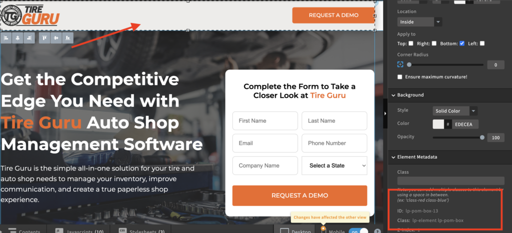
- Set the URL to lp-pom-box-#, where the # is the ID of the header section where the form lives
-
- You can get the section ID by clicking on the section you want users to jump to upon clicking on the CTA and then viewing the ID under the Element Metadata
-
- Set the URL to lp-pom-box-#, where the # is the ID of the header section where the form lives
-
-
- Click the Javascript button at the bottom of the page and select Add New Javascript
- Copy and paste the following code into the text box
- NOTE: be sure to update the # in the line “lp-pom-box-#’ with the actual ID associated with the box that lives at the top of the screen. In the case of the screenshot below, it would read ‘lp-pom-box-13’
<script type="text/javascript">

  // Fixed Header v1.1

  // Replace ID below with your own box ID
  var boxToAppend = '#lp-pom-box-#';

  var boxParent = $(boxToAppend).parent();

  $(boxToAppend).clone().appendTo(boxParent).css({"position":"fixed", "left":"0", "top":"0", "width":"100%", "z-index":"899"}).children().remove();

  $(boxToAppend).css({"position":"fixed", "left":"auto", "top":"0px", "width":"100%", "z-index":"999", "border-style":"none none none none", "border-width":"0px", "background":"none"});

</script>
2. Unbounce Multi-Step Forms
One of the longest standing conversations in the world of conversion rate optimization (CRO) is form length.
There are cases to be made for longer forms that help to better qualify prospects, shorter forms that drive higher volume of leads and everything in between.
However, there is a proven middle ground that many B2B SaaS advertisers who use Unbounce landing pages often forego, for no other reason than difficulty to execute.
Multi-step forms.
Understanding the power of multi-step forms can significantly impact your conversion rates. Here are three specific reasons on why multi-step forms should be part of your lead generation strategy when using Unbounce pages for B2B SaaS.
1. Progressive Disclosure Boosts User Engagement
As we mentioned, long forms can be daunting and lead to user drop-off while short forms might not do a good enough job of qualifying prospects. By breaking down the information collection process into smaller, more manageable steps, multi-step forms employ the strategy of progressive disclosure, which can drastically increase form completion rates.
In the case of B2B SaaS businesses, where the information needed might be more detailed or technical, multi-step forms can simplify the process. They allow users to focus on one piece of information at a time, reducing the perceived complexity and effort.
2. Reducing Friction
Nothing derails the conversion process faster than friction. Multi-step forms can effectively reduce this friction by starting with easy-to-answer questions. This can provide users with an immediate sense of accomplishment, motivating them to continue through the form. It’s a more engaging way to capture user information and can reduce drop-off rates compared to traditional single-page forms.
For B2B SaaS companies, this approach can be especially beneficial. By starting with simple queries before moving onto questions about company size, role, budget, or other specific needs, potential customers are more likely to complete the form, contributing to a higher conversion rate.
3. High-Quality Lead Generation
One of the key benefits of multi-step forms is the ability to better qualify leads. By strategically placing important qualifying questions in the form, you can filter out visitors who are less likely to convert, thus increasing the percentage of high-quality, relevant leads.
For B2B SaaS companies, where the sales process can be longer and more complex, gathering this information early can streamline the sales cycle. Only relevant, interested leads are passed to your sales team, improving efficiency and ultimately boosting conversion rates.
Here is how to deploy multi-step forms on Unbounce pages.
Keep in mind, this version will only collect form submissions when the entire multi-step form is completed.
Here is the exact javascript you need to activate multi-step forms in Unbounce.
Some important things to note that will need to be edited in the javascript
Change the text on var startingCTACopy = ‘name-of-your-CTA-to-move-users-to-step-2’to whatever you’d like the button that pushes users to the next step in the form to be (e.g. “Next”)
- Enter the name of the heading for Steps 2 – x under the section labeled // Set form headlines, if no change leave at ”
- Enter the name of the CTA for Steps 2 – x under the section labeled // Set CTA copy Changes, if no change leave at ”
Here’s a quick video showing how to style your form in the Unbounce landing page builder.
3. Redirect to unique destination upon form completion
Most B2B SaaS advertisers know that not all leads are created equal. It’s extremely common for two completely different types of prospects to be conducting nearly identical keyword searches and winding up on your Unbounce landing page.
For example, one of our clients who offers an Applicant Tracking System, has a field in their demo request form that asks the question “How many recruiters work in your firm?” where users can select one of the following options from the dropdown menu:
- 1 – 5
- 6 – 15
- 15 – 50
- 50+
Since they charge per user per month, leads that have indicated they have more recruiters are given a higher priority.
In light of that, they’ve also organized their sales team to handle leads based on the number of recruiters that are in the organization, where more senior reps handle the larger leads and the more junior team members handle the smaller leads.
In order to route leads accordingly, the client has set up unique /thank-you pages for each sales rep that have their calendars embedded in the page.
Using the javascript below, we’re able to redirect users to the appropriate landing page based on the selection they make on the “How many recruiters work in your firm?” dropdown menu mentioned previously.
<script>
$("#number_of_recruiters_at_your_firm").on('change', function() {
  switch ($(this).val()) {
    case '1 - 5':
        window.module.lp.form.data.url = "https://www.website.com/get-a-demo-thank-you-starter/";
        break;
    case '6 - 15':
        window.module.lp.form.data.url = "https://www.website.com/get-a-demo-thank-you-us-paul/";
        break;
    case '16 - 50':
        window.module.lp.form.data.url = "https://www.website.com/get-a-demo-thank-you-us-16-50-matt/";
        break;
    case '50 +':
        window.module.lp.form.data.url = "https://www.website.com/get-a-demo-thank-you-us-50-matt/";
        break;
  }
});
</script>
This script works by following these instructions:
-
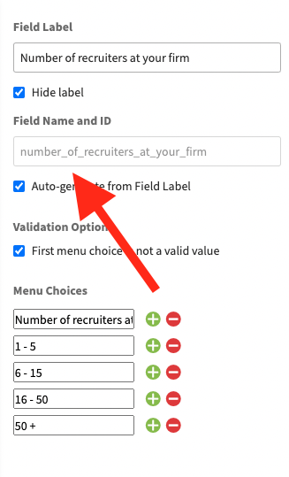
- Replace the line “#number_of_recruiters_at_your_firm” with the text in the Field Name and ID in the Unbounce form. See the screenshot below for an example.
-
- If you’re deploying this script based on a selection of a dropdown menu item, replace the lines “case ‘1 – 5’, case ‘6 – 15’”, etc. with whatever your menu items say, just be sure to leave the word “case“
4. Only Accept Business Emails in Forms
One of the most common gripes B2B SaaS advertisers have is when forms are filled out using free or personal email addresses.
Sales people hate those leads, and usually for good reason.
As soon as a rep sees a gmail, outlook, aol, etc. email address, it’s almost a guarantee that the lead won’t get worked with the same enthusiasm (if at all) as a lead that uses a business email.
B2B SaaS advertisers should employ forms that accept only business emails and not free ones for a number of compelling reasons.
Accepting only business emails ensures a higher level of audience quality. These email addresses are tied to specific organizations, and by limiting access to them, you are likely to attract serious, professional individuals who are more likely to be involved in decision-making processes at their respective companies. This directly aligns with the B2B focus.
Secondly, business email addresses can provide valuable insight into the person’s company, industry, and role, allowing for more tailored and efficient communication. In contrast, free email services like Gmail, Outlook, or AOL do not necessarily represent a professional or corporate identity. They can be created anonymously and used for non-business related purposes, leading to potential dilution of your target audience and waste of marketing resources.
Everyone reading this likely has a “burner” email account (or two) that they use to fill out forms from businesses they have no intention of taking further action in.
Filtering for business emails can significantly improve the quality of leads, enhance the effectiveness of marketing campaigns, and ultimately increase return on advertising spend (ROAS).
Here is the javascript necessary to block most free email domains
<script>
  window.ub.form.customValidators.nonWebmailEmail = {
    isValid: function(value) {
      return /\@(?!(me|mac|icloud|gmail|googlemail|hotmail|live|msn|outlook|yahoo|ymail|aol)\.)/.test(value.toLowerCase());
    },
    message: 'Please enter your work email address',
  };
</script>
<script>
window.module.lp.form.data.validationRules['work_email'].nonWebmailEmail = true;
</script>
If you ever encounter any free/fake domains from people trying to bypass the script (e.g. [email protected]), add them after “|aol” by placing a vertical “bar” (|) directly after “aol” and then type the domain.
E.g. using the example above, it would look like “aol|company)”.
Conclusion
Start using these UX tips for your Unbounce landing pages and watch your lead quality and conversion rates increase.
If you need any help on designing or optimizing your Unbounce landing pages, schedule a call with us so we can learn more about your needs and help you build a high converting landing page for your B2B SaaS product.