




Written by: Aaron Rovner, Founder, Saas Hero | Last updated: August 30, 2026
Key Takeaways
- Quantified outcome ads replace vague claims with a specific number in the top-left quadrant at 80px or larger, which forces quick mental calculation and lifts click-through rate.
- Pain-point ads follow the F-pattern and PAS copy, naming the buyer’s frustration first and reaching up to 8.1% conversion versus 3.2% for generic messaging.
- Proof-first and old-way-vs-new-way layouts put before-and-after evidence in front of the viewer so the magnitude of change is clear within three seconds.
- ICP-specific and competitor-switching headlines narrow the message to one role or trigger, producing 2.3× higher win rates and 15–40% conversion lifts.
- SaaSHero builds and measures these five value-proposition patterns as one system, then runs a six-concept testing cadence tied directly to your CRM pipeline; book a discovery call to see how this works in your account.
1. Quantified Outcome Ad Layouts That Force Calculation
Quantified outcome ads replace category claims with a specific, verifiable number tied to a business result the buyer already wants. A clear number makes the brain calculate instead of dismiss the message. HubSpot’s February 2026 headline “Grow Traffic 6x Faster” demonstrates this principle in practice, as the “6x” claim nearly doubled the industry-average click-through rate and delivered 505% ROI over three years. TestGorilla applied the same quantified approach to customer acquisition, using specific outcome numbers to acquire over 5,000 new customers with its skills testing platform.
The visual rules that make these numbers register in under three seconds follow a consistent pattern. Eye-tracking studies show the top-left quadrant of ads receives 60–70% of initial fixations, so that quadrant becomes the correct placement for the quantified claim. Because approximately 83% of social media usage and ad spend occurs on mobile devices, minimum font sizes of 48px for body text and 80px for headlines keep the claim readable on a phone without zooming. Together, placement and size ensure the number actually lands in those first few seconds.
The copy framework carries equal weight. B2B SaaS teams following the 40-40-20 rule, with 40% value proposition, 40% pain-point highlighting, and 20% CTA, have achieved up to 650% growth in ROAS. The number in the headline acts as the proof that earns the click, while the body copy names the pain and the CTA gives a single clear next step.
- Place the quantified claim in the top-left at 80px or larger so it lands where the eye goes first.
- Pair the number with the specific role it benefits, such as “HR Leaders,” so the right buyer immediately recognizes themselves.
- Use a single high-contrast CTA color against a muted background to create one obvious action.
- Reserve the remaining frame for one supporting visual, not multiple claims, because extra elements dilute the primary message.
2. Pain Point Ad Design That Triggers Recognition
While quantified outcome ads lead with proof of what is possible, pain point ads lead with the problem itself. Pain point ad design names the operational frustration the buyer feels before they have fully articulated it. The reaction it creates is recognition, a sense of “these people understand my situation,” rather than hard persuasion. PAS (Problem-Agitation-Solution) copy achieved an 8.1% conversion rate and $220 customer acquisition cost versus 3.2% and $485 CAC for generic messaging in a comparative study of B2B SaaS ad messaging.
The visual hierarchy for pain point ads follows the F-pattern. The F-pattern, documented by the Nielsen Norman Group through eye-tracking research, requires ad copy to front-load hooks and value propositions in the first two lines and start each subsequent line with the most important words, since readers only catch the first 2–3 words during vertical scanning. This pattern means the pain statement should occupy the first full line at maximum weight.
B2B SaaS lead-gen ad layouts perform better when they place the pain point or business outcome at the top, use a cropped UI panel only as supporting proof, and keep the CTA direct rather than allowing screenshots to dominate the frame. In this structure, the pain point acts as the hook, the UI acts as the evidence, and the CTA remains the single ask.
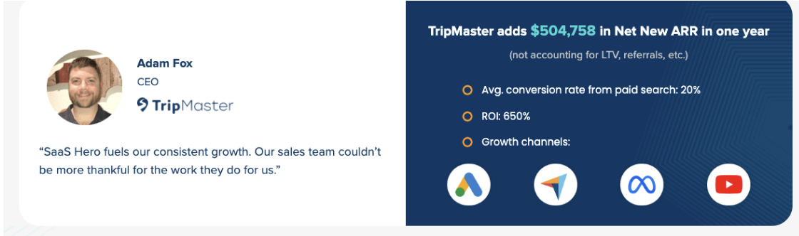
TripMaster’s competitor conquesting headline “Tired of [Competitor] High Costs? Get Pricing Quote Now” achieved a 20% conversion rate, 650% ROI, and generated $504,758 in Net New ARR. This result shows that pain point framing can work at the bottom of the funnel as effectively as at the top.
SaaSHero’s paid creative team builds pain point ads as part of a full-funnel sequence, with the same team owning the landing page the ad points to. Book a discovery call to see how pain point ad design fits into a CRM-connected acquisition system.
3. Proof-First Layouts That Lead With Evidence
Proof-first layouts lead with a verifiable result rather than a benefit claim, placing the evidence before the explanation. This structure matters because a claim such as “Built for pipeline growth” remains an opinion, while a case study number or before-and-after dashboard is a fact the viewer can evaluate. B2B social proof lifts vary by type, from 8–22% for logos and claims to 25–80% for video testimonials, while review presence can raise purchase likelihood up to 270%, and video testimonials can produce up to 80% higher conversion and roughly 2.6–2.7× engagement versus text-only.
Quantified proof combined with product visuals can deliver higher CTR than generic creative, and social proof can help ads outperform standard ones. The visual mechanism is contrast. When a viewer sees two states side by side, the brain automatically calculates the difference instead of evaluating each state alone. A January ad dashboard at $52 CPA and 1.1x ROAS placed beside a March dashboard at $29 CPA and 2.8x ROAS, with the same team, forces that calculation and makes the magnitude of improvement immediately tangible.
For bottom-of-funnel and retargeting creative, proof should appear within the first three seconds, while top-of-funnel creative can lead with story and emotional stakes, with proof in a supporting role. Specific, risk-reducing proof placed near demos, trials, and pricing decisions, rather than generic proof that fills space, is what moves a viewer toward action.
Not all proof is equal. Claims such as a “37% revenue boost from Salesforce dashboard visuals” lack documentation, while verified results such as Spotify Advertising’s 40% productivity gain carry persuasive weight because they can be traced to a specific customer and outcome. The proof asset must be both verifiable and placed in the visual hierarchy where it registers in the first three seconds.
4. Old Way vs. New Way Layouts That Show Cost of Inaction
Old way vs. new way layouts make the cost of inaction visible by placing the buyer’s current state and the transformed state in direct contrast within a single frame. This structure answers the implicit question every B2B buyer carries: “Is what I am doing now actually the problem?” The layout confirms that it is, visually, before a word is read.
Effective before-and-after layout testing for Meta ads begins with structural variations such as product-first versus person-first focal points, top-led versus center-overlay text placement, integrated versus isolated CTA treatment, and stripped-back versus proof-heavy information density before smaller details are adjusted. The contrast must feel dramatic and still remain credible. Before-and-after proof breaks when the comparison cherry-picks the worst and best moments or when the before and after circumstances are not comparable, which causes the proof to feel staged instead of believable.
B2B SaaS landing pages in 2026 that convert use outcome-first headlines pairing a specific business result with a credible number, such as “Cut your billing reconciliation time by 80 percent” instead of generic descriptions such as “Modern billing infrastructure”. The same principle applies to the ad itself. The “old way” panel names the current friction in the buyer’s language, and the “new way” panel names the specific outcome with a number attached.
Message match requires that the landing page continue the exact promise made in ads, because mismatch causes high bounce and weak demo intent. An old way vs. new way ad that lands on a generic product page loses the contrast effect the moment the click happens. This is why the ad and the landing page work best when built by the same team against the same brief.
5. ICP-Specific and Competitor-Switching Ads That Narrow the Buyer
ICP-specific messaging narrows the headline to a single role, company type, or trigger event so the right buyer self-selects and the wrong buyer scrolls past. This narrowing trades broad reach for higher relevance. Firms with tightly scoped ICPs achieve 2.3× higher win rates versus open TAM targeting, according to Forrester’s 2023 B2B Marketing and Sales Benchmark. Buyer-verbatim language extracted from win-loss interviews, G2 reviews, and sales calls typically lifts conversion rates 15–40% over internally-crafted copy in A/B tests.
Competitor switching ads add a second layer by naming the incumbent’s failure mode as the hook. B2B buyers switch vendors because of product failure, service issues that damage trust, new decision-makers, or strategic shifts. An ad that names one of these triggers in the headline, as TripMaster’s “Tired of [Competitor] High Costs?” did, meets the buyer at the moment of maximum receptivity.
Competitor-switching value propositions work best when tied to a concrete trigger and explicit switching economics rather than general superiority claims, because buyers must believe the value of switching exceeds the pain and risk of leaving the incumbent. A vague ICP can waste 50–80% of outbound budget on prospects who cannot or will not buy, while a clear ICP focuses spend on the small share that can. The same focus improves paid social and search performance.
SaaSHero builds ICP-specific and competitor switching creative in-house, with the same team running the media, owning the landing page, and connecting results to CRM pipeline. See how tightly scoped messaging translates to pipeline in your CRM and schedule a discovery call to map your ICP to a custom creative test.
6. How to Test These Five Patterns: Six-Concept Cadence
A six-concept testing cadence treats value proposition design as a system with a defined operating rhythm rather than a series of one-off creative decisions. The six concepts map to the five patterns above plus one UI-forward variant, and they run within a controlled structure so the winning message can be identified and then scaled.
The cadence structure follows a validated framework. Every creative test should begin with a written hypothesis in the format “If we change [variable] from [A] to [B], then [metric] will improve by [X%] because [reason]”. A core creative concept is the underlying persuasion idea, such as a customer problem, proof point, objection, or value proposition, while a variation only adjusts executional elements like hook, visual format, or CTA within that concept.
The six concepts to test in sequence are:
- Quantified outcome static with a number-led headline at 80px, top-left placement, and a single CTA.
- Pain point static using an F-pattern layout, a problem statement in line one, and a UI panel as supporting proof.
- Proof-first static with a before-and-after dashboard or case study result as the primary visual element.
- Old way vs. new way static using two-panel contrast with verifiable numbers in the “new way” panel.
- ICP-specific or competitor switching static with a role or trigger in the headline and switching economics in the body.
- SaaS UI video using sequential revelation that places the value proposition in the first three seconds and the CTA as the final visual element.
Reading the results relies on a metric ladder. A metric ladder for creative tests prioritizes thumb-stop rate, with a 25–35% benchmark for paid social, followed by hold rate at 30–45%, CTR at 1.0–1.8% on Meta, and only then CPA or ROAS after upstream metrics qualify the creative. A mature paid media account maintains three active creative groups: proven control assets carrying spend, promising iterations receiving incremental budget, and fresh concepts generating future learning.
Winning variants should be promoted to evergreen ad sets at 60–80% budget weight, with the next test cell iterating on the winning hook while preserving the message structure that succeeded. B2B SaaS accounts using offline conversions and value-based bidding can generate 3x more pipeline at 31% lower CPL, which means the testing cadence compounds only when the conversion events feeding the algorithm are CRM-qualified outcomes, not raw form fills.
SaaSHero runs this cadence in-house, with concept, copy, design, and CRM-connected measurement owned by the same team. These patterns produce pipeline when the creative, the landing page, and the attribution layer are built and measured together. Schedule a discovery call to start your first six-concept test cycle.
Frequently Asked Questions
What is value proposition design in the context of B2B SaaS ads?
Value proposition design in B2B SaaS ads translates a product’s core benefit into a visual and copy system that registers in under three seconds. This discipline extends beyond copywriting. It governs where the primary claim sits in the frame, what size and weight the typography uses, how contrast directs the eye toward the CTA, and which proof element appears before the viewer scrolls. A well-designed value proposition places the single most important outcome or pain point in the top-left quadrant at 48–80px bold weight, uses a high-contrast color for the CTA against a muted background, and isolates one piece of verifiable proof, such as a number, case study result, or before-and-after visual, within the first three seconds of exposure. The five core patterns in this article, plus the UI-forward video format, are repeatable executions of that system across different funnel stages and audience temperatures.
How do you measure whether a value proposition ad design is working?
Measurement for value proposition ad design uses a metric ladder that reads upstream signals before drawing conclusions from cost-per-result. Thumb-stop rate, the share of impressions that pause on the ad, and hold rate, which shows how long viewers stay, reveal whether the visual hierarchy earns attention before the copy has a chance to work. CTR shows whether the value proposition is strong enough to generate a click. Cost per qualified lead and sales-accepted lead rate show whether the audience the ad attracted was the right one. For B2B SaaS, form fills do not act as a reliable proxy for pipeline. An ad optimized toward form fills trains the platform to find people who like filling out forms, which is a different group from the people who buy. Measurement should connect ad-level performance to CRM lifecycle stages so the optimization signal reaching the platform is a qualified opportunity or a closed deal, not a page event.
Who should own the creative, landing page, and measurement for B2B SaaS ads?
One team should own the creative, landing page, and measurement for B2B SaaS ads. When the ad is built by one party, the landing page by another, and the conversion tracking by a third, no single party remains accountable for the outcome between the impression and the CRM record. The most common failure mode is an agency that optimizes the ad account but cannot change the landing page headline, which is the highest-leverage variable in the post-click experience. A second failure mode is a landing page that continues a different promise from the one the ad made, which causes high bounce and weak demo intent regardless of how well the ad performed. A third failure mode appears when conversion tracking is configured to a low-quality event, which trains the ad platform toward the wrong audience over time. The only configuration that allows all three elements to be optimized together is one team owning all three, with the creative brief, landing page copy, and CRM conversion architecture built against the same positioning document and measured against the same pipeline outcomes.
How long does it take for a new value proposition ad design to show measurable results in B2B SaaS?
Timelines for value proposition ad design have two layers. At the creative level, upstream signals such as thumb-stop rate, hold rate, and CTR become readable within the first one to two weeks of a controlled test, as long as the ad set has enough impression volume to generate statistically meaningful data. At the pipeline level, the signal takes longer because B2B sales cycles typically run three to nine months. A value proposition change that improves demo request quality in week three may not appear as a change in closed-won revenue until the following quarter. Leading indicators such as shorter sales cycles within the target ICP, improved inbound demo request quality, and win-loss interviews that begin citing the company’s differentiation language unprompted act as early signs that a value proposition is working before lagging conversion metrics move. For accounts spending at $15,000 per month and above, a six-concept creative test run against a stable campaign structure and CRM-connected conversion events can produce a readable signal on message resonance within 30 days and a pipeline signal within 90.