




Written by: Aaron Rovner, Founder, Saas Hero | Last updated: September 4, 2026
Key Takeaways
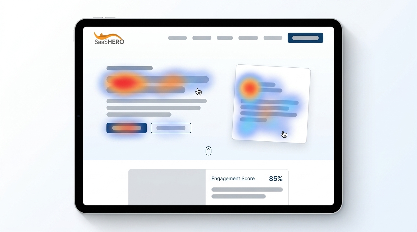
- Landing page heatmap analysis shows user clicks, scrolls, and movements so you can spot friction that blocks B2B SaaS conversions.
- Average scroll depth of 56% and a 4.2% B2B conversion rate show why behavioral data should replace surface metrics like click-through rates.
- Click, scroll, and move maps each answer a different question. Click maps reveal dead clicks, scroll maps show attention cliffs, and move maps generate hypotheses rather than conclusions.
- B2B SaaS pages need traffic-source segmentation and revenue-focused testing because paid and organic visitors behave differently and only 14% of A/B tests win.
- SaaSHero turns heatmap insights into qualified pipeline. Talk with our team to put the full workflow in place.
Why Heatmap Analysis Matters Now
B2B SaaS landing pages often underperform because marketers rely on surface metrics like click-through rates and miss the behavior behind them. Contentsquare’s 2026 Digital Experience Benchmark reports an average landing page scroll depth of 56%, with content below the 60% mark seen by fewer than half of visitors. Unbounce’s 2026 Conversion Benchmark Report puts the average B2B conversion rate at 4.2%.
In a B2B context where the average click-to-customer rate runs between 0.5% and 1.5%, every friction point compounds across a multi-month sales cycle. A visitor who stops scrolling before your pricing section or clicks a non-interactive testimonial image expecting more represents lost pipeline and not just a lost session.
SaaSHero works with B2B SaaS companies to turn behavioral data into revenue outcomes. If you want to move from colorful maps to qualified pipeline, talk to our team about our process.
What Heatmap Analysis Actually Tells You
Heatmap analysis acts as a diagnostic tool that feeds your testing roadmap. The three core map types each answer a different question about user behavior on your landing page.
- Click maps show where users act or try to act. They surface dead clicks on non-interactive elements, ignored CTAs, and rage clicks that signal frustration. Clicks on non-clickable elements represent wasted active intent, since users expected interactivity the page did not provide.
- Scroll maps show how far users reach before leaving. Scroll depth is the most reliable of the three map types because it is unambiguous. A user either reached a section or did not.
- Move maps track cursor position on desktop as a loose proxy for attention. Cursor movement is not eye tracking. It can lag, park in neutral spots, and rest wherever a hand left it, so move maps work best as hypothesis generators rather than firm conclusions.
This diagnostic-to-hypothesis-to-test workflow separates teams that win from teams that stare at color gradients. Every observation from a heatmap becomes a specific, testable hypothesis. You then validate that hypothesis through A/B testing and measure the result against CRM revenue data.
See how SaaSHero runs this process end to end for B2B SaaS companies.
How B2B SaaS Landing Pages Behave Differently
B2B SaaS pages serve multiple intents at once, such as demo requests, free trials, and content downloads, each with different buyer expectations. An analysis of 10,000 heatmap sessions shows that SaaS users slow at the hero, speed through the middle feature section, then slow again at testimonials and pricing. They scan for fit signals and proof rather than reading linearly.

Nielsen Norman Group research measuring 130,000 eye fixations across 120 participants found that users spend about 57% of their viewing time above the fold and 74% within the first two screenfuls of a webpage. Content placed below that threshold stays invisible to most visitors, regardless of its quality.
Traffic source segmentation shapes how you interpret these patterns. Paid and organic visitors behave differently on the same page, and the fix for a paid traffic problem such as faster value delivery or an earlier CTA often differs from what helps organic traffic convert. Aggregate heatmaps that ignore source segmentation blend contradictory intent signals into noise.
The 5-Step Heatmap Analysis Workflow
- Define the question before opening the tool. Decide which conversion goal matters on this page. Then define what user behavior would indicate something is wrong. A clear question prevents the common trap of pattern-matching without purpose.
- Segment before you analyze. Split data by device, traffic source, and new versus returning visitors. Desktop converts 2.1x better than mobile, and blending the two hides the behavioral differences that matter most.
- Check sample size first. Heatmaps with fewer than 1,000 sessions per device type are statistically unreliable. High-traffic pages may reach this threshold in 5–7 days, while lower-traffic pages may need 4–6 weeks.
- Read scroll maps first, then click maps, then move maps. Find the attention cliff, which is the sharp drop-off point, then examine what users click near that boundary. The attention cliff signals that something in the section just above it failed to give users a reason to continue scrolling.
- Translate patterns into testable hypotheses. Turn each observation into an “If we change X, then Y will improve because Z” statement. To fill the “why” gap in that statement, pair heatmaps with 10–15 session recordings of users who bounced before you write the hypothesis.
Common Heatmap Mistakes to Avoid
Each of the following pitfalls has a simple diagnostic question that helps you catch it before it corrupts your analysis.
- Looking at heatmaps in isolation. Confirm that you watch 10–15 session recordings to understand why the pattern exists before changing anything. Heatmaps locate where to look, while recordings reveal what actually happened.
- Drawing conclusions from too little data. Check whether your heatmap is built on a sufficient sample size. A low-sample heatmap can show intense hotspots that represent clicks from just a handful of users, which signals that the sample is too small to trust.
- Ignoring mobile versus desktop differences. Review separate heatmaps for each device. Aggregating mobile and desktop into one heat view produces a blended average that accurately represents neither audience.
- Assuming hot spots are always good. Check whether high click density on navigation elements signals confusion rather than engagement. Heat represents attention, and the most clicked element is not automatically the one creating value.
- Failing to tie insights to revenue. Confirm that you can connect each finding to pipeline impact and not just clicks. Heatmap data that stops at behavioral observation never reaches the board meeting.
How to Prioritize Heatmap Findings
Prioritization ensures your limited testing traffic goes to the highest-value ideas. Score each finding by three criteria: how many users are affected, how close the issue sits to conversion, and how easy the fix is to implement. This maps directly to the ICE framework (Impact, Confidence, Ease) used in enterprise CRO programs.
Only 14% of A/B tests produce a significant winner, so prioritization determines which hypotheses deserve the traffic. A non-clickable statistic that 60% of visitors reach and click is a higher-priority fix than a section nobody scrolls to, because it affects more users and sits closer to conversion.
The table below compares leading heatmap tools by starting price, free tier availability, and key differentiator. Notice how tools with generous free tiers, like Microsoft Clarity, suit teams validating early insights, while enterprise options like Contentsquare fit companies with higher volume and revenue-attribution needs.
| Tool | Starting Price | Free Tier | Key Differentiator |
|---|---|---|---|
| Microsoft Clarity | Free | Unlimited sessions | Rage click and dead click detection, no cost |
| Hotjar | $49/month (annual) | 200,000 sessions/month | Surveys and feedback widgets integrated |
| Crazy Egg | $29/month (annual) | None | Confetti maps color-code clicks by traffic source |
| Lucky Orange | $32/month (annual) | 7-day free trial | All-in-one with live chat included |
| Contentsquare | Free plan; Growth from $49/month (annual); Pro and Enterprise custom quote | Free plan available | Enterprise-grade journey analytics |
From Heatmap to Revenue: The B2B SaaS Playbook
A realistic scenario shows how this workflow connects to pipeline. A Series B SaaS company installs scroll maps and discovers that 70% of visitors never reach the pricing section. The click map shows heavy clicks on a non-interactive testimonial image near the middle of the page. Fifteen session recordings of non-converting visitors reveal a consistent pattern: users look for social proof before committing to the demo request form, and the page structure buries it.
The team forms this hypothesis: “If we move one strong testimonial above the fold and link the testimonial image to the demo request form, demo requests will increase because visitors will see proof before the commitment ask.”
That hypothesis is specific, mechanistic, and testable. It connects a behavioral observation such as a scroll cliff before pricing and dead clicks on a testimonial to a business outcome such as demo requests through a stated mechanism of proof before ask. The team can A/B test it in Unbounce, measure the result against CRM-qualified pipeline, and then validate or discard the idea within a defined window.
This workflow is what SaaSHero owns end to end for B2B SaaS companies, including landing page design, copy, build, A/B testing, and improvement based on CRM revenue data. If your team has heatmap data but no structured process for turning it into pipeline, schedule time with SaaSHero to close that gap.
Frequently Asked Questions
How do you interpret a heatmap?
Start with the scroll map to find where users stop engaging. Identify the attention cliff, which is the sharp drop-off point, and note what content sits just above it, since that section likely failed to give users a reason to continue. Then examine the click map near that boundary, looking for dead clicks on non-interactive elements, ignored CTAs, and rage clicks that signal frustration. Check the move map last and treat it as a hypothesis generator rather than a firm conclusion. Before making any changes, watch 10–15 session recordings of non-converting visitors to understand the behavior behind the pattern. Always analyze desktop and mobile separately, and verify that your sample size is adequate before drawing conclusions.
How long should I run a heatmap study?
Time acts as a proxy for traffic volume, but traffic volume is the real measure. High-traffic pages typically reach a reliable sample within 5–7 days. Medium-traffic pages need 2–3 weeks. Lower-traffic pages that receive fewer than 200 sessions per week may need 4–6 weeks or longer before patterns stabilize. If your heatmap changes shape dramatically between reviews, you still lack enough data. For low-traffic pages, use session recordings as your primary tool while heatmap data builds over time.
What are the best heatmap tools for landing pages?
Microsoft Clarity is free with unlimited sessions and includes automatic rage click and dead click detection, which makes it a strong starting point for many teams. Hotjar offers integrated surveys and feedback widgets alongside heatmaps, which helps when you need qualitative research alongside behavioral data. Crazy Egg’s Confetti maps color-code individual clicks by traffic source, device, and UTM parameter, which helps teams running multiple paid campaigns to the same page. For enterprise-scale journey analytics with revenue attribution, Contentsquare operates at a different tier. Choose based on your traffic volume, whether you need qualitative research features, and whether A/B testing should live in the same tool.
Can heatmaps tell me why users do not convert?
Heatmaps show where behavior happens, but they do not explain why it happens. A cold area might mean content is uninteresting, understood immediately, or invisible because it resembles an ad. A hot area might indicate engagement or confusion, since users stare longest at things they cannot work out. Pair heatmaps with session recordings to fill the “why” gap. Watching 10–15 recordings of non-converting visitors who spent more than 10 seconds on the page usually reveals the pattern behind the map. Surveys and exit-intent questions add another qualitative layer when recordings alone do not explain the behavior.
How do I turn heatmap insights into A/B tests?
Write a specific hypothesis with a mechanism, such as “If we change X, then Y will improve because Z.” The mechanism makes the hypothesis useful because it produces learning whether the test wins or loses. Test one change at a time so the result ties back to a single variable. Measure against the metric most connected to revenue. For B2B SaaS, that usually means demo requests, sales-qualified leads, or pipeline created. Use the ICE framework (Impact, Confidence, Ease) to prioritize which hypotheses deserve traffic first, since only a minority of A/B tests produce a significant winner.
Do heatmaps work for B2B SaaS companies with low traffic?
Heatmaps still help low-traffic B2B SaaS companies, but the collection window needs to be longer and segmentation becomes even more important. Below 200 sessions per week, treat session recordings as your primary diagnostic tool and let heatmap data accumulate over 4–6 weeks before drawing conclusions. Filter recordings to non-converting visitors who spent more than 10 seconds on the page, since a recurring pattern typically emerges within 15–20 filtered recordings. When heatmap data does accumulate, segment by device and traffic source before interpreting, because a blended map at low volume is especially susceptible to a handful of outlier sessions distorting the pattern.
Conclusion: Turn Insights into Pipeline
Heatmap analysis functions as a diagnostic tool that generates hypotheses for A/B testing. The workflow stays consistent: segment first, verify sample size, read scroll maps then click maps then move maps, confirm patterns with session recordings, prioritize findings by revenue proximity, and test one change at a time against CRM-connected outcomes.
Winning teams go beyond the colorful map. They follow each observation through to a specific hypothesis, run the test, and measure the result against qualified pipeline. That full chain requires owning the landing page, the test, and the measurement layer at the same time.
SaaSHero’s team owns landing page design, copy, build, and testing, and improves performance against CRM revenue data. If you want a partner to turn heatmap insights into pipeline growth, connect with SaaSHero today.