

Key Takeaways for B2B SaaS Heuristic Analysis
- Heuristic analysis uncovers UX issues that cause 20-30% conversion losses in B2B SaaS without relying on traffic data.
- Ten Nielsen heuristics highlight fixes such as progress indicators, jargon removal, and user control that lift conversions 15-40%.
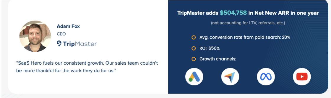
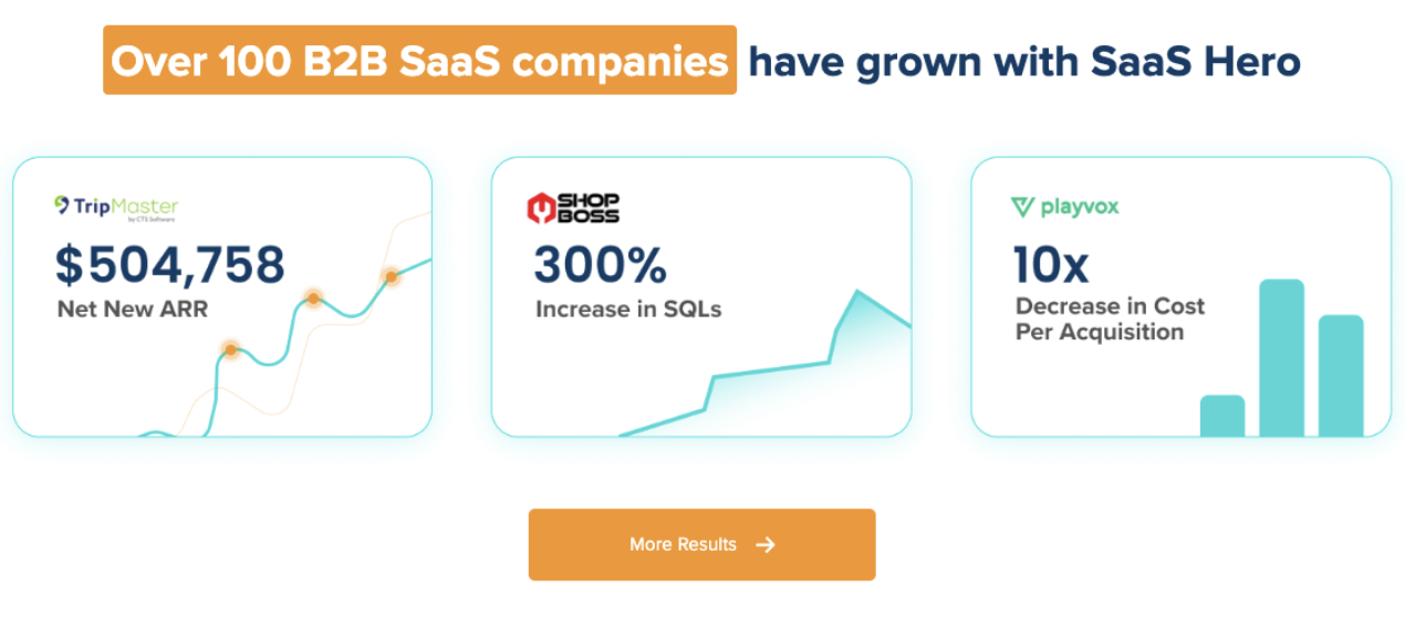
- SaaSHero’s audits have driven $504K ARR growth and cut form abandonment by 35% for B2B SaaS clients.
- Teams should prioritize violations in trust signals, error prevention, and value clarity to improve CAC efficiency.
- Schedule a free discovery call with SaaSHero to uncover your website’s conversion blockers.
10 Practical Heuristic Analysis Examples for B2B SaaS Websites
1. Visibility of System Status on Demo and Signup Flows
B2B SaaS demo request forms often hide progress, which causes up to 40% of users to abandon multi-step flows. A transportation software client used a multi-step form without progress indicators, so prospects felt unsure about time commitment and required details.
SaaSHero’s audit flagged missing system status feedback during form completion and demo scheduling. The team added clear progress bars, step labels, and real-time validation messages. After launch, the client saw a 35% drop in form abandonment and a 20% lift in qualified demo requests.
Quick Fixes:
- Add progress bars to every multi-step form.
- Show loading states during form submission.
- Display confirmation messages after each completed step.
- Include an estimated completion time near the first step.
Severity Rating: Major, because it directly affects conversion funnel completion.
2. Matching Product Language to Real-World Buyer Language
Technical jargon blocks non-technical decision-makers from understanding value. A cybersecurity SaaS client filled their pricing page with terms like “API endpoints” and “webhook configurations,” which confused budget owners who did not manage implementation details.
The heuristic analysis exposed a gap between buyer mental models and interface language. SaaSHero replaced most technical terms with business-focused outcomes and added light explanations where needed. The client saw a 25% increase in pricing page engagement and stronger sales qualification.
Quick Fixes:
- Swap technical jargon for clear business benefits.
- Use familiar icons and simple metaphors.
- Group content by business function instead of technical feature.
- Add tooltips for technical terms that must remain.
Severity Rating: Critical, because it blocks understanding for key decision-makers.
3. User Control and Freedom in Trials and Onboarding
B2B software trials often lock users into rigid workflows without clear ways to exit or skip. An HR tech client forced users through every onboarding step and blocked navigation back to earlier sections, which created friction during evaluation.
SaaSHero’s evaluation found weak user control patterns. The team introduced “Skip for now” options, breadcrumb navigation, and visible exit paths from flows. Trial completion rates increased by 30%, and navigation-related support tickets dropped.
Quick Fixes:
- Add “Skip” or “Do this later” options to non-critical steps.
- Use clear breadcrumb navigation for multi-step flows.
- Provide obvious exit points from every workflow.
- Allow users to cancel or undo actions easily.
Severity Rating: Major, because it affects user confidence and trial completion.
4. Consistent CTAs and Standards Across Key Pages
Inconsistent call-to-action patterns confuse visitors and lower conversion rates. A marketing automation client used many button colors, sizes, and labels, which made it hard for users to spot the primary action on each page.
The heuristic review documented 12 different CTA styles across core pages. SaaSHero standardized button design, placement, and wording. The client then saw an 18% lift in overall conversion rates and smoother user flows.
Quick Fixes:
- Standardize primary CTA button color, size, and style.
- Use the same CTA labels for the same actions.
- Keep navigation patterns uniform across templates.
- Define and follow clear visual hierarchy rules.
Severity Rating: Major, because it undermines user confidence and navigation efficiency.
5. Error Prevention on High-Intent Forms
Poor form validation frustrates B2B users who expect a polished experience. A procurement software client only showed validation errors after submission, which forced users to re-enter data and often led to abandonment.
SaaSHero’s analysis highlighted weak error prevention. The team added real-time validation, smart defaults, and clear field requirements. Form errors dropped by 60%, and signup completion rates increased by 22%.
See SaaSHero’s CRO results from structured error prevention work.
Quick Fixes:
- Use real-time validation for every critical field.
- Add smart defaults and auto-formatting for inputs.
- Show field requirements before users start typing.
- Use progressive disclosure for complex or advanced fields.
Severity Rating: Critical, because it directly causes conversion failures.
6. Recognition Over Recall in Pricing and Feature Comparisons
Complex pricing layouts force users to remember details across sections, which increases cognitive load. A construction management SaaS client required visitors to recall feature lists while jumping between plans, which slowed decisions.
The heuristic evaluation showed that the interface placed a heavy memory burden on users. SaaSHero redesigned the page with side-by-side comparisons, feature tooltips, and persistent plan summaries. Pricing page conversion improved by 28%, and the sales cycle shortened.
Quick Fixes:
- Add clear feature comparison tables for all plans.
- Use persistent navigation that shows the current section.
- Include contextual help and tooltips near complex items.
- Display relevant details at the moment of decision.
Severity Rating: Major, because it increases cognitive load and decision difficulty.
7. Flexibility and Efficiency for Power Users
Power users expect shortcuts and advanced controls that do not overwhelm new users. A project management SaaS client lacked keyboard shortcuts and bulk actions, which annoyed experienced evaluators during trials.
SaaSHero’s audit identified missing efficiency features for advanced users. The team added keyboard shortcuts, bulk operations, and customizable dashboards. Engagement increased by 40%, and trial-to-paid conversion improved among power users.
Quick Fixes:
- Introduce keyboard shortcuts for frequent actions.
- Offer bulk operations for repetitive tasks.
- Provide customizable layouts or dashboards.
- Design dedicated workflows for advanced users.
Severity Rating: Minor, because it affects efficiency more than core functionality.
8. Minimalist Layouts That Highlight SaaS Value
Cluttered layouts overwhelm B2B buyers who need to grasp value quickly. A healthcare SaaS client packed 15 separate messages onto the homepage, which diluted focus and hurt clarity.
The heuristic analysis surfaced information overload and weak hierarchy. SaaSHero trimmed content, clarified visual hierarchy, and centered the page on core value propositions. Homepage conversion rose by 32%, and message comprehension scores improved.
Quick Fixes:
- Remove interface elements that do not support key goals.
- Focus copy and design on primary user outcomes.
- Use white space to separate sections and ideas.
- Highlight only the most essential information above the fold.
Severity Rating: Major, because it affects message clarity and user focus.
9. Clear Error Messages and Recovery Paths
Generic error messages slow users who need precise guidance. A financial software client relied on vague alerts like “Something went wrong,” which blocked critical workflows and confused users.
SaaSHero’s evaluation found weak error communication patterns. The team wrote specific messages, added suggested fixes, and mapped clear recovery paths. Support tickets fell by 45%, and task completion rates improved.
Quick Fixes:
- Write specific, actionable error messages for each scenario.
- Provide step-by-step recovery instructions.
- Offer alternative paths when possible.
- Include contact options for complex or high-risk issues.
Severity Rating: Critical, because it blocks progress and increases support load.
10. Contextual Help and Documentation Inside the App
B2B SaaS users need help at the moment of confusion, not in a separate portal. A logistics software client hid help content in external docs, which forced users to leave workflows to find answers.
The heuristic review showed a lack of contextual support. SaaSHero added in-app help, interactive walkthroughs, and targeted tips. Onboarding completion improved by 35%, and time-to-value dropped.
Quick Fixes:
- Embed contextual help directly in key workflows.
- Offer a searchable knowledge base from within the app.
- Use interactive tutorials for core features.
- Reveal deeper help progressively as users explore.
Severity Rating: Major, because it affects learning and feature adoption.
Website Heuristic Evaluation Checklist for SaaS: SaaSHero’s 7-Principle Overlay
SaaSHero uses a Heuristic Analysis Framework where three evaluators independently review your site against seven usability principles such as Relevance, Clarity, Trust, and Friction. The team then consolidates findings into a prioritized roadmap of quick wins to address before scaling media spend. This approach fits B2B SaaS realities like complex pricing, multi-stakeholder decisions, and long sales cycles.
| Heuristic | Severity Score | Quick Win | CAC Impact |
|---|---|---|---|
| Trust Signal Visibility | Critical | Add security badges above fold | 15-25% conversion lift |
| Value Prop Clarity | Critical | 5-second comprehension test | 20-30% message clarity |
| Social Proof Integration | Major | Customer logo placement | 10-18% credibility boost |
| Mobile Responsiveness | Major | Touch target optimization | 12-20% mobile conversion |
This checklist supports systematic evaluation of B2B SaaS websites before you increase advertising budgets. SaaSHero’s detailed audit methodology repeatedly uncovers high-impact improvements that lower customer acquisition costs and improve trial signup quality.
Heuristic Evaluation FAQs for B2B SaaS Teams
What is a heuristic analysis for B2B SaaS websites?
A heuristic analysis is a structured UX review where experts compare your website against established usability principles to find conversion barriers without traffic data. For B2B SaaS, this process reveals issues that inflate acquisition costs, reduce trial signups, and weaken onboarding. SaaSHero uses three evaluators who review the site independently, then merge findings into severity ratings and a prioritized fix list.
How long does a SaaS heuristic evaluation take?
A full B2B SaaS heuristic evaluation usually takes 2 to 3 weeks from kickoff to delivery. The timeline covers initial site review, independent expert evaluations, consolidation of findings, severity scoring, and detailed recommendations with visual mockups. SaaSHero also includes tracking setup guidance and integration notes so teams can connect changes to measurable conversion gains.
What ROI can I expect from fixing heuristic violations?
B2B SaaS companies often see 15-40% conversion lifts after fixing critical heuristic issues. SaaSHero clients have reported 650% ROI increases, 20% conversion improvements, and meaningful drops in cost per lead. The strongest returns usually come from improvements to trust signals, value proposition clarity, and form performance, which directly affect trial signups and sales qualification.
How do SaaS heuristics differ from generic website evaluations?
B2B SaaS heuristic work requires knowledge of long sales cycles, multi-stakeholder buying, and technical demos. Generic audits often miss SaaS-specific problems such as trial onboarding friction, complex pricing pages, security concerns, and integration messaging gaps. SaaSHero’s methodology adds SaaS-focused heuristics that cover trust signals, technical credibility, scalability messaging, and conversion funnel performance that many general UX audits overlook.
Nielsen Heuristic Evaluation for SaaS: Next Steps with SaaSHero
The three most impactful heuristic areas for most B2B SaaS websites are error prevention on forms, trust signal visibility, and value proposition clarity. These focus areas often deliver the majority of conversion gains when teams address them systematically. Effective execution depends on clear prioritization based on severity, user impact, and development effort.
SaaSHero’s flat-fee, month-to-month model reduces risk compared to traditional agencies while providing deep B2B SaaS expertise. The heuristic evaluation process connects directly with conversion rate optimization and landing page design services so insights turn into measurable revenue growth.
Partner with SaaSHero for heuristic CRO and turn your website into a reliable conversion engine for your SaaS growth.