
Last updated: January 19, 2026
Key Takeaways
- Craft 5-second hero sections with benefit-led headlines using the formula “[Outcome] for [Audience] Without [Pain]” to capture B2B attention instantly.
- Deploy a single prominent CTA with action-focused copy like “Start Free Trial” to remove choice paralysis and lift conversions by up to 65%.
- Stack social proof above the fold with specific metrics and recognizable logos to build trust and reduce B2B buyer risk.
- Use benefit-driven copy, clear visual hierarchy, and mobile-first layouts to guide users to conversion without distractions.
- Apply advanced CRO with heuristics, A/B testing, and competitor conquest pages; schedule a discovery call with SaaSHero for a free CRO audit and 3-5x conversion growth.
1. Build a 5-Second Hero Section That Sells the Outcome
Your hero section must communicate value in five seconds or less before skeptical B2B buyers bounce. Effective SaaS landing pages rely on strong headlines, sub-headlines, and visible CTAs that clearly communicate unique value. Generic lines like “The Best CRM Solution” fail because they ignore outcomes and do not separate you from competitors.
Use this headline formula: “[Specific Outcome] for [Target Audience] Without [Current Pain Point].” For example, “Reduce Customer Churn by 40% for SaaS Teams Without Complex Analytics.” Write a subheadline that reinforces benefits instead of listing features. Swap “Advanced Reporting Dashboard” for “See which customers are at risk before they cancel.”
Visuals carry equal weight. Replace stock photos with real product screenshots or mockups that show how the tool works. Hero sections with clear value propositions convert 35-40% better than vague alternatives. Place trust signals like G2 badges or customer logos above the fold instead of hiding them in the footer.
Avoid jargon that confuses readers, burying the main value proposition below minor features, and ignoring mobile layouts where thumb-friendly actions matter. Track time-on-page. If visitors spend under 30 seconds, your hero section likely misses the mark.
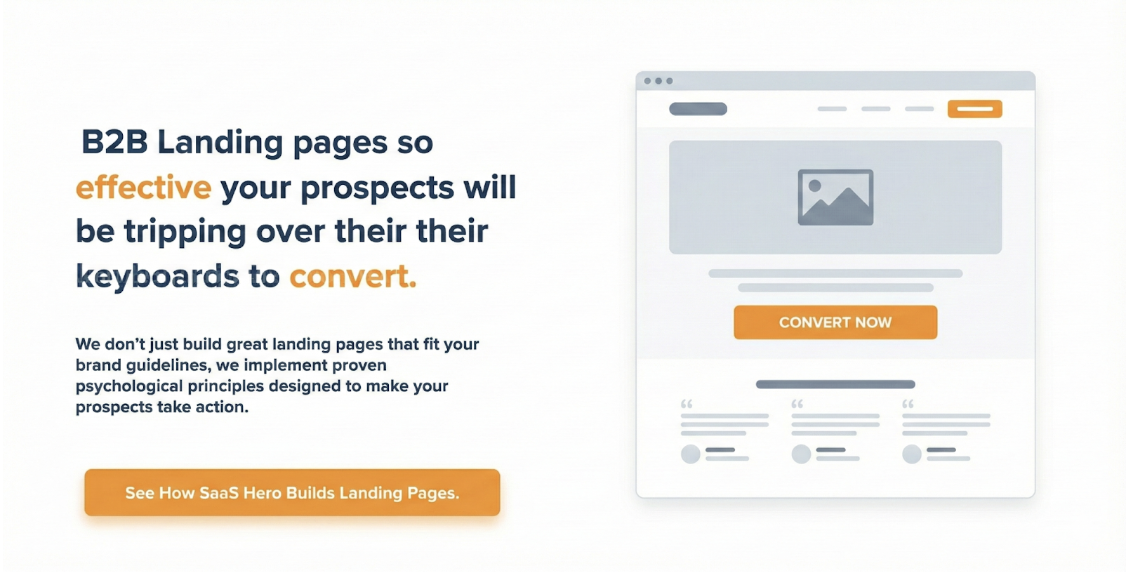
2. Use One Clear Call-to-Action That Drives the Main Goal
Choice paralysis hurts B2B conversions. Multi-purpose pages with competing CTAs convert up to 65% lower than single-goal pages. Give the page one primary objective, such as demo requests, free trials, or consultation bookings.
CTA copy influences performance more than button styling. “Get Demo” beats a generic “Submit” button, and personalized CTAs convert 202% better than generic ones. For B2B SaaS, use action phrases like “See How It Works” or “Start Free Trial” that create gentle urgency.
Pay attention to mobile details. Make CTA buttons at least 44×44 pixels for easy tapping, use high-contrast colors that stand out from your palette, and repeat the primary CTA below the fold for scrollers. HubSpot’s landing pages follow this pattern with consistent “Get Started” buttons that keep visual hierarchy intact.
Limit conversion paths. Secondary CTAs such as “Learn More” or “Download Whitepaper” should support the main goal rather than compete with it. Watch CTA click-through rates. Numbers below 10% usually signal weak positioning, unclear copy, or both.
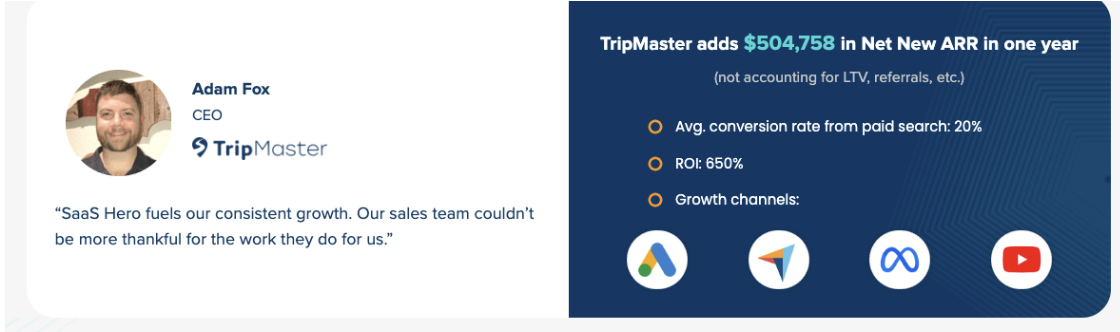
3. Place Social Proof Where Buyers Feel the Most Risk
B2B buyers feel high risk when choosing software that affects productivity or data security. Social proof needs deliberate placement to support it at key decision points. Client logos, testimonials, and case study snippets work best near CTAs to lower conversion anxiety.
Go beyond simple logo walls. Add specific metrics to testimonials. “Increased our team productivity by 35%” feels more credible than “Great product!” Highlight G2 badges and industry awards in visible areas because third-party validation carries more weight than internal claims. Short case study snippets that mention revenue gains or percentage lifts give concrete proof of ROI.
Intercom’s landing pages show this clearly. They feature customer success metrics directly in the hero section instead of hiding them on separate pages. This mix of logos and outcomes builds a strong trust story that supports conversions.
Burying social proof below the fold weakens performance. Lack of proof above the fold fails to build trust in the crucial first 5-10 seconds, so qualified prospects leave before engaging. Place your sharpest testimonials and metrics where visitors see them immediately.
4. Write Benefit-First Copy and Design Clear Visual Hierarchy
B2B buyers care about outcomes such as revenue, efficiency, and risk reduction, not feature lists. Structure copy with a problem-agitate-solve flow that names specific pain points, intensifies them, then presents your solution. 2026 trends highlight bold typography, gradients, and split-screen layouts that balance text with performance-focused visuals.
Make the page easy to scan. Use bold headings for key benefits, bullets for feature lists, and generous white space to guide the eye. Monday.com does this well by pairing workflow visuals with benefit-led headlines that speak directly to project management challenges.
Visual hierarchy also includes color and layout choices. Playful typography with vibrant colors can build an emotional connection while still feeling professional. Use contrast to highlight crucial information and create a natural reading path toward your CTAs.
Avoid feature dumping, where you list capabilities without tying them to business results. Replace “Advanced Analytics Dashboard” with “Identify your highest-value customers and focus sales efforts where they matter most.” Track scroll depth. If most users never reach 50% of the page, your hierarchy likely needs a redesign.
5. Remove Distractions and Design for Mobile-First Journeys
Distraction-free layouts support B2B conversions, especially when decision-makers review options on mobile between meetings. Every extra second of load time can cost 7% of conversions, so fast performance directly affects CAC.
Strip away navigation menus, sidebar links, and heavy footers that pull visitors away from your main goal. Minimalist, distraction-free layouts keep attention on core messaging and CTAs. Treat the landing page as a focused conversion environment instead of a directory for your entire site.
Design from a mobile-first perspective. Make buttons easy to tap, shorten forms for small screens, and keep load times under three seconds. Non-responsive layouts can cut conversions by 30-50%, so mobile-first development now counts as a baseline requirement.
Typeform offers a strong example. Their interactive, one-question-per-screen experience lowers cognitive load and lifts completion rates. The design removes clutter while keeping engagement high through gradual disclosure of fields.
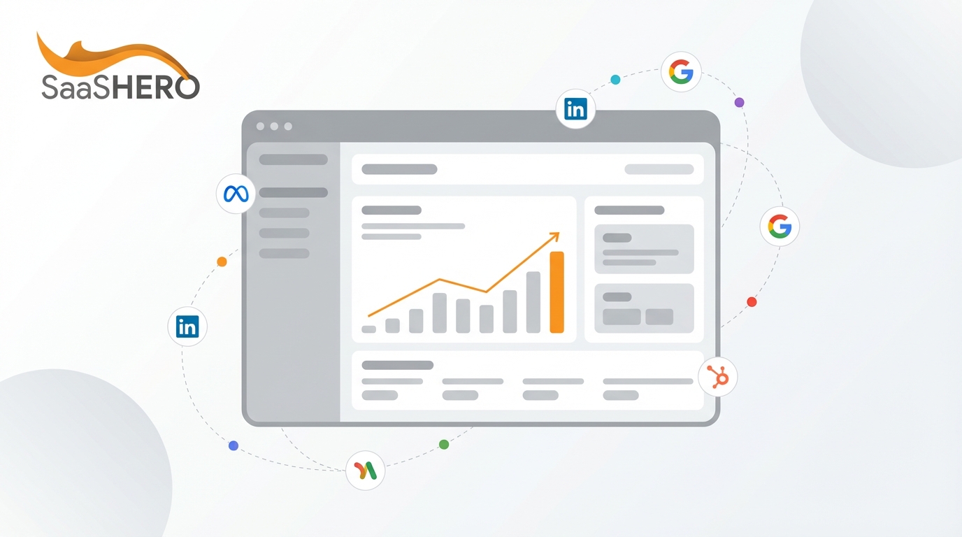
6. Scale Results with Advanced CRO and Competitor Conquest Pages
Advanced CRO focuses on high-intent traffic from competitor searches and dark funnel research instead of simple layout tweaks. Create comparison guides for searches like “HubSpot vs Salesforce CRM comparison” to capture competitor conquest opportunities. Include honest feature comparisons, clear pricing tables, and switching incentives.
Run heuristic analysis before launching A/B tests. Heuristic scoring uses hundreds of benchmarks tailored to your audience and funnel stage. This process uncovers quick wins such as sharper hero benefits, stronger CTA contrast, or better spacing between sections.
Build competitor conquest pages with a tight message match. Visitors searching “[Competitor] pricing” expect a pricing comparison page, not a generic overview. Include total cost of ownership breakdowns, migration support offers, and specific switching benefits that address known competitor gaps.
Track deeper metrics than basic conversion rate. Monitor SQL quality, CAC payback periods, and Net New ARR attribution. Use heatmaps and session recordings to spot hesitation points and messaging gaps that block qualified prospects from converting. Aim for more qualified leads that close faster and deliver higher lifetime value, not just higher lead volume.
Book a discovery call to roll out these advanced CRO strategies with SaaSHero’s proven methodology.
Frequently Asked Questions
What makes B2B SaaS landing pages different from B2C pages?
B2B SaaS landing pages support longer, multi-stakeholder buying cycles that often last weeks or months instead of single-session impulse purchases. They must build deeper trust with detailed ROI proof, security certifications, and integration details. B2B pages also speak to multiple personas, such as end users, IT leaders, and budget owners, each with unique concerns. Conversion goals focus on qualified lead generation and demo requests rather than instant purchases, which means these pages feed nurture sequences and sales conversations.
How should I design landing pages for competitor intent keywords?
Competitor intent pages need precise message-match and a clear content plan. Create dedicated pages for each comparison and include honest feature matrices, transparent pricing, and total cost of ownership breakdowns. Address known competitor weaknesses directly. If users search “cancel [Competitor],” they likely feel pain that you can solve. Offer switching incentives such as free migration, contract buyouts, or longer trials. Keep the tone helpful and educational, so the page feels like a buying guide instead of a hard pitch.
What tools and metrics should I track for effective B2B SaaS CRO?
Track revenue-focused metrics such as SQL quality, CAC payback periods, pipeline velocity, and Net New ARR attribution instead of only surface-level conversion rates. Use tools like Hotjar or Crazy Egg for heatmaps and recordings that reveal friction points and behavior patterns. Set up attribution that connects ad clicks and landing page visits to closed-won revenue in your CRM. Watch page speed, mobile usability, and form completion rates as early indicators of performance. Advanced teams also run cohort analysis to see how landing page changes affect retention and lifetime value.
What is the typical timeline and cost for professional B2B SaaS landing page design?
Professional B2B SaaS landing page projects usually take 2-3 weeks for strategy, copy, design, development, and early optimization. Pricing varies by complexity and agency model. Budget-friendly options start around $750 for a focused conversion page, while full redesigns with advanced CRO support can range from $3,000 to $15,000. Evaluate the spend against revenue upside. A 2-3 point lift in conversion rate on $50,000 in monthly ad spend can add hundreds of thousands in ARR each year, which makes expert landing page work a strong investment for scaling SaaS teams.
How does SaaSHero’s approach differ from traditional agencies?
SaaSHero works on month-to-month agreements instead of long contracts, so performance drives retention instead of legal terms. Their flat-fee pricing removes percentage-of-spend incentives that push some agencies to recommend higher budgets without efficiency gains. They focus only on B2B SaaS and understand metrics like MRR, churn, and sales cycle length that generalist agencies often misread. Senior strategists stay directly involved with accounts instead of handing work to junior staff, and reporting centers on Net New ARR and pipeline impact instead of vanity metrics.
Conclusion: Turn Traffic into Net New ARR with Focused Landing Pages
These six principles create the backbone of high-converting B2B SaaS landing pages: benefit-led hero sections, single CTAs, visible social proof, hierarchy-driven copy, distraction-free mobile design, and advanced CRO tactics. Start with the hero section for quick wins, then refine each element based on traffic levels and conversion data.
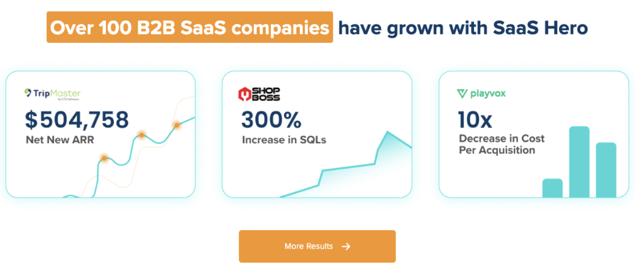
The gap between 3.8% industry-average conversion rates and 15-25% elite performance comes from consistent use of these methods. Companies like TripMaster have added more than $500k in Net New ARR through focused landing page optimization, while TestGorilla reached 80-day CAC payback periods that supported their $70M Series A.