





Written by: Aaron Rovner, Founder, Saas Hero | Last updated: August 23, 2026
Key Takeaways for Enterprise Landing Pages
- Place trust signals at the exact locations where buyers hesitate, such as within 100 px of the hero CTA, directly above form fields, and immediately before the final CTA.
- Use recognizable customer logos, G2 or Capterra ratings with review counts, and specific quantified testimonials to drive measurable conversion lifts of 12–34%.
- Position security and compliance badges (SOC 2 Type II, SSL, GDPR) next to form inputs to reduce data-entry friction and increase form completion rates for procurement-focused buyers.
- Deploy guarantees, specific customer counts, and case-study ROI cards at key decision points to address distinct buyer fears and shorten payback periods when paired with paid campaigns.
- Book a discovery call with SaaS Hero to audit your landing page against this placement matrix and uncover the highest-revenue trust-signal opportunities.
1. Place Recognizable Logos Within 100 px of the Hero CTA
Enterprise buyers arrive pre-educated through review sites and peer networks, then judge your page within seconds. A logo strip that appears only below the fold stays invisible to many visitors who bounce quickly. Trust signals placed near the hero CTA have more impact on visitor behavior than the same signals positioned lower on the page, because users make their first evaluation almost immediately.
Position a horizontal bar of several recognizable named customer logos no more than 100 px below the primary CTA button, inside the first viewport. To maintain visual hierarchy without overwhelming the hero section, use SVG assets at 32–40 px height, grayscale by default, with a hover state that restores brand color. Keep the introductory label concise at eight words or fewer (for example, “Trusted by teams at:”) so the logos remain the focal point. A logo strip with recognizable brands can lift conversion rates on landing pages, with especially strong impact for higher-consideration B2B purchases.
2. Place G2 or Capterra Ratings Above the Primary CTA
While logos establish initial credibility, buyers also look for independent validation on review platforms before engaging sales. No 2025 ClickUp study of 412 B2B procurement workflows was identified; G2’s 2025 Buyer Behavior Report surveyed 1,100 global B2B decision-makers on AI-influenced buying behavior and confirmed the role of third-party proof in vendor selection.
Place the G2 or Capterra badge with the numerical star rating and review count in a single inline element directly above the CTA button, within 40 px of it. Display the exact count, such as “4.8 ★ across 312 reviews on G2,” instead of a rounded figure. Numerical review ratings that include sample size outperform unspecified star ratings or review counts without scale. Star ratings displayed with review counts lift conversion rates 12–25% when shown in the hero section or adjacent to the CTA.
3. Insert a Named, Quantified Testimonial 50 px Below the Hero Headline
Specific, attributed testimonials with measurable outcomes outperform generic anonymous quotes, which often produce less than 5% conversion lift. Enterprise buyers want to see a peer in a similar vertical and company size achieving a concrete result before they trust the headline claim. A named testimonial with a clear metric answers that need.
Place one testimonial 50 px below the hero headline, before any feature copy. The layout should include a circular headshot at 48 px diameter, full name, job title, company name, and a quote of 25–40 words that states a specific metric, such as “We reduced onboarding time by 41% in the first 60 days.” Specific testimonials with names, photos, titles, companies, and measurable outcomes correlate with +3.8 points higher Trust scores on analyzed landing pages.
The following code block illustrates a compliant hero-section structure:
<section class="hero"> <h1>[Benefit-Driven Headline — Max 10 Words]</h1> <!-- Testimonial: 50 px margin-top --> <blockquote style="margin-top:50px;"> <p>"We reduced onboarding time by 41% in the first 60 days."</p> <footer> <img src="headshot.jpg" alt="Jane Doe" width="48" height="48" style="border-radius:50%;"> <cite>Jane Doe, VP Operations, Acme Corp</cite> </footer> </blockquote> <!-- G2 Rating: directly above CTA --> <p class="rating">4.8 ★ across 312 reviews on G2</p> <!-- Primary CTA --> <a href="/demo" class="cta-btn">Get a Demo — No Credit Card Required</a> <!-- Logo bar: within 100 px of CTA --> <p class="logo-label">Trusted by teams at:</p> <ul class="logo-bar"> <li><img src="logo-a.svg" alt="Company A"></li> <li><img src="logo-b.svg" alt="Company B"></li> <li><img src="logo-c.svg" alt="Company C"></li> </ul> </section> 4. Place SOC 2 or Compliance Badges Next to Form Fields
Security posture often becomes a gating factor before any vendor receives approval. SOC 2 Type II certification is the specific industry credential that B2B SaaS enterprise procurement teams actually verify during evaluation. A badge buried in the footer does not address the hesitation that appears at the form.
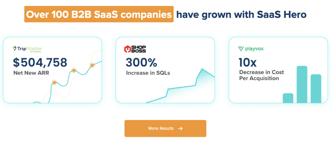
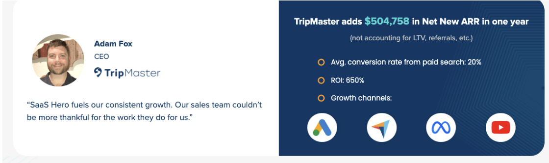
Place the SOC 2 Type II badge, or HIPAA, FedRAMP, or ISO 27001 where relevant, within 24 px to the left of the first form input field. Link the badge to a publicly accessible trust center or certificate PDF so a skeptical reviewer can confirm it quickly. A trust signal’s value is proportional to how easily a skeptical buyer can verify it; signals that a hostile procurement analyst cannot confirm in under 60 seconds should be upgraded or removed. SaaS Hero clients who implement this placement pattern alongside full-funnel paid campaigns have contributed to ARR outcomes including $504,758 in Net New ARR for TripMaster within 12 months.
5. Add a 30-Day Money-Back Line Directly Under the CTA
Guarantees shift perceived risk from first-time buyers to the vendor, who understands delivery far better. Guarantees are most relevant when prospects believe in value but hesitate due to fear of project stalling or inaction. For enterprise champions, the primary fear is social risk, not price.
Place a single line of 12–16 words directly beneath the CTA button, in 13 px text, using a muted brand color rather than red. Example copy: “30-day money-back guarantee. No forms, no questions.” This placement keeps the guarantee tied to the decision moment and reduces perceived risk by shifting it from buyer to seller. On an 80-day payback model, the benchmark SaaS Hero achieved for TestGorilla, even a small lift in demo rate compresses payback materially.
Book a discovery call to get your landing page scored against this placement matrix.
6. Show a Specific Customer Count in the Hero Subhead
Specific customer counts build more credibility than vague claims such as “thousands of users,” which buyers cannot verify. Adding a specific customer count statement like “Join 2,847 remote teams managing projects more effectively” near the hero section of a B2B SaaS landing page contributed to higher conversions compared to vague claims.
Insert the exact customer count as a subheadline or inline stat directly in the hero subhead and update it at least quarterly. Use the format “Join [exact number] [specific descriptor] teams” in 18–22 px type so the stat reads as a clear social proof element. Specific customer counts produce a 20–22% conversion lift as a social proof type. The specificity signals that the number is auditable, which procurement reviewers treat as a proxy for operational maturity.
7. Add a Case Study Card with Champion and ROI Before Pricing
Buying committees often require deeper proof before approving budget, especially for higher-ticket SaaS. A structured case study featuring a named customer, logo, champion, and quantified outcome outperforms ten short testimonials on B2B SaaS pages. One company reported a 28% conversion lift over 60 days after adding three named case studies with quantified outcomes.
Position a card component mid-page, immediately before the pricing section, so it supports the budget decision. The card should include the company logo, champion name and title, one-sentence problem statement, one ROI metric in large type such as “163% increase in qualified leads,” and a “Read full case study” link. Replacing an anecdotal quote with a link to a full case study on a homepage can increase demo requests because it gives evaluators a deeper story to share internally.
The following placement matrix maps each trust signal to its optimal position and the primary fear it resolves, along with available benchmarks:
| Trust Signal | Optimal Placement | Primary Fear Resolved | Conversion Benchmark |
|---|---|---|---|
| Named customer logo bar (recognizable logos) | Within 100 px of hero CTA, first viewport | “Is this vendor legitimate?” | Directional lift reported in multiple B2B tests |
| G2/Capterra star rating with review count | Within 40 px directly above primary CTA | “Can I trust third-party validation?” | +12–25% conversion lift |
| Named, quantified testimonial | 50 px below hero headline | “Has this worked for someone like me?” | Consistent lifts observed in testimonial A/B tests |
| SOC 2 Type II / compliance badge | Within 24 px left of first form input | “Is my data safe with this vendor?” | Higher form completion rate vs. unprotected fields |
| 30-day money-back guarantee | Directly below CTA button, 13 px text | “What if it does not work?” | Documented lifts in risk-reversal experiments |
| Specific customer count stat | Hero subheadline, 18–22 px type | “Is this product proven at scale?” | +20–22% conversion lift |
| Named case study card with ROI metric | Mid-page, immediately before pricing | “Can I justify this to my committee?” | 28% lift reported in one 60-day test |
| SSL/GDPR security badges | Immediately left of form inputs | “Is my data being handled securely?” | Reduced pricing-page exit rate in form tests |
| High-impact testimonial (repeated) | Directly above final CTA | “Am I making the right decision now?” | +34% purchases (WikiJob placement test) |
| “No Credit Card Required” micro-copy | Inside CTA button label | “Am I committing to something I cannot exit?” | Higher CTA click rate in commitment-friction tests |
8. Position SSL and GDPR Badges Next to Form Inputs
Data-entry points create a distinct type of anxiety that differs from product skepticism. Submitting a work email or phone number to an unfamiliar vendor introduces personal and organizational risk. Trust signals should be placed adjacent to every data collection input, including email fields, signup forms, and payment fields, to reduce friction at the exact point of data entry.
Place SSL and GDPR badges as inline SVG icons at 20 px height, immediately to the left of the first form input label. Add a one-line privacy note below the submit button that states “Your data is encrypted and never sold.” Displaying security certifications such as GDPR and SSL on a B2B SaaS landing page addresses concerns about legitimacy and risk. Avoid generic consumer badges such as Norton Secured or McAfee Secure on non-payment pages; generic security badges reduce conversion an average of 4–9% when placed on non-payment pages.
9. Repeat One High-Impact Testimonial Above the Final CTA
Last-mile anxiety often becomes the final barrier between a qualified visitor and a submitted demo request. At the decision stage, security badges, money-back guarantee icons, and prominent testimonials near the CTA reduce last-mile anxiety. Repeating a strong testimonial at this point reinforces confidence at a second decision moment.
Select the testimonial with the highest-specificity ROI metric from tactic 3. Reformat it as a pull-quote at 120% font size, with the champion’s headshot at 56 px diameter, placed within 60 px above the final CTA button. WikiJob placed three lines of customer testimonials near the purchase decision instead of farther down the page, producing a +34% increase in purchases. If a landing page has more than one CTA, every CTA should have a piece of social proof nearby because decision moments repeat throughout the page.
10. Add “No Credit Card Required” Inside the CTA Button
Commitment friction can block conversions even after every other objection has been cleared. Buyers hesitate if the button suggests an irreversible financial commitment or a long contract. The commitment reducer should appear above the CTA button or in the button label itself, not below it, so it resolves risk doubts before the click decision.
Structure the CTA button as two lines of text within a single button element. Use a primary action label in 16 px bold, such as “Get Your Demo,” and a secondary micro-copy line in 11 px regular weight that reads “No credit card required.” This pattern reduces perceived commitment and can increase CTA click rate. On a campaign spending $25,000 per month, a small lift in demo rate directly reduces CAC and compresses the payback period, the same lever that compressed TestGorilla’s payback to 80 days.
Frequently Asked Questions
How do trust signals differ from social proof on B2B SaaS landing pages?
Trust signals include any element that reduces perceived risk or increases credibility, such as security certifications (SOC 2 Type II, GDPR badges), money-back guarantees, SSL indicators, and compliance attestations. Social proof forms a subset of trust signals that come from customer behavior or endorsement, including testimonials, review ratings, customer counts, case studies, and logo bars. On a B2B SaaS landing page, both categories matter: security and compliance signals address procurement-level risk, while social proof addresses product and outcome risk. The most effective pages layer both types at each decision point instead of relying on a single category.
How can teams measure the revenue impact of trust-signal placement?
Revenue impact comes from a connected tracking stack that links ad click identifiers through the landing page form submission into the CRM and then to closed-won revenue. The primary metrics to track include demo-request rate from visit to form submission, SQL rate as the percentage of demos that qualify as sales-qualified leads, pipeline value generated per landing page variant, and Net New ARR closed from that pipeline. Secondary metrics include scroll depth to each trust signal, heatmap click density near CTA zones, and pricing-page exit rate before and after badge placement. A/B testing individual placement changes, such as moving a guarantee from the footer to below the CTA, isolates the revenue contribution of each tactic. SaaS Hero connects these data points into board-ready dashboards that report CAC, LTV, and payback period, not just conversion rate.
Who should own trust-signal implementation across marketing, design, and CRO?
Trust-signal implementation works best as a shared responsibility with a clear decision hierarchy. Marketing owns strategy, including which signals to use, which customer logos and testimonials to source, and which certifications to display. Design owns execution, including pixel-level placement, visual hierarchy, badge sizing, and responsive behavior across devices. CRO owns testing and iteration, including hypotheses, A/B or multivariate tests, and interpretation of results against revenue metrics. In practice, teams often treat trust signals as someone else’s job, which leads to badges dropped into footers by default. Assigning a single owner, typically the growth or demand-generation lead, to maintain a placement matrix and audit it quarterly against conversion data resolves this gap.
How should teams with different ad spend levels prioritize these tactics?
Teams spending under $10,000 per month on paid campaigns should start with the three highest-impact, lowest-effort placements. These include the named logo bar within 100 px of the hero CTA, the G2 or Capterra rating with review count directly above the CTA, and the “No Credit Card Required” micro-copy inside the button. These changes require no new content assets and can produce measurable lift within a single test cycle. Teams spending $50,000 or more per month have enough traffic volume to run statistically significant multivariate tests across all ten tactics at once. At this spend level, the priority shifts to the case study card before pricing and the repeated testimonial above the final CTA, because these placements most directly influence SQL quality and deal size when CAC is already efficient.
Conclusion: Turn Every Landing-Page Visit into Measurable ARR
Trust signals convert only when they appear at the locations where doubt peaks. A SOC 2 badge in the footer, a testimonial at the bottom of a page most visitors never reach, or a guarantee buried in fine print all represent wasted proof. The ten tactics above map each signal to the exact pixel location where the corresponding fear is highest, such as initial credibility in the first viewport, data-entry anxiety at the form field, and last-mile hesitation above the final CTA.
SaaS Hero applies this placement-first methodology as part of every landing page engagement and connects design decisions directly to CAC, payback period, and Net New ARR. The same framework that produced an 80-day payback for TestGorilla and a six-figure ARR result for TripMaster begins with a structured audit of where proof is missing relative to where doubt peaks.