

Key Takeaways
- Over 68% of B2B buyers research on mobile, so you need thumb-zone CTAs, sub-3-second load times, and single-column layouts to prevent conversion leakage.
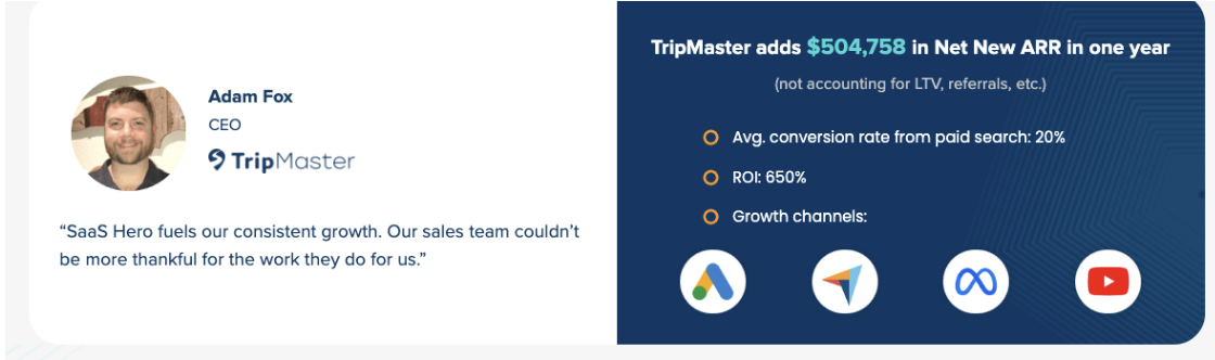
- SaaSHero’s mobile-first designs drive outcomes like $504K Net New ARR for TripMaster and 650% ROI using trust signals and animated demos.
- Top ad formats include screenshot trust builders, G2 badge headlines, client logo carousels, and competitor pricing tables that reach 15-30% conversion rates.
- Core principles include 5-second clarity tests, 44×44 pixel CTAs, progressive disclosure, and the 40-40-20 rule that balances visuals, trust, and urgency.
- You can implement these high-ROAS designs with SaaSHero’s discovery call on a $1,250/mo retainer with typical 80-day payback periods.
Mobile-First SaaS Ad Principles That Drive Revenue
SaaSHero’s methodology focuses on compelling visuals, strong trust signals, and urgency-driven CTAs that match how people actually use mobile. The framework speaks to mobile B2B buyers who skim quickly, scroll with their thumbs, and decide in seconds whether to keep engaging.
Effective design follows clear heuristics. Run 5-second clarity tests, use minimum 44×44 pixel touch targets for CTAs, and stick to single-column layouts that remove horizontal scrolling. Compress images aggressively so pages load in under 3 seconds on typical mobile connections.
Progressive disclosure keeps buyers engaged without overwhelming them. Lead with a concise value proposition, then offer tap-to-expand sections or secondary screens for deeper feature details.
|
Ad Element |
Mobile Optimization |
Conversion Lift |
|
GIF Demos |
Thumb-zone CTA placement |
+30% CTR |
|
Trust Badges |
Above-fold positioning |
+25% conversions |
|
Urgency Copy |
Action-oriented language |
+20% click-through |
Scale with SaaSHero’s $1,250/mo retainer to roll these mobile-first principles across your full ad portfolio.
12 Mobile-First B2B SaaS Ad Design Examples That Convert
1. Screenshot Trust Builders That Show the Real Product
Authentic product screenshots create instant credibility because prospects see the actual interface, not stock imagery. The mobile layout uses a clean dashboard screenshot with key metrics highlighted and a bold “Start Free Trial” CTA placed directly in the thumb zone.
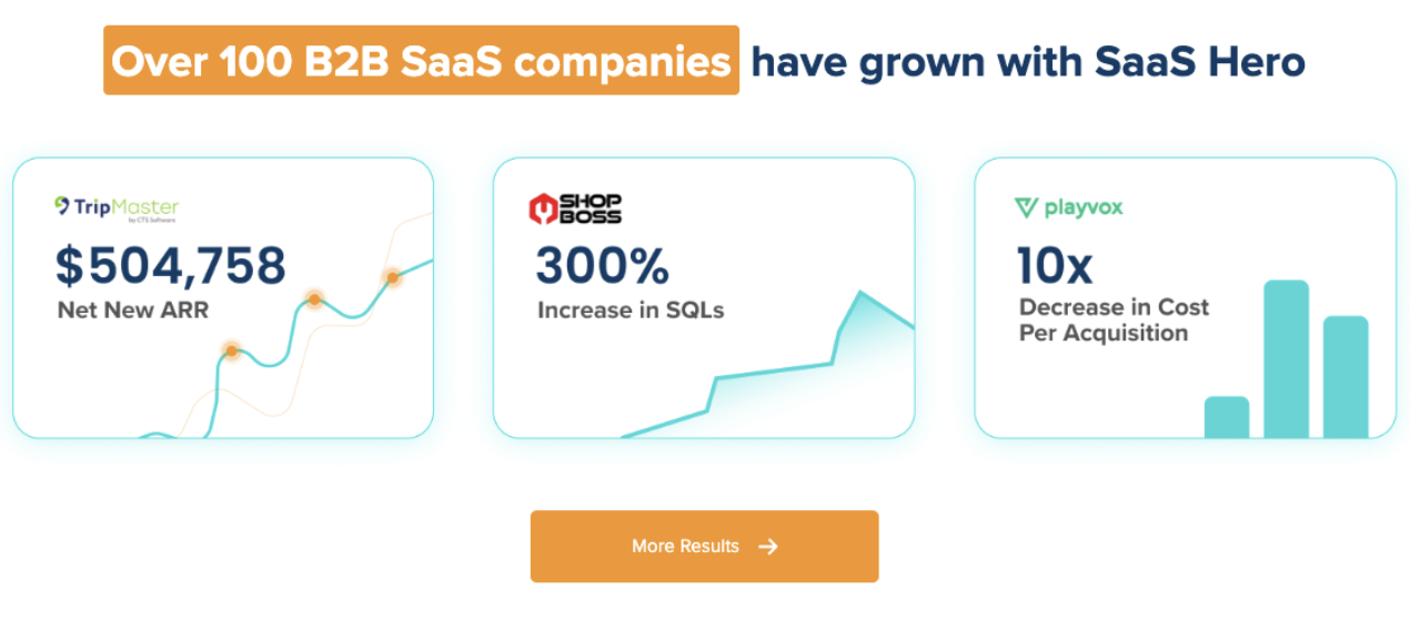
This format helped TripMaster reach a 20% conversion rate from paid search by showing real software value within the first 3 seconds of viewing.
2. Client Logo Carousels That Prove Social Proof
Horizontal logo carousels perform strongly on mobile because users can swipe through recognizable brands in seconds. Our design for Shop Boss displayed 8 automotive client logos in a smooth-scrolling carousel with “Join 500+ Auto Dealers” messaging.
This social proof format produced a 305% conversion lift by tapping into peer validation, which heavily influences B2B purchase decisions.
3. G2 Badge Headlines That Build Instant Trust
G2 High Performer badges used as headline elements create immediate authority. The mobile layout places the orange G2 badge at the top, followed by “Rated #1 HR Software” copy and a contrasting CTA button.
TestGorilla used this structure to support their 80-day payback window by reducing hesitation through clear third-party validation.
4. Minimalist Value Props That Cut Through Noise
Single-benefit headlines work best on small screens because they remove decision fatigue. For Playvox, we led with “Cut Support Costs 40%” as the main headline, paired with a simple product icon and a green “Get Demo” button.
This focused message helped drive a 10x decrease in cost per lead by avoiding the cognitive overload that often comes with complex B2B copy.
5. Figma-Style Animated Demos That Replace Heavy Video
Animated product demos with Figma-style transitions show core workflows without bulky video players. HTML5 ads with animated dashboards and interactive elements resulted in 166% conversion rate increases for several B2B SaaS brands.
The mobile animations loop every 4 seconds, keep attention, and still respect data limits for users on cellular networks.
6. Loom-Style Minimalist Screenflows for Fast Clarity
Short looping screen recordings show a complete workflow in under 10 seconds, which fits mobile attention spans. The sequence walks through a specific problem and how the product solves it with a clean interface.
The mobile version includes captions for sound-off viewing and ends on a clear “Try It Free” CTA placed for easy thumb tapping.
7. Zapier Integration Polls That Qualify Prospects
Interactive poll ads achieve 2x CTR over static images by inviting quick participation. Integration-focused polls ask “Which tool do you use for [specific workflow]?” and list popular software options.
This format surfaces qualified leads by revealing each prospect’s tech stack while positioning your product as the stronger integration hub.
8. GIF Before/After ROAS Proofs That Show Real Gains
Before-and-after GIFs turn abstract promises into visible results. The design cycles between “Before” dashboards with weak metrics and “After” dashboards with clear percentage improvements highlighted.
This visual proof helped several clients reach 650% ROI by making performance gains feel concrete and believable.
Get SaaSHero to build yours using proven GIF templates that turn mobile traffic into qualified demos.
9. Competitor Pricing Tables for High-Intent Searches
Mobile-friendly comparison tables capture buyers who search for “[Competitor] pricing” or “[Competitor] alternatives.” The layout uses a simple two-column table that compares features and pricing while clearly showing your stronger value position.
This conquering approach regularly delivers 20% or higher conversion rates by meeting prospects during active evaluation.
10. Switch from Competitor Offers That Remove Friction
Switching incentives like “Free Migration from [Competitor]” or “Cancel [Competitor] We’ll Pay the Fee” speak directly to frustrated users. The mobile creative highlights the switching benefit with bold headlines and risk-reduction copy.
These campaigns usually reach 15-25% conversion rates because they target users who already show strong purchase intent.
11. Review Conquest Variants That Win Comparison Shoppers
Ads aimed at “[Competitor] reviews” searches work well when they feature real testimonials and G2 rating comparisons. The mobile layout showcases 5-star ratings at the top with specific quotes that address known competitor pain points.
This structure builds trust and positions your product as the better alternative while the prospect actively researches options.
12. Urgency Demo CTAs With Clear Payback Metrics
Time-bound offers paired with specific ROI promises create strong motivation to act. Headlines such as “Demo Today See 80-Day Payback” or “Book Now Join 500+ Companies Saving 40%” combine urgency with social proof.
The mobile design uses countdown timers and bold scheduling CTAs in the thumb zone, which often produces 18-22% conversion rates.
2026 Mobile B2B SaaS Ad Trends You Can Use Now
AI-driven hyper-personalization becomes the minimum standard in 2026 and supports real-time ad variations by role, industry, and buying stage. Interactive carousel ads achieve 2x CTR improvements by telling short stories and highlighting multiple features in one unit.
Voice-activated CTAs, zero-party data polls, and AI-generated creative variants will shape mobile-first strategies across platforms. SaaSHero’s platform-agnostic CRO approach adapts to these shifts while keeping attention on pipeline and revenue, not just clicks.
FAQs
What makes mobile-first SaaS ads convert better than desktop-focused designs?
Mobile-first SaaS ads convert better because they match how B2B buyers research and decide on their phones. With over 68% of B2B research happening on mobile, ads must load in under 3 seconds, use thumb-friendly CTAs of at least 44×44 pixels, and rely on single-column layouts that remove horizontal scrolling.
Mobile users skim quickly, so winning ads communicate value in seconds using the 40-40-20 rule. That balance means strong visuals, visible trust signals, and urgency-focused CTAs placed directly in the thumb-scrolling zone.
How should B2B SaaS companies measure ROAS as SaaSHero does?
Accurate ROAS measurement for B2B SaaS requires tracking the full journey instead of only last-click attribution. Configure tracking so data flows from ad clicks through landing pages into your CRM, then connect impressions and sessions to closed-won revenue.
Prioritize Net New ARR, pipeline value, and sales-qualified leads over vanity metrics such as impressions or raw clicks. Use tools like HubSpot or Salesforce integrations to visualize impact across the funnel and calculate true customer acquisition cost, including the full sales cycle.
Which platforms deliver the best results for mobile B2B SaaS ads?
LinkedIn usually performs best for B2B SaaS when you need precise professional targeting. Google Search Ads excel at capturing high-intent traffic, especially for competitor conquesting and solution-aware queries.
Google Display Ads work well for retargeting visitors who already showed interest, while Meta and Facebook Ads can support reach when campaigns are tightly structured. The strongest results come from aligning each platform to its role, such as LinkedIn for targeting, Google for intent, and display for remarketing.
What are the most common mobile ad design mistakes that hurt conversions?
Common mistakes include desktop-first layouts that force horizontal scrolling and CTAs placed outside the thumb zone. Many teams also create forms with too many fields or small touch targets and skip image compression, which slows pages beyond 3 seconds.
Complex messaging that fails the 5-second clarity test, weak or missing trust signals above the fold, and feature-heavy copy all reduce performance. Generic stock photos and vague value props also underperform compared to real product screenshots and specific outcome statements.
How can SaaS companies get started with high-converting mobile ad campaigns?
Begin with a heuristic review of your current mobile experience by testing ads and landing pages on real devices. Check clarity, load speed, and how easily you can tap CTAs with one hand.
Apply the 40-40-20 framework with strong product visuals, visible trust signals such as G2 badges or client logos, and urgency-focused CTAs in the thumb zone. Use single-column layouts, compress images, and reveal information progressively instead of dumping every detail at once.
Launch competitor conquesting campaigns around high-intent searches and connect your ad platforms to your CRM so you can track revenue impact instead of only surface metrics.
Conclusion: Mobile-First Design as Your 2026 Growth Engine
Mobile-first B2B SaaS ad design now sits at the core of profitable growth in 2026. Top-performing formats such as animated product demos, competitor pricing tables, and urgency-driven CTAs with payback metrics consistently deliver 2x or higher CTR lifts and measurable ARR gains.
Winning teams move away from desktop-first thinking and focus on thumb-zone layouts, strong trust signals, and sub-3-second load times. SaaSHero’s flat-fee model, senior-led execution, and history of 10x CPL reductions position us as a strong partner for these mobile-first campaigns.
Book a discovery call for $750 landing pages plus ads that turn your mobile traffic into Net New ARR.