

Key Takeaways
- Transparent pricing visualizations reduce bounce rates by 25% and boost conversions by addressing buyer skepticism upfront in B2B SaaS ads.
- Three-tier pricing tables use the central dominance effect, with middle tiers highlighted as “Most Popular” for stronger ad performance.
- Interactive sliders and ROI calculators personalize pricing, demonstrate value, and deliver 18-40% conversion lifts across Google and LinkedIn ads.
- Trust badges like “No Hidden Fees” and competitor comparisons build credibility while positioning your SaaS clearly and legally.
- Implement these 12 proven visualization ideas through a SaaSHero discovery call to cut CAC and scale qualified leads.
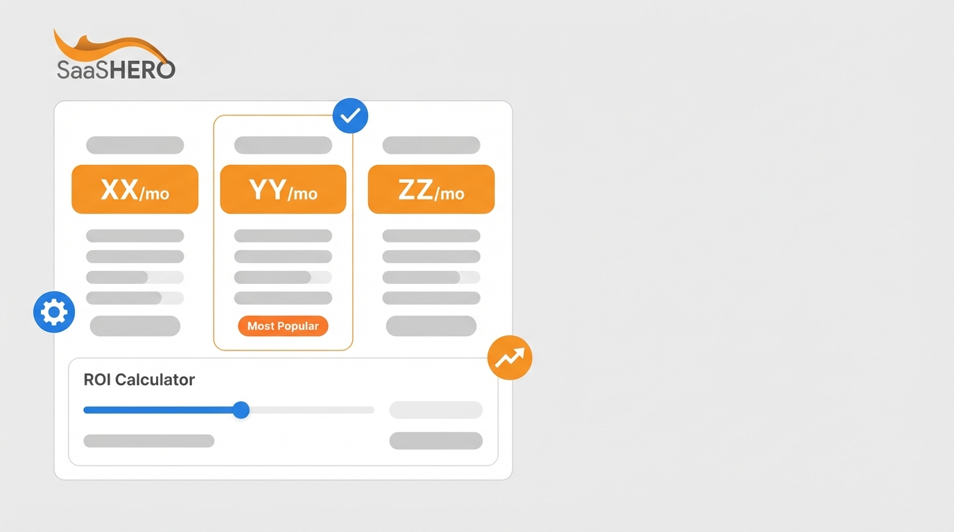
Idea #1: Three-Tier Pricing Tables That Highlight Your Core Plan
Three-tier pricing tables guide prospects toward the middle option through the central dominance effect. Salesforce Commerce Cloud enables A/B testing of pricing pages with three-tier structures highlighting the central premium option as the recommended choice. For LinkedIn banner ads, show three tiers with clear monthly pricing, feature differences, and a visible “Most Popular” badge on the middle tier. Google responsive ads should feature a clear starting price such as “Plans from $X/month” while still hinting at higher tiers. Implementation steps: create a clear visual hierarchy with pricing first, use contrasting colors for the recommended tier, and list 2-3 core features per tier.
Idea #2: Honest Side-by-Side Competitor Comparisons
Competitive comparison tables capture prospects who actively research alternatives and want clarity. Show your pricing next to 1-2 competitors with obvious feature advantages highlighted. For Google ads on competitor keywords, send traffic to dedicated landing pages with honest pricing comparisons that spotlight your unique value. LinkedIn ads can tease the comparison with “See how we compare” messaging and a cropped table preview. Legal compliance requires factual comparisons, no competitor logos, and no trademark use. Implementation steps: pull competitor public pricing, highlight your strengths with checkmarks or icons, and add total cost of ownership calculations.
Idea #3: Interactive Pricing Sliders That Match Real Usage
Usage-based pricing sliders help prospects estimate costs based on their actual needs. The majority of modern software companies have adopted usage-based pricing models that align vendor success with customer value. In ads, preview the slider with common scenarios such as “100 users = $X/month” or “10,000 API calls = $X/month.” This format works especially well for LinkedIn campaigns by company size and Google ads on high-intent pricing keywords. Implementation steps: define usage metrics clearly, show pricing at 3-4 realistic usage levels, and include visible annual discount options.
Idea #4: Clear “Starting From” Anchors With ROI Calculators
Price anchoring paired with ROI projections reframes cost as measurable value. Show a simple “Starting from $X/month” anchor with instant ROI statements such as “Save $Y annually vs competitors” or “ROI in 90 days.” This structure fits Google search ads where pricing intent already exists. LinkedIn ads can lead with ROI headlines and support them with short calculations in the copy. Book a discovery call to design ROI calculators that turn high-intent traffic into qualified sales conversations.
Idea #5: “No Hidden Fees” Badges That Build Trust Fast
Trust badges that address hidden fee concerns increase credibility in crowded markets. Transparent pricing builds trust amid declining customer trust, with 72% trusting companies less because of hidden costs. Place badges such as “No Setup Fees,” “No Hidden Costs,” or “Cancel Anytime” directly in your ad creative. These badges work across Google text ads, display formats, and LinkedIn sponsored content. Implementation steps: review your pricing for hidden elements, design simple badges with direct wording, and test different placements in your ad layouts.
Idea #6: Feature Checklists With Simple Pricing Icons
Visual feature matrices help prospects see what they get at each price point in seconds. Use checkmarks, X marks, and upgrade icons to show feature availability across plans. Effective pricing pages use iconography and feature clustering for clear tier differentiation that reduces friction. For banner ads, highlight 3-4 core features across tiers with clear labels. Google responsive ads can spotlight premium features with short upgrade prompts. Implementation steps: choose your strongest features, design consistent icons, and group features by user needs such as admin, security, or reporting.
Idea #7: Annual vs Monthly Savings Calculators That Nudge Commitments
Annual discount calculators encourage longer contracts by making savings obvious. Show monthly pricing next to annual options with clear savings such as “Save 20% annually” or “$X saved per year.” Mailchimp shows monthly and yearly toggles with savings indicators to guide decisions. This visualization works well in LinkedIn ads for budget-focused decision makers and finance leaders. Implementation steps: calculate annual discounts precisely, show total savings amounts, and mention payment flexibility where available.
Idea #8: Tiered Pricing Cards With Simple Usage Toggles
Interactive pricing cards let prospects switch between usage levels or billing periods without confusion. Show a card for each tier with toggles for monthly versus annual billing or different user counts. This format simplifies complex SaaS pricing while keeping the layout clean. For Google ads, preview the toggle with a clear price range such as “$X to $Y per month.” LinkedIn ads can stress flexibility with messaging like “Pricing that scales with your team.” Implementation steps: design uncluttered card layouts, use smooth but simple toggle states, and confirm mobile responsiveness for all ad traffic.
Idea #9: Usage-Based Pricing Meters for Consumption Models
AI-powered dynamic pricing visualizes prices adjusted in real time based on customer activity and market conditions, turning static pricing into revenue systems. Usage meters show pricing at different consumption levels with clear per-unit costs. This approach fits API products and platforms that bill on consumption. In ads, present two or three common usage bands with matching prices. Book a discovery call to build usage-based pricing visuals that convert technical buyers into qualified leads.
Idea #10: Pricing Displays Paired With Targeted Testimonials
Customer testimonials placed next to pricing reduce risk perception and support your value story. Add short quotes beside each relevant tier, such as “This plan paid for itself in 3 months – Sarah, VP Marketing.” This social proof counters skepticism and shows real ROI. For LinkedIn ads, pair customer logos with the plan that fits similar companies. Google ads can use testimonial snippets in extensions or descriptions. Implementation steps: collect testimonials that mention pricing or payback, map each quote to a tier, and include titles and companies for credibility.
Idea #11: AI-Driven Animated Pricing Reveals in Video Ads
AI-driven personalization delivers 18-24% lifts in B2B SaaS conversions through dynamic content. Animated pricing reveals build perceived value step by step, starting with base pricing and then showing added features or savings. Google’s Gemini model enables real-time dynamic ad copy rewriting for relevance, which supports personalized pricing displays. For LinkedIn or YouTube video ads, use short sequences that reveal each tier in order. Implementation steps: script progressive reveals, time each step for quick understanding, and confirm animations display smoothly on all major devices.
Idea #12: Outcome-Based Pricing Visuals That Tie Cost to Results
Outcome-based pricing ties payments to actual value or tasks performed, supported by AI and machine learning for tracking. Show pricing based on results instead of seats or usage, such as “Pay per qualified lead” or “Pricing linked to revenue uplift.” This model tackles ROI concerns directly by aligning your revenue with customer outcomes. In ads, highlight performance-based pricing with specific outcome metrics. Implementation steps: define measurable outcomes clearly, set baseline metrics, and build transparent tracking methods.
Top Transparent Pricing Visuals for Search Campaigns
The following table summarizes the strongest pricing visualization types for B2B SaaS ad campaigns:
|
Visualization Type |
Primary Benefit |
Best Ad Format |
Conversion Impact |
|
Three-Tier Tables |
Central dominance effect |
LinkedIn banners |
25% improvement |
|
Interactive Sliders |
Personalized pricing |
Landing pages |
18-24% lift |
|
Trust Badges |
Reduces skepticism |
All formats |
20% CTR boost |
|
ROI Calculators |
Demonstrates value |
Google search ads |
35-40% better conversion |
Adapting SaaS Pricing Pages for High-Intent Traffic
Effective visualization techniques include placing critical KPIs at the top left with size and color hierarchy and limiting to 5-7 visualizations per page to avoid overload. For ad-driven traffic, lead with a strong hero pricing anchor and place supporting details and explanations below the fold.
Modern Pricing UI Practices for 2026
2026 trends show 8x year-over-year growth in usage-based pricing and hybrid models that mix predictability with scaling. Modern pricing interfaces now include AI-driven dynamic pricing and feature-level metering for add-ons and advanced modules.
Frequently Asked Questions
How should B2B SaaS companies A/B test pricing visualizations in ads?
Teams should start with baseline metrics for current ad performance, then test one pricing visualization element at a time. Focus on high-impact changes such as pricing table layouts, trust badges, or ROI calculators. Run tests for at least two weeks to reflect B2B buying cycles. Track metrics beyond click-through rates, including cost per qualified lead and sales-accepted leads. Use statistical significance testing before rolling out winning variations across campaigns.
What mobile optimization considerations apply to pricing visuals in responsive ads?
Mobile pricing layouts need compressed hierarchy and simplified structures because of smaller screens. Use larger fonts, at least 16px, for pricing numbers and limit tables to three columns on mobile. Favor vertical scrolling instead of horizontal swipes. Add touch-friendly interactive elements with enough spacing. Test image load times and compress files so slow loading does not increase bounce rates.
Are there legal restrictions for competitor pricing comparisons in B2B SaaS ads?
Competitor comparisons must remain factual and supported by evidence to avoid false advertising claims. Use only publicly available pricing information and avoid competitor logos or trademarks. Clearly identify your company as the advertiser and include disclaimers for pricing accuracy, dates, and terms. Emphasize feature differences instead of vague superiority claims. Consult legal counsel for industry rules and trademark issues.
What ROI benchmarks should B2B SaaS companies expect from transparent pricing ads?
Strong transparent pricing campaigns often deliver 15-25% conversion lifts and 20-30% click-through increases compared with opaque pricing. Cost per lead reductions of 10-40% are common when clear pricing filters out poor-fit traffic. Sales cycles can shorten by 15-20% when prospects enter with realistic pricing expectations. Track performance over at least 90 days to match longer B2B decision timelines.
How can agencies implement these pricing visualizations for SaaS clients?
Agencies should connect pricing visualizations directly to client pricing strategy, competitive research, and conversion tracking. Start with a pricing page audit, identify transparency gaps, and build ad-specific landing pages with focused pricing layouts. Define success metrics tied to revenue and pipeline instead of vanity metrics. Run ongoing optimization cycles that test new visualization formats and refine based on performance data.
Conclusion: Turning Transparent Pricing Into a Growth Lever
Transparent pricing visualizations create a measurable advantage in B2B SaaS advertising by reducing skepticism and improving efficiency. The strongest setups combine three-tier pricing tables, interactive calculators, and trust elements to build clear and compelling ad journeys. Google’s AI Max for Search delivers 14% more conversions at a similar CPA when paired with transparent pricing strategies.
Consistent success depends on structured testing, mobile-first design, and alignment with your broader marketing funnel. Teams that focus on revenue metrics instead of vanity metrics use pricing transparency to drive qualified leads and faster sales cycles. Book a discovery call to build transparent pricing ad campaigns that lower customer acquisition costs and accelerate revenue growth with proven visualization strategies.