

Key Takeaways for B2B SaaS Teams
- Generic value propositions increase customer acquisition costs because B2B buyers see little real difference between suppliers.
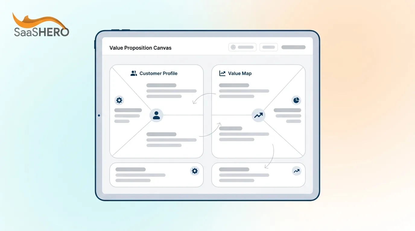
- The SaaSHero Revenue Value Proposition Canvas adds ICP trigger events, quantified pains and gains, proof layers, and direct CTA outputs that the classic Strategyzer canvas does not include.
- Each of the six canvas components maps directly to landing-page headlines, ad copy, and sales-deck messaging for measurable message-market fit.
- Teams that quantify pains and gains and attach proof points see higher SQL-to-close rates and shorter sales cycles than teams using generic messaging.
- Schedule a revenue-focused messaging audit with SaaSHero to apply the Revenue Value Proposition Canvas to your ICP and accelerate pipeline growth.
Why the Classic Value Proposition Canvas Falls Short in B2B SaaS
The original Strategyzer Value Proposition Canvas maps customer jobs, pains, and gains against product features, pain relievers, and gain creators. It remains useful for early product-market fit work. Growth-stage SaaS teams accountable to pipeline and ARR face three gaps that limit its effectiveness.
First, it produces static lists. Jobs, pains, and gains evolve with regulatory, technological, and macroeconomic shifts, so a canvas completed at Series A can be stale by the time the Series B deck is built. Second, it does not prioritize by revenue elasticity. Without explicit prioritization by customer importance and competitive differentiation, teams produce diluted messaging that attempts to address all pains equally. They miss the two or three outcomes most likely to move pipeline. Third, it has no output layer. Workshop results frequently languish in a Google Doc and never influence product, marketing, or sales direction.
To address these three limitations, revenue-focused adaptations integrate competitor conquesting logic, landing-page message match, and CRM-connected attribution. SaaS buyers now spend less than 20% of their purchase journey time speaking with vendors, conducting the rest of their research independently across reviews, pricing pages, and peer communities. The value proposition must therefore carry most of the selling work before any sales conversation begins.
Schedule a messaging audit to compare your current positioning against this revenue-ready framework.
Revenue Value Proposition Canvas Example for B2B SaaS
The SaaSHero Revenue Value Proposition Canvas uses six components in sequence. The following example uses a fictional HR Tech product, TalentPulse, to illustrate each step and produce a Geoff Moore-style positioning statement.
- ICP Trigger Event: Identify the time-bound signal that opens a buying window. Recently funded companies represent a high-intent trigger because they carry fresh capital, investor pressure for rapid growth, and an 18–24 month runway to demonstrate results. For TalentPulse: Series A HR Tech companies, 3–6 weeks post-funding announcement, with a new VP of People hired in the last 90 days.
- Quantified Customer Pain: Rate pains on severity and frequency, then attach a number. The Value Map must translate each prioritized pain into a specific, quantified pain reliever rather than a generic feature list. For TalentPulse: manual performance review cycles consume 14 hours per manager per quarter and produce data that is 60 days stale by the time decisions are made.
- Quantified Gain: Map the gain to one of three financial levers: make money, save money, or reduce risk. Quantifiable business outcomes should use simple formulas such as (Current Cost) × (% Savings) = Annual Savings. For TalentPulse: automated continuous feedback reduces manager review time by 70%, saving $3,200 per manager annually and cutting regrettable attrition by 18%.
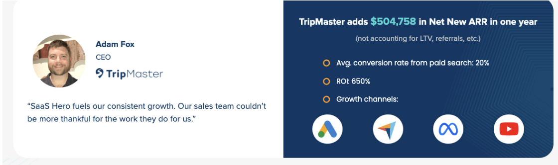
- Proof Layer: Attach a validated proof point from a comparable customer. In the DockFlow logistics example, quantified claims were validated through landing-page tests achieving a 6.2% demo rate and pilots showing measurable operational improvements. For TalentPulse: a 200-person Series B SaaS company reduced voluntary churn by 22% within two quarters of deployment.
- Primary Alternative: Name the incumbent the ICP is most likely replacing. A strong value proposition statement must be comparative, naming the primary alternative, to be falsifiable and portable across GTM assets. For TalentPulse: annual review cycles managed in spreadsheets or legacy HRIS modules.
- CTA Output: Translate the above into a landing-page headline and a Geoff Moore-style positioning statement. For TalentPulse: “For Series A HR Tech companies whose new VP of People needs to demonstrate retention impact before the next board meeting, TalentPulse is a continuous performance platform that reduces regrettable attrition by 18% within two quarters. Unlike annual review cycles in spreadsheets, it surfaces real-time engagement signals so managers act on data that is never more than 48 hours old.”
Apply this six-part canvas to your ICP in a working session with the SaaSHero team.
Key Strategic Decisions and Trade-offs in Your Canvas
Generic vs. ICP-specific pains. Generic pains (“slow processes,” “lack of visibility”) appear in every competitor’s messaging. Unclear or generic messaging leads to lost sales, poor conversion rates, and competitors winning business simply because their value is easier to understand. ICP-specific pains tied to a named trigger event reduce CAC by filtering unqualified traffic before it reaches the sales team. This filtering creates a trade-off: a narrower focus reduces your addressable audience, yet every prospect who does convert is pre-qualified around the specific pain you solve, which supports higher SQL-to-close rates and shorter payback periods.
Qualitative vs. quantified gains. Qualitative gains (“easier reporting,” “better collaboration”) are easy to produce and easy to ignore. Only the 2–3 highest-elasticity pain relievers and gain creators should be elevated into the Unique Value Proposition, each expressed as a measurable outcome. Quantified gains require customer interview data and win/loss analysis, which takes time. The trade-off favors teams that invest in this work: teams using MEDDPICC or MEDDIC quantification report 4–8 percentage-point or 20–30% win-rate gains in complex B2B deals and 15–25% reductions in sales-cycle length.
Static vs. dynamic proof layers. A single case study published at launch becomes stale. SaaS value proposition work should be revisited after major product changes or every 6–12 months because markets evolve. Dynamic proof layers, such as updated G2 ratings, rolling cohort data, and live payback period calculations, maintain message-market fit as the competitive landscape shifts. These proof assets directly support conversion rate improvements on landing pages.
How Leading SaaS Teams Use the Canvas Today
Growth-stage SaaS teams increasingly treat the value proposition canvas as a living GTM asset rather than a one-time workshop output. In 2026, SaaS marketing functions as a systems problem that connects data, product usage, brand trust, and revenue outcomes, requiring marketing, sales, and customer success to align under a single RevOps revenue strategy.
Customer-led narratives now outperform feature-based messaging because buyers respond more strongly to real-world outcomes, implementation stories, and measurable business impact. As a result, marketing and product teams run joint ICP interviews quarterly. They feed updated jobs-to-be-done data back into the canvas and propagate changes to landing pages, sales decks, and onboarding flows within the same sprint cycle.
The shift toward revenue-mapped outputs also changes how proof is collected. High-performing teams instrument their product to surface time-to-first-value and error-rate-reduction metrics automatically. They then pipe those figures directly into ad copy and landing-page headlines for continuous A/B testing.
Canvas Readiness, Maturity, and Rollout Plan
Teams at different stages require different levels of canvas sophistication. A three-stage maturity model provides a practical diagnostic.
Stage 1 — Foundational. The team has completed qualitative ICP interviews and can articulate one quantified pain and one quantified gain. Messaging exists on the homepage but has not been tested against ad copy or sales deck performance. Diagnostic question: Do you have win/loss data from the last 10 closed deals that names the primary alternative?
Stage 2 — Revenue-Ready. The canvas includes trigger events, a named primary alternative, and at least one validated proof point. Landing-page headlines match ad copy, and demo-to-opportunity conversion is tracked in the CRM. Diagnostic question: Can you calculate your current payback period from first ad impression to closed-won revenue?
Stage 3 — Scaled. The canvas feeds a dynamic messaging system where ICP signals (funding events, executive hires) trigger personalized landing-page variants and outbound sequences. Value proposition work at this stage is tied to lifecycle stage and unit economics, with canvas updates governed by a cross-functional RevOps cadence. Diagnostic question: Is there a named owner across marketing, product, and sales who is accountable for canvas accuracy?
Common Pitfalls and Quick Diagnostic Checks
- Unquantified pains. Pains expressed as adjectives (“slow,” “complex”) cannot be tested or falsified. A useful value proposition must be specific enough to be tested, such as reducing migration timelines by 30–40% versus an industry average. Internal question: Can you attach a time, cost, or frequency number to every pain on your canvas?
- Missing trigger events. Without a trigger, messaging reaches prospects who are not in a buying window, inflating CPL and reducing SQL quality. Internal question: Have you mapped the three most common events that preceded your last 20 closed-won deals?
- No proof layer. Claims without proof are indistinguishable from competitor claims. A 2025 Wynter survey found 86% of B2B SaaS marketing leaders felt trapped in a “sea of sameness.” Internal question: Does every quantified gain on your canvas have a named customer or cohort data point attached?
- Generic CTAs. “Learn more” and “Get started” do not communicate outcome or urgency. Internal question: Does your primary CTA name the specific result the prospect will move toward?
- No negative-keyword hygiene. Navigational search traffic (users looking for a competitor’s login page) inflates click volume without contributing to pipeline. Internal question: Are competitor brand terms without intent modifiers excluded from your paid campaigns?
Team Archetypes and How They Use the Canvas
The Overwhelmed Founder. A CEO at $600K ARR writes ad copy on weekends and uses a generic homepage headline copied from a competitor. The canvas has never been completed with customer interview data. The constraint is time, not budget. The decision point: invest four hours in a structured ICP interview session to produce one quantified pain and one trigger event, then test a single landing-page variant against the existing homepage. Even a modest conversion rate improvement compounds significantly at this stage.
The Frustrated VP of Marketing. A VP at a Series B company ($8M ARR) has a canvas from the last brand refresh, but it has not been updated since the product added two new modules. The sales team uses different messaging than the website. The constraint is cross-functional alignment. The decision point: run a joint messaging audit with sales and product to reconcile the canvas, then propagate the updated positioning statement to landing pages, the sales deck, and outbound sequences within a single two-week sprint.
The Post-Funding Scaler. A marketing lead at a freshly funded Series A company has 90 days to demonstrate pipeline velocity to the board. The canvas exists but lacks trigger events and proof layers. The constraint is speed. The decision point: prioritize the trigger event and proof components first, since these two additions have the highest immediate impact on SQL quality and sales-cycle length, then layer in quantified gains as customer data accumulates.
Free B2B SaaS Value Proposition Canvas Template
The SaaSHero Revenue Value Proposition Canvas template is available as a free download. It includes pre-built fields for all six components: ICP trigger event, quantified pain, quantified gain, proof layer, primary alternative, and CTA output. Each field includes a worked B2B SaaS example and a diagnostic question to guide completion.
The template is designed to produce a Geoff Moore-style positioning statement on completion, ready for direct use in landing-page hero copy, sales deck opening slides, and outbound email subject lines. Once teams adopt this structure, they report measurable improvements in demo requests and qualified pipeline in B2B software deployments.
Download the free canvas and book a live messaging audit with the SaaSHero team.
Frequently Asked Questions
How is the SaaSHero Revenue Value Proposition Canvas different from the standard Strategyzer canvas?
The standard Strategyzer canvas maps customer jobs, pains, and gains against product features, pain relievers, and gain creators. It is a useful product-market fit tool but does not include trigger events, quantification requirements, proof layers, or output fields for landing pages and sales decks. The SaaSHero canvas adds these six components and is structured to produce a testable Geoff Moore-style positioning statement on completion, which makes it directly usable for paid media, outbound, and sales enablement without additional translation work.
How do you integrate the canvas output into a landing page?
The six-component framework maps directly to landing-page structure. The trigger event informs audience targeting and ad copy. The quantified pain becomes the problem statement in the hero section. The quantified gain becomes the headline benefit claim. The proof layer populates the social proof section. The primary alternative informs the comparison or “why us” section. The CTA output field produces the button copy and form headline. Message match between ad copy and landing-page headline is one of the highest-leverage conversion rate improvements available to B2B SaaS teams, and the canvas is structured to enforce that match by design.
How do you measure whether the value proposition is working?
Leading indicators include ad click-through rate, landing-page demo conversion rate, demo-to-SQL conversion, win rate versus named alternatives, and sales-cycle length. Lagging indicators include Net New ARR per cohort, CAC, and payback period. The canvas should be treated as a hypothesis, not a finished document. Each component can be A/B tested independently. For example, run two landing-page variants with different quantified gain claims, measure demo conversion rate, and promote the winner. Revisit the full canvas whenever win rate drops more than five percentage points or a major product change alters the core gain delivered.
Who owns the value proposition canvas in a B2B SaaS company?
Ownership works best across a small cross-functional group: a marketing lead responsible for messaging and channel execution, a product lead responsible for validating that claimed gains are deliverable, and a sales lead responsible for confirming that the positioning resonates in live discovery calls. A single named DRI (directly responsible individual) should govern the document and schedule quarterly reviews. Without a named owner, canvas updates stall and messaging diverges between the website, sales deck, and outbound sequences, which often causes misaligned pipeline reporting.
Can the canvas be used for multiple ICPs simultaneously?
A separate canvas should be completed for each distinct ICP segment. In B2B SaaS, the economic buyer, the end user, and the technical evaluator often have different jobs, pains, and gains. As discussed in the trade-offs section, attempting to address all stakeholders in one canvas dilutes your messaging, which is why separate canvases for each ICP segment produce stronger results. For most Series A–B companies, the highest-leverage starting point is completing one canvas for the single ICP segment that represents the largest share of closed-won revenue, validating the messaging in paid media, and then expanding to secondary segments once the primary canvas produces consistent pipeline results.
Conclusion and Next Steps for Your B2B SaaS Canvas
The six-component SaaSHero Revenue Value Proposition Canvas (ICP trigger event, quantified pain, quantified gain, proof layer, primary alternative, and CTA output) addresses the structural gaps that make generic canvases ineffective for growth-stage B2B SaaS teams. It produces a testable positioning statement, enforces message match between ads and landing pages, and connects positioning directly to Net New ARR and payback period metrics.
The most practical next step is a focused messaging audit. Map your current homepage headline and primary ad copy against each of the six components and identify which fields are missing or unquantified. Most Series A–B teams find that trigger events and proof layers are the two components with the largest gaps and the highest immediate impact on SQL quality when added.
Run a live SaaSHero messaging audit and use the free Revenue Value Proposition Canvas template with your team.