




Written by: Aaron Rovner, Founder, Saas Hero | Last updated: July 7, 2026
Key Takeaways
- Seven conversion principles – Relevance, Clarity, Trust, Friction Reduction, Outcome Visibility, Speed, and Personalization – turn B2B SaaS landing pages into reliable pipeline drivers instead of ad-spend sinks.
- High-converting dedicated landing pages can reach 8–15% demo-request rates, nearly doubling the 4.02% median and delivering roughly 4× better capital efficiency than simply buying more traffic.
- Examples from HubSpot, Salesforce, Intercom, Ahrefs, and others show how short headlines, specific customer counts, three-field forms, and above-the-fold trust signals consistently lift conversions.
- Competitor-conquest campaigns, heuristic audits, and mobile-first layouts remove common conversion killers such as generic homepages, vague logo strips, and bloated forms.
- Ready to turn your landing pages into revenue infrastructure? Schedule a conversion audit to benchmark your current pages against 2026 performance ranges.
Why High-Converting Landing Pages Are Now a Capital-Efficiency Lever
The median dedicated landing page across all industries converts at 4.02% in 2026, nearly double the 2.35% median for general website pages. For B2B SaaS, demo request pages average 1.5%–4%, while best-in-class pages reach 8–15%. A page converting at 2% requires roughly five times more ad spend to generate the same leads as a page converting at 10% in controlled tests.
That spread maps directly to Net New ARR. Conversion improvements are typically 4× more capital-efficient than scaling traffic to produce the same pipeline. For a $5M–$50M ARR company spending $30k per month on paid search and LinkedIn, closing the gap between a 2% and a 5% demo-request conversion rate can add hundreds of thousands of dollars in annual pipeline without increasing media budget.
SaaSHero client TripMaster illustrates the ceiling. TripMaster added $504,758 in Net New ARR in 12 months after shifting to a systematic landing-page optimization program anchored to revenue metrics instead of raw form fills. That outcome required no additional ad spend and relied on disciplined page architecture and measurement.
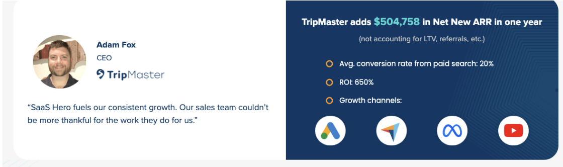
Teams winning in 2026 treat landing pages as revenue infrastructure, not design artifacts. Pages instrumented to pipeline, SQL rate, and close rate compound ARR every month; pages that are not quietly erode it.
Get your pages audited against these 2026 benchmarks so your paid traffic supports revenue instead of vanity metrics.
12 Proven Landing-Page Examples
The 12 examples below show how top-performing B2B SaaS companies apply seven conversion principles – Relevance, Clarity, Trust, Friction Reduction, Outcome Visibility, Speed, and Personalization – to reach conversion rates in the 8–15% range. Each example highlights which principles drive performance so you can adapt the patterns to your own pages.
1. HubSpot — Demo Request (Sales-Assisted)
HubSpot’s Outcome-First Hero Layout
HubSpot’s demo request page leads with an outcome-specific headline under eight words, a subheadline that names the delivery mechanism, and a single primary CTA above the fold. Short hero headlines force clarity, reduce jargon, and keep the promise tightly aligned with the ad that drove the click.
HubSpot’s Above-the-Fold Trust Signals
A named customer count (“Trusted by 184,000+ customers”) sits immediately below the CTA. Named-customer-count social proof produced the highest lift of any social-proof format tested across 2,000 A/B tests at +22% versus no social proof above the fold.
HubSpot’s Low-Friction Form and CTA
The form uses four fields, which keeps friction close to the optimal range. Three-field forms convert at 10.1%, while nine-field forms drop to 3.6%. Navigation is stripped entirely, and no-navigation-bar landing pages can convert up to 2x higher than pages with full site navigation in controlled tests.
Why it converts: The page satisfies Clarity, Trust, and Friction Reduction at the same time. The named-customer-count format also supports Specificity, which routinely beats vague logo strips.
2. Salesforce — Enterprise Demo
Salesforce’s Role-Specific Hero Copy
Salesforce’s enterprise demo page opens with a role-specific headline targeting revenue operations leaders instead of a generic product tagline. Message match between ad and headline drives more conversions than visual design changes, so the headline directly repeats the promise made in the ad.
Salesforce’s Enterprise-Grade Social Proof
Fortune 500 logos appear in the hero section, keeping trust visible before any scrolling. 73% of B2B buyers trust peer recommendations more than vendor websites or other marketing channels, so recognizable customer brands carry significant weight.
Salesforce’s Multi-Step Form Strategy
A multi-step form spreads qualification across two screens. Multi-step forms convert at 13.9% vs 4.5% for single-page forms in Formstack’s 2014 data on 450k+ accounts.
Why it converts: The page satisfies Relevance and Trust. The multi-step form architecture reduces perceived friction while still collecting the qualification data enterprise sales teams need.
3. Intercom — Pricing-Intent Visitors
Intercom’s Transparent Pricing Hero
Intercom’s pricing page leads with clear tier names and monthly costs, removing the opacity that drives pricing-intent searchers to competitor pages. SaaS pricing pages convert at a median of 2–5% to demo requests, and transparency pushes results toward the upper end of that range.
Intercom’s CTA-Adjacent Proof
G2 High Performer badges and a customer count appear next to the primary CTA. Social proof positioned adjacent to the primary CTA delivers a 68% conversion lift versus placement buried lower on the page.
Intercom’s Live-Chat Handoff
Intercom’s proactive live chat handoff on the pricing section captures pricing-intent visitors in the moment and often books more demos than a passive contact form.
Why it converts: The page satisfies Outcome Visibility and Friction Reduction. Transparent pricing removes the biggest objection for pricing-intent visitors before they bounce to a review site.
4. Ahrefs — Competitor Comparison
Ahrefs’ Direct “Vs” Headline
Ahrefs uses a direct “Ahrefs vs. [Competitor]” headline that confirms message match for visitors arriving from competitor-keyword campaigns. Competitor-conquest landing pages that use interactive comparison tables convert high-intent alternative searches into trials.
Ahrefs’ Third-Party Ratings
Independent G2 and Capterra ratings appear in the comparison section. Social proof lifts B2B SaaS conversions by a median of 37%, with case studies and review badges performing best.
Ahrefs’ One-Field Trial Entry
A single-field email capture initiates the trial, which represents the lowest-friction implementation of that principle.
Why it converts: The page satisfies Relevance and Trust. The comparison layout speaks directly to Review and Validation intent, giving “[Competitor] vs Ahrefs” searchers the side-by-side evidence they expect.
5. monday.com — Asana Alternative
monday.com’s Switch-Focused Hero
monday.com’s Asana comparison page opens with “Why teams switch from Asana to monday.com,” which matches Problem and Complaint intent for visitors frustrated with their current tool.
monday.com’s Switcher Testimonials
Switcher testimonials that name the previous tool appear in the hero section. Video testimonials often outperform text quotes in A/B tests because they feel more credible and specific.
monday.com’s No-Risk CTA
A “Start free — no credit card” CTA removes the financial-commitment objection and keeps the perceived risk low.
Why it converts: The page satisfies Relevance and Outcome Visibility. Naming the competitor in the headline creates an immediate match for Problem and Complaint intent.
6. Semrush — Single-Field Interactive Entry
Semrush’s Interactive Hero Experience
Semrush’s competitor-analysis landing page uses a single-field form prompting visitors to enter any domain name and click “Get Insights” to reveal traffic sources and engagement data. The product delivers value before the visitor commits to a trial.
Semrush’s Specific User Count
A user count appears below the entry field, which supports the Specificity principle that named counts outperform generic logo strips.
Semrush’s Zero-Navigation Flow
One field and no navigation keep the focus on the interactive result, which hooks the visitor before any registration wall appears. Interactive demos generate 2x higher engagement than video walkthroughs and produce leads that close 20–25% faster.
Why it converts: The page satisfies Friction Reduction and Outcome Visibility. The “aha moment” arrives before the conversion ask, which reverses the usual friction sequence.
7. Slack — Free Trial (Self-Serve)
Slack’s Simple Trial Hero
Slack’s free-trial page leads with a benefit headline, a product screenshot, and a single email-entry CTA. Self-serve product landing pages achieve a median conversion rate of 4%–10%, with top pages reaching 12%–18%.
Slack’s Enterprise Logo Strip
Enterprise logos such as Airbnb, Target, and NASA appear immediately below the CTA, which satisfies the above-the-fold trust requirement for risk-averse buyers.
Slack’s One-Field Entry
One field and no credit card keep friction extremely low. Every additional form field reduces conversions by an average of 4%, so Slack’s single-field architecture represents the logical endpoint of that trend.
Why it converts: The page satisfies Friction Reduction and Trust. The zero-commitment entry point removes nearly every rational objection for a self-serve motion.
8. Zoom — Webinar Registration
Zoom’s Event-Specific Hero
Zoom’s webinar registration pages use event-specific headlines with date, time, and speaker credentials above the fold, which matches Relevance for paid traffic from event-promotion campaigns.
Zoom’s Speaker-Based Trust
Speaker titles and company affiliations act as implicit trust signals. B2B SaaS purchases involve 4–6 stakeholders with different evaluation lenses, and speaker credentials speak to both executives and practitioners.
Zoom’s Three-Field Form
The form uses three fields – name, email, and company – which keeps friction low while still capturing basic qualification data.
Why it converts: The page satisfies Relevance and Friction Reduction. The event-specific headline removes ambiguity, which often kills top-of-funnel registration pages.
9. Notion — PLG Signup
Notion’s One-Click Signup Hero
Notion’s signup page uses a single animated product preview, a five-word headline, and a Google SSO button as the primary CTA. Most visitors can sign up with a single click.
Notion’s Large-Scale Social Proof
A “4M+ teams” counter appears below the CTA, which reinforces that many similar companies already trust the product.
Notion’s SSO-First Flow
SSO removes form fields entirely. Action-oriented CTAs with clear expectations outperform generic “Sign up” buttons by 2x, so the button copy sets a clear next step.
Why it converts: The page satisfies Friction Reduction and Speed. SSO-first signup is a zero-field implementation of form reduction, which suits PLG motions where activation speed drives trial-to-paid conversion.
10. Loom — Use-Case Specific Page
Loom’s Role-Focused Hero
Loom’s “async video for engineering teams” page uses a role-specific headline and a product demo video under 90 seconds. Video demos placed above the fold, muted, captioned, and lazy-loaded can boost conversions by up to 80%.
Loom’s Engineering-Focused Proof
Engineering-specific customer quotes appear next to the CTA. Tailored messaging by company size and industry can increase reply rates by up to 2–3x and deliver a personalization ROI multiplier of 208%.
Loom’s Sticky CTA
A sticky bottom CTA follows the visitor down the page, which keeps the conversion action visible even as visitors explore details.
Why it converts: The page satisfies Personalization and Outcome Visibility. The role-specific headline and use-case video remove the “is this for me?” hesitation that generic product pages create.
11. Calendly — Pricing Page to Demo
Calendly’s Dual-Path Pricing Hero
Calendly’s pricing page uses a three-tier layout with a highlighted “Most Popular” plan and a dual-path CTA: “Start free” for self-serve buyers and “Talk to sales” for enterprise buyers. Self-serve products benefit from transparent pricing with 2–3 tiers, while enterprise products need dual-path CTAs that route to demo requests.
Calendly’s Proof in the Pricing Section
G2 badges and a customer count appear in the pricing section header, which keeps trust close to the moment of plan selection.
Calendly’s Motion-Aligned Forms
The “Start free” path requires only an email. The “Talk to sales” path opens a four-field form. Each path matches the friction level to the buyer motion.
Why it converts: The page satisfies Clarity and Friction Reduction. The dual-path architecture avoids forcing a sales-assisted motion on self-serve buyers, which often kills pricing-page conversion.
12. Clearview Social — Niche Vertical Page
Clearview’s Industry-Specific Hero
SaaSHero client Clearview Social uses an industry-specific headline targeting law firm marketing teams, with a product screenshot and a “Book a demo” CTA above the fold. SaaSHero’s landing page design approach leads every page with a benefit-driven headline and a clear CTA such as “Get a Demo” or “Start Free Trial.”
Clearview’s Legal-Focused Proof
Law firm logos and a G2 High Performer badge appear in the hero section. Companies with 10–15 targeted landing pages see a 55% conversion lift compared to those with fewer than 10 pages, and Clearview Social’s vertical-specific strategy reflects that pattern.
Clearview’s Simple Demo Form
The page uses three fields and no navigation. SaaSHero built this page at a flat $750 fee, which is the same model available to every client regardless of ARR stage.
Why it converts: The page satisfies Relevance and Personalization. The niche-specific headline removes the “is this built for my industry?” objection that generic SaaS pages cannot address.
Competitor Conquest Landing Pages
Competitor-intent visitors behave differently from cold traffic, so they need tailored page structures. Examples 4, 5, and 6 (Ahrefs, monday.com, Semrush) all target visitors actively comparing alternatives, and this segment converts 2–3x higher when the page architecture matches their intent.
Competitor-conquest campaigns segment visitors into three psychological-intent buckets, and each bucket requires a distinct page layout to satisfy Relevance and Trust.
Pricing Intent – Visitors searching “[Competitor] pricing” or “[Competitor] cost” are price-sensitive and often facing a renewal decision. SaaSHero routes this traffic to dedicated pricing comparison pages that lead with a clear cost table and address Total Cost of Ownership immediately. Sending this traffic to a generic homepage produces high bounce rates because the message match fails.
Problem/Complaint Intent – Visitors searching “[Competitor] alternatives” or “cancel [Competitor]” are experiencing active pain with their current solution. These visitors represent churn risk for the competitor and high-intent prospects for you. Dedicated problem-solution pages that address known competitor weaknesses and feature case studies from customers who switched convert this segment into closed-won revenue.
Review/Validation Intent – Visitors searching “[Competitor] reviews” or “[Competitor] vs [Client]” are in the consideration phase and want third-party validation. A comparison landing page with a feature matrix, migration guide, and pricing parallel delivers the largest conversion lift in competitor-keyword campaigns.
Negative-keyword hygiene keeps conquesting profitable. SaaSHero proactively negates bare competitor brand terms to filter out navigational intent, because users searching only the brand name usually want the login page and will bounce regardless of page quality. Targeting only modifiers such as “pricing,” “alternatives,” “vs,” and “reviews” isolates evaluative intent and reduces wasted spend. These elevated CPCs make negative-keyword hygiene essential to viable conquest economics.
Switching resources such as free migration offers, data import tools, and contract buyout programs, placed prominently on comparison pages, lower the behavioral barrier to switching and address the risk aversion that often stalls competitor-intent conversions.
Heuristic Audit Framework
The 12 examples above share a pattern: each one satisfies several conversion principles at once. Instead of guessing which principle to fix first, SaaSHero uses a seven-principle heuristic audit to prioritize issues before running any A/B tests. This diagnostic step finds conversion killers without waiting weeks for test traffic.
The principles follow an order of impact. Message-match issues such as Relevance and Clarity usually destroy more conversions than design issues such as Speed and Personalization, so the audit starts there. Each principle includes one diagnostic question you can apply to your pages today.
- Relevance – Does the landing page headline contain the same language as the ad or keyword that triggered the click? If not, visitors bounce before they read further.
- Clarity – Can a first-time visitor state your value proposition in one sentence after five seconds on the page? If not, the headline is too abstract.
- Trust – Are at least two trust signals (logos, review badges, customer counts) visible without scrolling on both desktop and mobile? If not, skeptical buyers hesitate.
- Friction Reduction – Does your form have more than four fields, or does your page include site navigation that offers an exit path? Extra fields and links create avoidable drop-off.
- Outcome Visibility – Does your hero headline name a measurable result such as time saved, revenue added, or cost reduced instead of a product feature? Outcomes convert better than feature lists.
- Speed – Does your page achieve LCP under 2.5 seconds? Slower pages lose impatient visitors before they see your offer.
- Personalization – Does your page serve the same headline to a LinkedIn visitor from a 500-person fintech company and a Google Ads visitor from a 10-person startup? If so, you are leaving relevance and response rate on the table.
Any “no” answer becomes a prioritized fix and a strong candidate for your next test. Few marketers actively A/B test landing pages, even though testing can produce large gains, so the heuristic audit focuses limited test traffic on the highest-impact changes.
Request a heuristic audit of your three highest-traffic pages and receive a prioritized fix list before you spend another dollar on A/B tests.
Common Conversion Killers
Several recurring mistakes undermine the seven conversion principles and cap performance, even on otherwise well-designed pages.
Homepage as landing page. Sending paid traffic to a homepage is the most common and expensive mistake in B2B Google Ads campaigns because homepages serve multiple audiences with multiple goals. A dedicated landing page built for one persona, one intent, and one CTA consistently outperforms the homepage for paid traffic.
Generic social proof. A logo strip with no context acts as decoration instead of persuasion. “Trusted by 8 of the Fortune 50” beats a bare logo strip because specificity supports Trust and Clarity at the same time.
Video autoplay in the hero. Video autoplay in the hero often reduces conversions, mainly because it slows down LCP. Lazy-load video and use a static image hero with a play button to protect Speed and Friction Reduction.
Professional-level copy. 5th-to-7th grade copy converts at 12.9% for SaaS pages versus 2.1% for professional-level writing in Unbounce’s benchmark data. Jargon signals insider knowledge to the writer but signals friction and confusion to the buyer.
Reporting on MQLs instead of pipeline. A 2% demo-request-page conversion rate that produces a 30% SQL-to-opportunity rate outperforms a 6% MQL rate that generates no downstream pipeline. Optimizing for form fills without CRM integration creates vanity metrics instead of Net New ARR.
Frequently Asked Questions
What conversion rate should a B2B SaaS demo request page target in 2026?
Demo request pages for mid-market and sales-assisted B2B SaaS motions average 1.5%–4%, with high-touch pages that include clear qualification reaching the 8–15% range established earlier through systematic use of the seven conversion principles. If your current demo page converts below 1.5%, the most common causes are weak message match between the ad and headline, too many form fields, or missing above-the-fold trust signals. A realistic optimization target for most teams is 3%–5% within 90 days of structured testing. Self-serve trial pages sit in a different range, typically 4%–10%, because the commitment level is lower. Always benchmark against the correct page type before judging performance.
How should B2B SaaS landing pages be adapted for mobile in 2026?
Mobile traffic now exceeds 50% of B2B SaaS website visits, yet mobile conversion rates run roughly 40% lower than desktop. That gap reflects pages designed for desktop and then shrunk for mobile instead of built mobile-first. Effective mobile adaptation uses single-column layouts, CTA buttons with at least a 48px tap target, forms limited to three or four fields, and LCP under 2.5 seconds. Compressed images and lazy-loaded video are non-negotiable, because 53% of mobile visitors abandon pages that take longer than three seconds to load. Test your mobile page separately from your desktop variant, since each serves different behavioral contexts and often needs different headline lengths and CTA placements.
What A/B testing cadence produces the best results for B2B SaaS landing pages?
SaaSHero recommends running experiments in four-to-six week sprints tied to pipeline metrics such as SQL rate, opportunity creation, and close rate instead of raw conversion percentages. The testing order that usually produces the highest lift per test is headline copy first, CTA button text second, hero visual third, form length fourth, and social proof placement fifth. Teams running 8–12 AI-assisted landing-page tests per month have reported annual conversion-rate increases of 35%–55%. Traffic volume, not test ideas, usually limits B2B SaaS testing. Pages with fewer than 1,000 sessions per variant per month need longer sprint windows to reach significance, so focus test budget on the highest-traffic pages first, typically the demo request and pricing pages.
When does competitor-conquesting make economic sense for a B2B SaaS team?
Competitor-conquesting becomes economically viable when three conditions hold. The product must have clear, defensible differentiation from the targeted competitor. The customer LTV must be high enough to absorb CPCs that run 2x–5x higher than own-brand terms. A dedicated comparison or alternatives landing page must exist to match the intent of the traffic. Sending competitor-keyword traffic to a generic homepage almost always produces poor economics, even with a strong product.